Navigation
Install the app
How to install the app on iOS
Follow along with the video below to see how to install our site as a web app on your home screen.
Note: This feature may not be available in some browsers.
More options
-
Guest - BigFooty Tipping 2025 - Get on! - $500 first prize - Weekly Prizes - Click to Join
PLUS Your club board comp is now up!
-
 BigFooty Tipping Notice Img
Weekly Prize - Join Any Time - Tip Round 0
The Golden Ticket - MCG and Marvel Medallion Club tickets and Corporate Box tickets at the Gabba, MCG and Marvel.
-
Guest - BigFooty Tipping 2025 - Get on! - $500 first prize - Weekly Prizes - Click to Join
PLUS Your club board comp is now up!
Opinion The 'Carlton related stuff that doesn't need it's own thread' thread Part 2
- Thread starter The Old Dark Navy's
- Start date
- Tagged users None
- Status
- Not open for further replies.
- Moderator
- #9,752
Never been a fan of ‘clash’ guernseys and never will be. 
We are the NAVY Blues!

We are the NAVY Blues!
It's better than the pale blue and grey abominations.
- Moderator
- #9,754
i think every club should have two jumpers in a different colour scheme, it works in every other professional league in the world.
home team chooses light or dark and the away team takes the opposite.
home team chooses light or dark and the away team takes the opposite.
Bletch
Premium Platinum
- Dec 8, 2020
- 4,074
- 12,960
- AFL Club
- Carlton
Completely agree. Though I'm pretty sure we're in the minority!!i think every club should have two jumpers in a different colour scheme, it works in every other professional league in the world.
home team chooses light or dark and the away team takes the opposite.
I'm sure other have said it before, but we should be locking in pink before other teams do. Easy synergy with ladies' team guernseys, easy to spot on field, great contrast with navy blue from a design aesthetic.i think every club should have two jumpers in a different colour scheme, it works in every other professional league in the world.
home team chooses light or dark and the away team takes the opposite.
Hasn't done Penrith any harm.
KJP7
Senior List
- Mar 22, 2018
- 186
- 947
- AFL Club
- Carlton
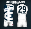
clash guernsey has been leaked
It’s almost so bad it’s iconic and a must have, like those hawks pre-season guernseys from the 90’s.
bradfisher14
Not actually Brad Fisher
I’m personally a fan of the light blue clash jumpers. We’re still wearing blue and no other team in the league wears that colour.
Navy or GAGF
Bletch
Premium Platinum
- Dec 8, 2020
- 4,074
- 12,960
- AFL Club
- Carlton
Don't get me wrong - love the Old Dark Navy Blue, and it's "our" colour. But, wouldn't care if we were wearing pink with purple polka dots if we won the flag. Sure Tigger supporters felt that way in 2017 too.
Got no issue with white and the CFC and number in Navy Blue. Could handle the orange we use and also a pink. The Navy and our ‘coat of arms’ are still bold and emblazoned in blue. Also, contrast jumpers sell like hot cakes and are a great money spinner. Don’t be an ‘Eddie’ and go the stripes only. Blah, blah, blah, blah. Sport has evolved and the Penrith example above is so true. They made a killing and it embraced a different demographic.
The traditional navy blue Carlton guernsey is a very 'pure' design - plain and uncluttered but beautiful.
I think the clash jumper should follow the same ethos and simply inverting it as white with a navy blue logo seems the logical thing for me.
....although I don't mind this years outlined CFC logo as well especially now it has some history being worn in that epic semi-final win !!
I think the clash jumper should follow the same ethos and simply inverting it as white with a navy blue logo seems the logical thing for me.
....although I don't mind this years outlined CFC logo as well especially now it has some history being worn in that epic semi-final win !!
- Moderator
- #9,763
Pink or Carlton respects orange would be a genuine contrast.I'm sure other have said it before, but we should be locking in pink before other teams do. Easy synergy with ladies' team guernseys, easy to spot on field, great contrast with navy blue from a design aesthetic.
Hasn't done Penrith any harm.
The Blue Weirdo
Premiership Player
I don't understand why clash jumpers are necessary unless there is a genuine 'clash of colours', which in Carlton's case is very rare.
I say don't dilute the traditional trade mark for the sake of marketing and raising a few dollarbucks.
I say don't dilute the traditional trade mark for the sake of marketing and raising a few dollarbucks.
I don't understand why clash jumpers are necessary unless there is a genuine 'clash of colours', which in Carlton's case is very rare.
I say don't dilute the traditional trade mark for the sake of marketing and raising a few dollarbucks.
….. or that other overseas sports do it !!
Sent from my iPhone using Tapatalk
The Blue Weirdo
Premiership Player
We've come a long way since the days of black & white TV replays with mud soaked Collingwood vs. Nth. Melbourne clashes etc.(with massive 24 inch screens)….. or that other overseas sports do it !!
Sent from my iPhone using Tapatalk
How did footy survive those ancient protocols?
You did have to concentrate harder.
Yeah, Nah - I wouldnt want to have a premiership photo of the lads in Pink & Purple polka dots ...Don't get me wrong - love the Old Dark Navy Blue, and it's "our" colour. But, wouldn't care if we were wearing pink with purple polka dots if we won the flag. Sure Tigger supporters felt that way in 2017 too.
We are the Pink & Purple Polka Dots
We are the old dark Pink & Purple Polka Dots
We're the team that never lets you down
We're the only team old Carlton knows
With all the champions
They like to send up
We'll keep our end up
And they will know that they've been playing
Against the famous old dark Pink & Purple Polka Dots
Last edited:
I with ya - a 'Carlton Respects' predominantly orange jumper with a navy CFC logo. Someone came up with a roughly put together concept a few years ago which wasn't bad (minus the grey piping). It'll look ok with either navy or white shorts depending on the opposition's colors.Pink or Carlton respects orange would be a genuine contrast.
It may not be everyone's cup of tea, but it's better than the white number they'll be rolling out this year imo. AFL probably wouldn't allow it though cos it may be a little too close to one of their love childs...

Orange crush
Norm Smith Medallist
- Aug 12, 2017
- 5,285
- 9,819
- AFL Club
- GWS
Toby, Chook, Cal, Tom Green and Sammy ... what a great photo
It's a fair line up alright......we just need SOS back to poach a few of themToby, Chook, Cal, Tom Green and Sammy ... what a great photo

Although these days he's more intent on poaching Carlton players...
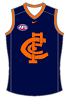
Yeah, thats pretty close! But you could invert it so that we are still 'Navy Blue' but enough orange for Carlton RespectsI with ya - a 'Carlton Respects' predominantly orange jumper with a navy CFC logo. Someone came up with a roughly put together concept a few years ago which wasn't bad (minus the grey piping). It'll look ok with either navy or white shorts depending on the opposition's colors.
It may not be everyone's cup of tea, but it's better than the white number they'll be rolling out this year imo. AFL probably wouldn't allow it though cos it may be a little too close to one of their love childs...
View attachment 1850713

That's not a clash jumper though, just a tweak in the trim colour of our regular guernsey.Yeah, thats pretty close! But you could invert it so that we are still 'Navy Blue' but enough orange for Carlton Respects
View attachment 1851027
I was just considering the Carlton Respects jumper.That's not a clash jumper though, just a tweak in the trim colour of our regular guernsey.
I don't mind this (white) version though! or the Crippa version here
- Status
- Not open for further replies.
Similar threads
- Replies
- 2K
- Views
- 38K
- Replies
- 44
- Views
- 2K
- Replies
- 6
- Views
- 890
- Replies
- 31
- Views
- 5K
- Replies
- 59
- Views
- 5K


