Navigation
Install the app
How to install the app on iOS
Follow along with the video below to see how to install our site as a web app on your home screen.
Note: This feature may not be available in some browsers.
More options
-


LIVE: Sydney v Brisbane Lions - 2:30PM AEST Sat
Squiggle tips Lions at 61% chance -- What's your tip? -- Ticketing Buy, Sell -- Teams on Thurs »
-
 BigFooty Tipping Notice Img
Weekly Prize - Join Any Time - Tip Grand Final
The Golden Ticket - MCG and Marvel Medallion Club tickets and Corporate Box tickets at the Gabba, MCG and Marvel.
Round PF Winner: Still Me
-
 BigFooty AFLW Notice Img
AFLW 2024 - Round 4 - Chat, game threads, injury lists, team lineups and more.
You are using an out of date browser. It may not display this or other websites correctly.
You should upgrade or use an alternative browser.
You should upgrade or use an alternative browser.
Opinion Adelaide Crows New Logo Discussion
- Thread starter Skinny_Love18
- Start date
- Tagged users None
- Oct 3, 2012
- 1,505
- 3,808
- AFL Club
- Adelaide
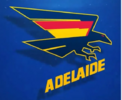
Is it better than what we’ve got? Probably. But it’s still eye watering bad.Initial thoughts were surely that can't be real. That's cr*p
But someone sent me the photo realigned, and without that stupid blue background. I don't actually mind it.
View attachment 2123065
It's really odd and not the direction I thought they would go at all.
I actually kind of love it in an ugly retro futurism kind of way.
I actually kind of love it in an ugly retro futurism kind of way.
The leaked rough version was bad.
The C9 one better.
Hopefully some more polished final version is much better.
Don't mind the concept.
The C9 one better.
Hopefully some more polished final version is much better.
Don't mind the concept.
Actually, that is much better! hmmmInitial thoughts were surely that can't be real. That's cr*p
But someone sent me the photo realigned, and without that stupid blue background. I don't actually mind it.
View attachment 2123065
With pre season training only a month away you would think the new crows training gear and apparel would already be in its final stages at O'neils.. so the logo has already gone to print you would think
- Oct 2, 2022
- 5,825
- 7,879
- AFL Club
- Adelaide
These aren't logos. They're illustrations.Just a couple of runs on a AI image gen can do better than that crap.
View attachment 2123139
View attachment 2123140View attachment 2123141
- Jun 12, 2012
- 20,931
- 66,955
- AFL Club
- Port Adelaide
With pre season training only a month away you would think the new crows training gear and apparel would already be in its final stages at O'neils.. so the logo has already gone to print you would think
I’d say so. It’s possible this wasn’t quite the final version, like they leaked an earlier revision, and I’m not sure what they do with that yellow font at small size, or on white background, but if anyone’s opinion is that they like it pending major changes I think there will be disappointment.
Same goes for the “at least it’s better than the last one because it’s cursed, something something, Trigg” people if we don’t have any success in the near future.
I expect it will look better when released in high quality and actual products, we’ve seen it in the worst light and expectations are now low, but I’d guess that the logo is the logo.
This morning I was seeing an SA coastline.Pardon the intrusion.
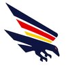
I think it’s almost there, the basic shape of the crow is fine. They’ve just butchered the area around the wing trying to integrate the red and yellow.
This is a crude edit but I think it looks miles better with the wing simplified like this.
View attachment 2123229
Any opportunity to make that more prominent
What annoys me is the club continues to let their fans down with rubbish like this. They should have came up with 3 designs and put it to vote from the members. They NEVER listen to the fans.I’d say so. It’s possible this wasn’t quite the final version, like they leaked an earlier revision, and I’m not sure what they do with that yellow font at small size, or on white background, but if anyone’s opinion is that they like it pending major changes I think there will be disappointment.
Same goes for the “at least it’s better than the last one because it’s cursed, something something, Trigg” people if we don’t have any success in the near future.
I expect it will look better when released in high quality and actual products, we’ve seen it in the worst light and expectations are now low, but I’d guess that the logo is the logo.
So, what 10 minutes and some random on Bigfooty has fixed months of work and thousands of dollars?
Good one AFC. Best people in the right seats.
The club is a f@#$ing joke. Pathetic from top to bottom.
I'm convinced we could sack the lot, replace them with people randomly chosen from bigfooty and run the club better.
- Apr 12, 2012
- 4,377
- 7,433
- AFL Club
- Adelaide
- Other Teams
- Ricciardo, Red Sox
This looks a lot better to me. Simplified. Maybe a tad less white between the stripes.Pardon the intrusion.
I think it’s almost there, the basic shape of the crow is fine. They’ve just butchered the area around the wing trying to integrate the red and yellow.
This is a crude edit but I think it looks miles better with the wing simplified like this.
View attachment 2123229
Andonis1997
All-Round Good Guy
Exactly.Initial thoughts were surely that can't be real. That's cr*p
But someone sent me the photo realigned, and without that stupid blue background. I don't actually mind it.
View attachment 2123065
Everyone is looking at a blurry photo of a computer screen, shot from an acute angle, on a busy background. Of course it'll look shit.
I'll reserve judgement until November when it comes out, but this is still an upgrade over the Baltelaide Cravens mashup attempt from 15 years ago. I'm positive with the way the club's going.
You might be the only one…Exactly.
Everyone is looking at a blurry photo of a computer screen, shot from an acute angle, on a busy background. Of course it'll look shit.
I'll reserve judgement until November when it comes out, but this is still an upgrade over the Baltelaide Cravens mashup attempt from 15 years ago. I'm positive with the way the club's going.
Neither of that changes the logo, you can still see what it would look like in good quality straight on, it’s rubbish.Exactly.
Everyone is looking at a blurry photo of a computer screen, shot from an acute angle, on a busy background. Of course it'll look shit.
I'll reserve judgement until November when it comes out, but this is still an upgrade over the Baltelaide Cravens mashup attempt from 15 years ago. I'm positive with the way the club's going.
crow2crow
Trapped in Victoria
- Sep 13, 2020
- 3,769
- 2,657
- AFL Club
- Adelaide
you said in response to my comment you didnt think the crow could be another colour. why? did I suggest another colour? NO. I was complementingWhat?
You commented on a logo where the crow is black.
You wrote crows are black?
How else can you interpret it?
its definitely better !Pardon the intrusion.
I think it’s almost there, the basic shape of the crow is fine. They’ve just butchered the area around the wing trying to integrate the red and yellow.
This is a crude edit but I think it looks miles better with the wing simplified like this.
View attachment 2123229
Another colour that’s not navy, red or yellow.you said in response to my comment you didnt think the crow could be another colour. why? did I suggest another colour? NO. I was complementing
its definitely better !
ie black.
I don’t believe the crow should be black it’s not one of our colours.
El Doederino
Norm Smith Medallist
- Apr 22, 2018
- 6,007
- 13,162
- AFL Club
- Adelaide
Blacks not a colourAnother colour that’s not navy, red or yellow.
ie black.
I don’t believe the crow should be black it’s not one of our colours.
- Apr 12, 2012
- 4,377
- 7,433
- AFL Club
- Adelaide
- Other Teams
- Ricciardo, Red Sox
Pardon the intrusion.
I think it’s almost there, the basic shape of the crow is fine. They’ve just butchered the area around the wing trying to integrate the red and yellow.
This is a crude edit but I think it looks miles better with the wing simplified like this.
View attachment 2123229
The thing I also like about this one is the separation between the colours means you can use it on a single colour item (Eg. a navy hat) with a raised effect, or in a two colour item (eg. a navy hat with white logo).
This appeals to me as an adult male.


SugarShane
C12 H22 O11
Every time a logo comes out everyone jumps on AI and makes these terrible looking video game-esque "create a team" type logos, surely people don't actually think they look good do they?Chatgpt to the rescue
Seriously....surely we cant end up with a logo 1000 times worse than one produced by chat gpt in 10 secs..
View attachment 2123013
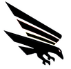
Another colour that’s not navy, red or yellow.
ie black.
I don’t believe the crow should be black it’s not one of our colours.
I've heard this before and it's wrong. We have used black crows before and it looks good.
We are not limited to 3 colours, crows are black, it's completely fine to use it.
Similar threads
- Replies
- 1K
- Views
- 33K
- Replies
- 4K
- Views
- 167K
- Poll
- Replies
- 581
- Views
- 23K
- Replies
- 626
- Views
- 25K


