Haymo_of_thor
It's not looking good brev
- Oct 6, 2018
- 153
- 378
- AFL Club
- Adelaide
- Other Teams
- Sturt, Adelaide Jets
G'day everyone, this is some stuff I made at the end of the last summer that I never ended up posting, so I'll do it now.
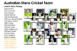
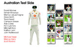
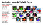
I decided to overhaul the kits, coaches, and squads of the Australian Cricket Landscape. I did this by dividing Australian cricket into two different teams; The Australian Mens Cricket Team (Tests and ODI), and the Australian Mens Twenty20 Team.
I took inspiration from past kits that Australia has worn just like CA has done in the past. Keep in mind that when I made these Alinta Energy was still sponsors of Australia, not Toyota.
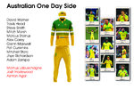
The merging of Test and ODI sides into one means that there is a return of the 'Baggie Yellow' cap just like the 'Baggie Green' worn in test matches. The ODI uniform takes inspiration from the 1987 Perth Challenge Tournament Jersey and even uses "retro" versions of sponsor logos. The T20I team wears a uniform inspired by the ODI kit worn between 1989 and 1992 but with a black base similar to current Australian T20I Kits.

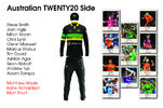
Thanks for reading through this short portfolio, I appreciate any feedback or critiques.
p.s. The teams were my opinion in March and are not the actual teams for each respective side.
I decided to overhaul the kits, coaches, and squads of the Australian Cricket Landscape. I did this by dividing Australian cricket into two different teams; The Australian Mens Cricket Team (Tests and ODI), and the Australian Mens Twenty20 Team.
I took inspiration from past kits that Australia has worn just like CA has done in the past. Keep in mind that when I made these Alinta Energy was still sponsors of Australia, not Toyota.
The merging of Test and ODI sides into one means that there is a return of the 'Baggie Yellow' cap just like the 'Baggie Green' worn in test matches. The ODI uniform takes inspiration from the 1987 Perth Challenge Tournament Jersey and even uses "retro" versions of sponsor logos. The T20I team wears a uniform inspired by the ODI kit worn between 1989 and 1992 but with a black base similar to current Australian T20I Kits.


Thanks for reading through this short portfolio, I appreciate any feedback or critiques.
p.s. The teams were my opinion in March and are not the actual teams for each respective side.


