- Mar 30, 2014
- 2,820
- 4,802
- AFL Club
- Brisbane Lions

- Other Teams
- Dolphins, Seattle Kraken
Goal
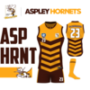
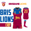
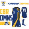
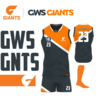
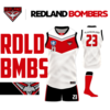
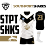
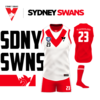
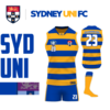
Redesign the NEAFL kits - a comp I was not necessarily familiar with. In the case with teams I was familiar, try and do something a bit different.
Rules
- 10 minutes to research a team, previous kits and colours.
- 20 min to design start to finish a kit.
- Each kit requires team logo, NEAFL logo and player numbers in the same spot (for consistency).
- The design can be inspired by previous kits, but cannot be exactly the same.
- Colour schemes have to be followed.
- Each kit will be displayed the same way for a clean look.
- Home kits only! Even if some kits look similar, the away kits are always different, so don't even think just design.
I will do notes after each design, but if you would like to skip ahead to a team you enjoy, feel free to click the links just below
Team Links
Aspley Hornets
Brisbane Lions
Canberra Demons
Gold Coast Suns
GWS Giants
Redland Bombers
Southport Sharks
Sydney Swans
Sydney University
And that's it, I hope you enjoyed looking at the designs! This was an interesting challenge, especially the time limit.
The part which was probably the hardest was that I only allowed myself one error check per kit, so if i f-ked up a layer and didn't notice it the first time, blerg!
I found the teams I was familiar with the most difficult as I didn't want to do a design that another FJGD designer had done.
Anyways, thanks for reading/perusing
Last edited:


