Navigation
Install the app
How to install the app on iOS
Follow along with the video below to see how to install our site as a web app on your home screen.
Note: This feature may not be available in some browsers.
More options
-


LIVE: Sydney v Brisbane Lions - 2:30PM AEST Sat
Squiggle tips Lions at 61% chance -- What's your tip? -- Ticketing Buy, Sell -- Teams on Thurs »
-
 BigFooty Tipping Notice Img
Weekly Prize - Join Any Time - Tip Grand Final
The Golden Ticket - MCG and Marvel Medallion Club tickets and Corporate Box tickets at the Gabba, MCG and Marvel.
Round PF Winner: Still Me
-
 BigFooty AFLW Notice Img
AFLW 2024 - Round 4 - Chat, game threads, injury lists, team lineups and more.
You are using an out of date browser. It may not display this or other websites correctly.
You should upgrade or use an alternative browser.
You should upgrade or use an alternative browser.
News New Crows Logo
- Thread starter _Damo_
- Start date
- Tagged users None
- Jun 23, 2021
- 2,104
- 1,936
- AFL Club
- Melbourne
- Other Teams
- LA dodgers LA Kings Melbourne Aces
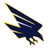
thumbs down from me, just does not hit, too sharp and long, and can't integrate text into the logo that well, its like they tried to copy this and mixed it with it with the og crow logo

(this is great but dated so it is the new crows logo either too furatisic or too old)
the retro vibe is not hitting too simplsic as well

(this is great but dated so it is the new crows logo either too furatisic or too old)
the retro vibe is not hitting too simplsic as well
cannavo
Binging the YT algorithm
- Moderator
- #79
Ah the old "Oopsie, lol no this isn't the final product at all........New Adelaide logo has been leaked.
Kane Cornes doesn't like it.
Barden Ingram from 9 Adelaide says it's real pending any late alterations.

 "
"Worked for Carlton when their grey and orange clash got leaked and later changed it, thanks to this board might I add

It looks like there is some more refinement needed to be made. From memory, in 2017 a grainy snapshot of the new west coast logo was leaked a few weeks before the reveal and there was quite a bit of refinement made to that before it was revealed to the public.
caloschwaby
Whisper
- Jan 3, 2017
- 5,077
- 6,955
- AFL Club
- Collingwood

- Other Teams
- Celtics, Renegades, Packers
Accomplished my life's work at ~18 years of age putting the fear of God into the Carlton Footy ClubWorked for Carlton when their grey and orange clash got leaked and later changed it, thanks to this board might I add
- Jun 12, 2012
- 20,931
- 66,968
- AFL Club
- Port Adelaide
I agree, there are far better designs on BF than what clubs end up adopting.Like all three logo designs and the away jumper. Wish the AFL clubs consulted you guys for their jumper and logo designs rather than their current graphic design companies that obviously relegate the job to the work experience kid.
The current Adelaide logo is particularly poor.
Freight Train
Maccas footy aficionado
- Moderator
- #85
View attachment 2119042
Not my design
I saw this on a forum from 2019, how close to this design is the new logo?
Sent from my iPhone using BigFooty.com
This is legitimately a better logo than what they’ve (apparently) gone with.
- Jun 12, 2012
- 20,931
- 66,968
- AFL Club
- Port Adelaide
Reminds me a bit of a Concorde with vapor lines over the top
Bluelegs
Digging into the why
Happy Birthday!It's my birthday tomorrow and this this is a shit present.
- Jul 25, 2008
- 3,938
- 2,548
- AFL Club
- Collingwood

- Other Teams
- Indiana Pacers
Yeah just doesn’t look right. The red and yellow parts cutting into the shape of the wing make it seem like half of it is missing. “Clipped wings” perhaps? That’s some Freo anchor tier symbolism right there.
The general shape is OK though if you colour them in.
View attachment 2123131
I do like that. The problem with the leaked one is the yellow/red on the wings doesn't fit well, sort of looks like someone just threw it on the top of the wings.
fethers17
Debutant
Attachments
with 4 weeks to go until pre season starts and the players get their new training gear etc the logo would have been done weeks ago and is probably in print at O'Neils. if this is the new logo, no way i am buying any new merch
I've put off buying merch since the dinocrow came in, what's another 15 seasons.with 4 weeks to go until pre season starts and the players get their new training gear etc the logo would have been done weeks ago and is probably in print at O'Neils. if this is the new logo, no way i am buying any new merch
Swooping_Magpie
it's swooping season
miles better than the leaked design
errant bounce
Team Captain
- May 2, 2024
- 539
- 832
- AFL Club
- Fremantle
- Other Teams
- South Fremantle
I don't entirely hate it, it's just another example of acknowledging a previous logo was great but feeling an unneccassary need to modernise it (North and Collingwood's 90s/early aughts motifs and even the inevitable St Kilda re-badge). Liverpool and Arsenal have essentially dropped all the 21st century add-ons and are going to the raw major identity on their crests; they're not trying to make them look like something from 2024.
Overall it's a massive upgrade even though there's plenty of other better approaches.
Think the actual crowd ident will be used way more than the wordmark version and it scales fairly well.
Main issue they have with it, and the current and the previous, is it really only works on a white backdrop. makes things look really messy when they've already got three colours on a polo or sponsor backdrop and makes presentation on graphics pretty difficult. you can't do a two-tone, you can't do an outline. if anything I was expecting the Gather Round crow to get a gig because of that: the outline removes this and makes things way more adaptable for social media and merch.
Only question is why the **** are there little jags and drops in the yellow and red wings? they just jut out for no reason. what's it supposed to resemble?
Has anyone on this board ever liked a logo redesign?
caloschwaby
Whisper
- Jan 3, 2017
- 5,077
- 6,955
- AFL Club
- Collingwood

- Other Teams
- Celtics, Renegades, Packers
Yes sometimes.Has anyone on this board ever liked a logo redesign?
News - Rumoured new Collingwood logo for 2018
Not sure if they're getting new jumpers, but Collingwood will have a new logo for next year
But they often just genuinely suck or in rare instances borderline rip-off designs made here.
Similar threads
- Replies
- 41
- Views
- 2K
- Poll
- Replies
- 2
- Views
- 233
- Replies
- 48
- Views
- 3K


