Andonis1997
All-Round Good Guy
Yeah, no.
Follow along with the video below to see how to install our site as a web app on your home screen.
Note: This feature may not be available in some browsers.
LIVE: Sydney v Brisbane Lions - 2:30PM AEST Sat
Squiggle tips Lions at 61% chance -- What's your tip? -- Ticketing Buy, Sell -- Teams on Thurs »
 BigFooty Tipping Notice Img
Weekly Prize - Join Any Time - Tip Grand Final
The Golden Ticket - MCG and Marvel Medallion Club tickets and Corporate Box tickets at the Gabba, MCG and Marvel.
 BigFooty AFLW Notice Img
AFLW 2024 - Round 4 - Chat, game threads, injury lists, team lineups and more.
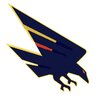
I still maintain mine is better than what they went for, but I can understand the idea of trying to distance from that a bit and change things up. That being said, some concepts I’ve seen do it better than me and what the Crows are considering. That one with the SA map and the Zoops style crow is fantastic, but might not fit modern logo conventions.
Mine for reference:
Yeah just doesn’t look right. The red and yellow parts cutting into the shape of the wing make it seem like half of it is missing. “Clipped wings” perhaps? That’s some Freo anchor tier symbolism right there.
The general shape is OK though if you colour them in.
View attachment 2123131


LolI'll just say it straight, the logo is unfixable. The shape of it is the main issue, it's just hard to really make out what is even happening with it or what it is. I'd hate to throw the AI-generated accusation around again but it's so hard to comprehend how a professional could design such a thing with how bizarre the shaping of it is. Obviously they are going for the look of the original crow, but funnily enough they've kept the worst thing about it; the robo-claw feet, and thrown out essentially everything else that made that logo awesome.
I'm starting to lose hope in the future of professional graphic design after seeing this and the Tasmania logos. How is it getting this bad? what happened?
Anyway, I've had my own go at it which combines the current logo with the 2000s one
View attachment 2123744View attachment 2123745

I'll just say it straight, the logo is unfixable. The shape of it is the main issue, it's just hard to really make out what is even happening with it or what it is. I'd hate to throw the AI-generated accusation around again but it's so hard to comprehend how a professional could design such a thing with how bizarre the shaping of it is. Obviously they are going for the look of the original crow, but funnily enough they've kept the worst thing about it; the robo-claw feet, and thrown out essentially everything else that made that logo awesome.
I'm starting to lose hope in the future of professional graphic design after seeing this and the Tasmania logos. How is it getting this bad? what happened?
Anyway, I've had my own go at it which combines the current logo with the 2000s one
View attachment 2123744
Greatly appreciated. There was a bit of divided opinion on the Crows board when the concept was shared there, but seemed like more in favour than against. One of the main arguments against it was that the jumper has been the way it has been since you guys started so I can understand keeping it, but the darkened vibe of the whole kit just feels so much nicer to me. For the same reason I much prefer Port’s current home jumper over the SBS jumper.I really like the guernsey in the last pic with Keays.
