Winning a premiership straight away would do that.I can't remember what the reaction to the Eagles rebrand was on here. I know on the WCE board it wasn't well received at fist but it's grown on the majority of us.
Navigation
Install the app
How to install the app on iOS
Follow along with the video below to see how to install our site as a web app on your home screen.
Note: This feature may not be available in some browsers.
More options
-
 BigFooty AFLW Notice Img
AFLW 2024 - Round 4 - Chat, game threads, injury lists, team lineups and more.
You are using an out of date browser. It may not display this or other websites correctly.
You should upgrade or use an alternative browser.
You should upgrade or use an alternative browser.
News New Crows Logo
- Thread starter _Damo_
- Start date
- Tagged users None
My recollection is that it was actually a relatively similar situation to what’s happened with the Adelaide logo.I can't remember what the reaction to the Eagles rebrand was on here. I know on the WCE board it wasn't well received at fist but it's grown on the majority of us.
A low quality image of West Coast’s jumper with the new bird on it leaked first. Just based on that people thought it looked odd, a fair few people preferred the Costa eagle - some did mock ups based off the small leaked image that were pretty accurate, then when the actual logo was revealed it was the same as whenever a team rebrands, some people liked it, some didn’t, and some just don’t like change.
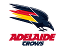
Here's another trace job by me. I honestly think this is the orientation they're going with. with the wordmark on this angle
View attachment 2124493
I’m really liking it now, and I don’t mind at all if the club runs with it.
Sent from my iPhone using Tapatalk Pro
- Oct 27, 2016
- 6,038
- 10,925
- AFL Club
- Collingwood
- Other Teams
- Packers, Raptors, Renegades
Rate that a lot. If I may make a suggestion to make this more unique compared to the original Crows logo, I’d be curious how it looks with just three thick trails, basically as thick as you have each set of three colours.
The Crow is fantastic though, good balance of old and new and done in a way where you don’t look at it and think it looks wrong without an open mouth. Well done!
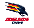
Something like this? I don't mind it actually. Both logos works really well with the current wordmark, I hope they keep it but it's a bit of a long shot


It's a starting point.Something like this? I don't mind it actually. Both logos works really well with the current wordmark, I hope they keep it but it's a bit of a long shot
View attachment 2126176
View attachment 2126181
I think it would work better if it wasn't on an angle.
And the crow into colours transition looks a little odd.
Similar threads
- Replies
- 41
- Views
- 2K
- Poll
- Replies
- 2
- Views
- 245
- Replies
- 48
- Views
- 3K


