The more I see it, the more I hate it
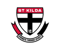
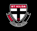
I was lucky enough to go to the unveiling yesterday and the first thing I saw were the glaring problems of mediocre logo craftsmanship. This was exaggerated by the CEO parroting jargon about the need to update the crest for a 'digital age'. This would be good and all, but the logo doesn't even do that. I opened my phone and saw this email below. The weird need to muddy the logo with a weird double stroke (one white, one black) serves no purpose at all. Even the mid war folk who created the 1933 logo were able to use a strong single stroke.

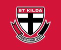
The 2 strokes, which turn into 3 on a non-white background.

3!! pointless strokes. Plus the joy inconsistent reds.

Losing the ribbon is a mistake. It has been on every Saints' jumper since 1933, and carried a classiness and classic feel. It create a balance of when used with the top heavy crest shape. The new 'ribbon', if you can call it that, clashes heavily with the classic and simple crest with another thin and sharp stroke.
I wish we took the route of a cleaning up, rather than a redesign. See numerous EPL and European soccer clubs simply cleaning up timeless logos, instead of changing them.

The motto
Only using it in marketing is a bit of a kick in the nuts to those supporters who love the club and its historical players. Loyalty is what has kept us existing. I think of all the crazy idiots like me who have shown up week on week to support the team when we'd surely get smashed and barely getting 20,000 at a home game. I think of Barks, Buckets and Roo who said no to getting more money to go to bigger and stronger clubs. A bit of the soul has been lost with the removal of the motto.
Lastly, my fixes.
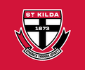
Use stickman more plebs!!

I was lucky enough to go to the unveiling yesterday and the first thing I saw were the glaring problems of mediocre logo craftsmanship. This was exaggerated by the CEO parroting jargon about the need to update the crest for a 'digital age'. This would be good and all, but the logo doesn't even do that. I opened my phone and saw this email below. The weird need to muddy the logo with a weird double stroke (one white, one black) serves no purpose at all. Even the mid war folk who created the 1933 logo were able to use a strong single stroke.
The 2 strokes, which turn into 3 on a non-white background.
3!! pointless strokes. Plus the joy inconsistent reds.
Losing the ribbon is a mistake. It has been on every Saints' jumper since 1933, and carried a classiness and classic feel. It create a balance of when used with the top heavy crest shape. The new 'ribbon', if you can call it that, clashes heavily with the classic and simple crest with another thin and sharp stroke.
I wish we took the route of a cleaning up, rather than a redesign. See numerous EPL and European soccer clubs simply cleaning up timeless logos, instead of changing them.
The motto
Only using it in marketing is a bit of a kick in the nuts to those supporters who love the club and its historical players. Loyalty is what has kept us existing. I think of all the crazy idiots like me who have shown up week on week to support the team when we'd surely get smashed and barely getting 20,000 at a home game. I think of Barks, Buckets and Roo who said no to getting more money to go to bigger and stronger clubs. A bit of the soul has been lost with the removal of the motto.
Lastly, my fixes.


Use stickman more plebs!!
