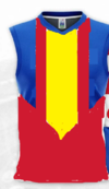
Really think with a guernsEy like this we could get rid of the logo.. View attachment 1541808
On iPhone using BigFooty.com mobile app
Too plain prefer the logo
Follow along with the video below to see how to install our site as a web app on your home screen.
Note: This feature may not be available in some browsers.
 BigFooty AFLW Notice Img
AFLW 2024 - Round 9 - Indigenous Round - Chat, game threads, injury lists, team lineups and more.
Really think with a guernsEy like this we could get rid of the logo.. View attachment 1541808
On iPhone using BigFooty.com mobile app
I think we still need a logo. Just need a different one to what we have.Really think with a guernsEy like this we could get rid of the logo.. View attachment 1541808
On iPhone using BigFooty.com mobile app
Would really class up the jointA gcfc monogram
biased cos i made them, but i still like these.
curved yoke as a sun on the home, blue waves on the away.
View attachment 1542383View attachment 1542385
Much better than the current ones, and probably all other suggestions, but what is the relevance of the wavy lines?biased cos i made them, but i still like these.
curved yoke as a sun on the home, blue waves on the away.
View attachment 1542383View attachment 1542385
rays of the sun on the home kit, waves of the beach on the away kit.Much better than the current ones, and probably all other suggestions, but what is the relevance of the wavy lines?

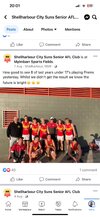
Shellharbour, NSW - Located on the South Coast about an hour and 45 south of Sydney.View attachment 1544899
Don’t know where Shell Harbour is but there Suns have a better guernsey than us !
On iPhone using BigFooty.com mobile app
View attachment 1544899
Don’t know where Shell Harbour is but there Suns have a better guernsey than us !
On iPhone using BigFooty.com mobile app

like this for the front (but add a new logo or monogram?)Something like this has potential
View attachment 1546494

I grabbed the blue one, arrived todayShould’ve went with these instead of being training tops
View attachment 1552149
View attachment 1552150
To busy imo, plus that hideous logo is still thereShould’ve went with these instead of being training tops
View attachment 1552149
View attachment 1552150
I reckon it'd help a lot if they just filled the logo to match the background of the jumper it's on. Red jumper logo stays red, blue jumper logos blue, yellow inverse to yellow. Just would help with the busynessTo busy imo, plus that hideous logo is still there
