Navigation
Install the app
How to install the app on iOS
Follow along with the video below to see how to install our site as a web app on your home screen.
Note: This feature may not be available in some browsers.
More options
You are using an out of date browser. It may not display this or other websites correctly.
You should upgrade or use an alternative browser.
You should upgrade or use an alternative browser.
Roast RFC is photoshopping the rancid fluro yellow back into traditional yellow on all social media platforms. time to bring the traditional yellow back
- Thread starter Groupie_
- Start date
- Tagged users None
sabso
bring your vodka and your charlie
- Aug 6, 2024
- 1,330
- 2,250
- AFL Club
- Richmond
- Other Teams
- Eng cricket, Leics CCC, Leicester Tigers
The afl would fixture us against a team with no traditions at some shithole ground thoughit would be cool if they brought back a rival round and it was with traditional colours and no sponsors
Prob the durex Gold Coast at carrara
rfctigerarmy
🏆🏆🏆🏆🏆🏆🏆🏆🏆🏆🏆🏆🏆
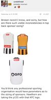
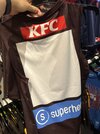
Looks like its been on the washing line for 3 consecutive summershawforn heritage jumper sponsors just as bad as oursthis league is rooted
View attachment 2192196View attachment 2192197
Cactus_
Bluesky: @weirdmelbs.bsky.social
This dates me
I’ve been here long enough to have read hundreds of pages of how much people hated the “dull” yellow we used to have and how excited peop were for the new “bright” strip
I’ve been here long enough to have read hundreds of pages of how much people hated the “dull” yellow we used to have and how excited peop were for the new “bright” strip
- Jul 8, 2017
- 25,315
- 74,011
- AFL Club
- Richmond
I think with the BLK strip the main complaint was the faded black?This dates me
I’ve been here long enough to have read hundreds of pages of how much people hated the “dull” yellow we used to have and how excited peop were for the new “bright” strip
rfctigerarmy
🏆🏆🏆🏆🏆🏆🏆🏆🏆🏆🏆🏆🏆
Agree, BLK black was the worstI think with the BLK strip the main complaint was the faded black?
- Oct 29, 2017
- 22,438
- 44,046
- AFL Club
- Richmond
The issue was the use of charcoal over black. A few years after this was fixed, the yellow went to fluro.This dates me
I’ve been here long enough to have read hundreds of pages of how much people hated the “dull” yellow we used to have and how excited peop were for the new “bright” strip
They are separate issues and both equally as bad.
Groupie_
time to return the traditional Richmond yellow
- Thread starter
- #312
the yellow BLK used was the same as the yellow on the current Rfc logo. its actually a pantone identical to west coast eagles and what the media team photoshop back into. its just that BLK changed their material to a nasty cheap one after 2014 and the colours come out grey and beige instead of yellow and black because the colour paint on the fabric printer couldnt penetrate that new material properly creating a faded monstrosityThis dates me
I’ve been here long enough to have read hundreds of pages of how much people hated the “dull” yellow we used to have and how excited peop were for the new “bright” strip
Puma saw this an excuse to impose borrusia dortmunds fluro yellow on us, a colour weve never worn in our past and we agreed
if you look at 2011-14 Kooga/BLK there was no fading problems
theres a reason the Puma fluro yellow only looks good on a sunny day and terrible on cloudy days/night and thats cos the sun makes it looks more like our actual traditional yellow ! also, our club photoshops the fluro back into traditional yellow on social media as you can see on this thread
Last edited:
the yellow BLK used was the same as the yellow on the current Rfc logo. its actually a pantone identical to west coast eagles and what the media team photoshop back into. its just that BLK changed their material to a nasty cheap one after 2014 and the colours come out grey and beige instead of yellow and black because the colour paint on the fabric printer couldnt penetrate that new material properly creating a faded monstrosity
Puma saw this an excuse to impose borrusia dortmunds fluro yellow on us, a colour weve never worn in our past and we agreed
if you look at 2011-14 Kooga/BLK there was no fading problems
theres a reason the Puma fluro yellow only looks good on a sunny day and terrible on cloudy days/night and thats cos the sun makes it looks more like our actual traditional yellow ! also, our club photoshops the fluro back into traditional yellow on social media as you can see on this thread

Nostradumbass
BigFooty Legend
- Oct 2, 2007
- 49,703
- 122,853
- AFL Club
- Richmond
- Other Teams
- Everton FC Williamstown FC
Might get the training shorts. Tried what seemed to be board shorts at the AFL store but they were really flimsy, felt cheap.
rfctigerarmy
🏆🏆🏆🏆🏆🏆🏆🏆🏆🏆🏆🏆🏆
Something about 50th anniversary since yellow shorts debut this year.
We better wear 'em.
We better wear 'em.
rfctigerarmy
🏆🏆🏆🏆🏆🏆🏆🏆🏆🏆🏆🏆🏆
Maybe they'll change it for the game and get great feebackwhen they wore em they were darker traditional yellow shorts.
imagine fluro shorts, would look fukt as
- Oct 29, 2017
- 22,438
- 44,046
- AFL Club
- Richmond
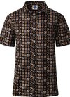
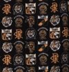
Reckon this shirt is mint with all the old logos and no fluro to be seen. Thoughts?puma are incapable of change, they want us to use borrusia dortmunds fluro and thats it

Richmond Tigers Mens Logo Cotton Shirt
Show off your club loyalty this year with the impressive Richmond Tigers Mens Logo Cotton Shirt.
Groupie_
time to return the traditional Richmond yellow
- Thread starter
- #320
would look mint at a shingdigReckon this shirt is mint with all the old logos and no fluro to be seen. Thoughts?

Richmond Tigers Mens Logo Cotton Shirt
Show off your club loyalty this year with the impressive Richmond Tigers Mens Logo Cotton Shirt.www.aflfootyshop.com.au
View attachment 2196482View attachment 2196483
sabso
bring your vodka and your charlie
- Aug 6, 2024
- 1,330
- 2,250
- AFL Club
- Richmond
- Other Teams
- Eng cricket, Leics CCC, Leicester Tigers
WantReckon this shirt is mint with all the old logos and no fluro to be seen. Thoughts?

Richmond Tigers Mens Logo Cotton Shirt
Show off your club loyalty this year with the impressive Richmond Tigers Mens Logo Cotton Shirt.www.aflfootyshop.com.au
View attachment 2196482View attachment 2196483
- Oct 29, 2017
- 22,438
- 44,046
- AFL Club
- Richmond
**** yeahwould look mint at a shingdig
Similar threads
- Replies
- 69
- Views
- 4K
- Poll
- Replies
- 30
- Views
- 1K


