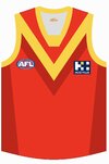
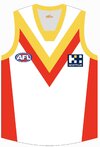
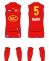
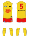
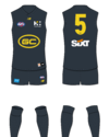
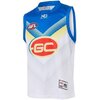
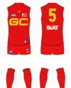
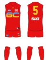
Preview ‘FEARLESS’ Gold Coast SUNS guernsey and branding discussions

Remove this Banner Ad

We really only need to wear the clash strip away to brisbane (once a year and always will be) and away to sydney (say on average 2 out of every 3 years). And maybe GWS i guess (again say 2 out of every 3 years).

So maybe we do a redesign of our home jumper that we can wear (with red shorts all the time) for 20 -21 games a year.

And then once thats done, do a clash jumper for the QClash/away Sydney games which can be on same template as whatever our redesigned home jumper is (and probably mostly yellow which should be fine against Brisbane, Sydney and GWS)

so dropping blue could be done but then the song would have to change.....
 

Log in to remove this ad.

Yeah. Red probably needs to be our main colour, with blue and yellow as contrast. Don’t mind trying stripes or a more classic strip though. Whatever gets rid of the GC logo!

What’s wrong with our logo? It’s symbolic and different to the rest of the league; I like it
 
It just doesn’t need the oval around it, especially the red filled oval on the blue jumper. The letters could be refreshed by any decent graphic designer


On iPhone using BigFooty.com mobile app

I’ll agree re the oval, I like the GC there though. Not for sentimental reasons either I just think it stands out and looks good.
 
It just doesn’t need the oval around it, especially the red filled oval on the blue jumper. The letters could be refreshed by any decent graphic designer


On iPhone using BigFooty.com mobile app

4019a24154a02066aedf0fb904d9f343.jpg
 

(Log in to remove this ad.)

I mainly like this paragraph

But the club is conducting a preliminary research project with an eye to changing its emblem. That projects includes feedback from various stakeholder, supporter and member groups.
 
I had a conversation with Mark Evans about a redesign of the suns jumper last week and supplied him with a bunch of details as to why the jumper needs updating. Without copy pasting directly his response, because I wasn't given permission, he stated:
  • They are currently having internal discussions around brand.
  • A specific group is doing this.
  • He personally thinks the logo is dated, however not everybody at the club thinks the same.
  • In his time at the hawks yellow was the worst selling item, so he doesn't particularly like a yellow jumper for the suns.
The GC Mids. We're viable.

On Nokia C2 2nd Edition using BigFooty.com mobile app
 
I had a conversation with Mark Evans about a redesign of the suns jumper last week and supplied him with a bunch of details as to why the jumper needs updating. Without copy pasting directly his response, because I wasn't given permission, he stated:
  • They are currently having internal discussions around brand.
  • A specific group is doing this.
  • He personally thinks the logo is dated, however not everybody at the club thinks the same.
  • In his time at the hawks yellow was the worst selling item, so he doesn't particularly like a yellow jumper for the suns.
This is positive IMO
 
Any body with any ties to the club have an update on a possible re design? We desperately need it
I’m hoping for retro round we will finally bust the wave back out or this because it’s a away game
 

Attachments

  • IMG_1662.jpeg
    IMG_1662.jpeg
    28.4 KB · Views: 48
Apologies if not allowed I just downloaded you're image to edit it on my phone. Want we to see what GC would like like enlarged. Was wondering if GC could be somehow used as the yoke. Or similar to how the giants used their G to be more of a shape on the Guernsey.
 

Remove this Banner Ad

Preview ‘FEARLESS’ Gold Coast SUNS guernsey and branding discussions

Remove this Banner Ad

Back
Top