Preview ‘FEARLESS’ Gold Coast SUNS guernsey and branding discussions

Remove this Banner Ad

6b5928cf00a5c7b6df327e636851a073.jpg


This thin blue line the upgrade everyone was hoping for lol


Sent from my iPhone using BigFooty.com
Don't like it but dislike it less than before. Incremental progress
 
Where do we go from here? How can Gold Coast members come together to demand actual change? Petition? If you got enough hype around it, particularly through social media, you'd easily be able to get several thousands of signatures. It's farcical that it's been over a decade of this same guernsey that became dated the second it was worn. The old Port Adelaide and Fremantle guernsey designs get a bad wrap but for their day they were very innovative, iconic and it meant something to the teams identity.

Anyway, someone start this damn petition by the end of the week or I will. I'm just sick of seeing such a poor excuse for a guernsey year in year out.
 
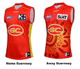
The SUNS will also don a revamped home and away New Balance playing guernsey on-field in 2024.

The minor tweaks to the 2024 Home Guernsey will see yellow piping at the top across the shoulders, as well as a blue stripe down each panel on the front.

The changes allow the club to use more of its secondary colours on the design; yellow and blue.

For the first time, the club’s 2024 AFL Away Guernsey will feature a permanent Indigenous design, inspired by SUNS defender Jy Farrar’s artwork Our Cultural Journey.

The 2024 Clash Guernsey remains the same as 2023, with the predominately blue design.
24 guernseys.png
 

Log in to remove this ad.

It's gotta be the board considering Evans seems on-board for a new jumper. Worthwhile emailing Bob East if that's the case.
 
I genuinely think we are just waiting until we have some sort of success before rebranding, in a “new look to represent the new era” kinda way. We’ve just, you know, never not been complete ass so it’s never come.

But then again, I’m still just sitting here waiting for the return of the wave so what do I know.
 

(Log in to remove this ad.)

Don't see the big fuss about the guernsey to be honest don't hink it's too bad. Have enjoyed some of the suggestions in here though especially the ones with the traditional style design. The wave is poxy though.
 
Don't see the big fuss about the guernsey to be honest don't hink it's too bad. Have enjoyed some of the suggestions in here though especially the ones with the traditional style design. The wave is poxy though.

Think you’ll find most are happy with colors and even design. Logo wrecks it


Sent from my iPhone using BigFooty.com
 
Think you’ll find most are happy with colors and even design. Logo wrecks it
Plus we're at that stage of our history that a home jumper redesign should be considered. We're entering our 14th season in the AFL in 2024, Port Adelaide changed their home jumper design after 14 years (2010) and Fremantle did the same after 17 years (2011).
 

Remove this Banner Ad

Preview ‘FEARLESS’ Gold Coast SUNS guernsey and branding discussions

Remove this Banner Ad

Back
Top