Discussion AFL 2023 Finals Series: Photos and Discussion

Remove this Banner Ad

I remember buying Weg's last ever submission as I left the MCG on Grand final day 2008. Swiftly framed it and it's still hung up in my childhood bedroom.

Obviously biased, but I feel he saved one of his best efforts 'till last.

Grant-54.jpg
 
I think stylistically they are so far apart that the only thing they really have in common is that Knight took over the tradition.

Knight’s style is like a kids book illustrator whereas Weg was capable of sketching bold, timeless mascots.

Don’t mean to s**t on anyone that likes them - I still like checking them out every year and there’s a few he’s done that I like. But yeah Weg was just so much better and also Knight is a total flog.

Yep it's definitely a different art style and that's not necessarily a bad thing, but Weg will always be the master.

I'm still glad though it's at least consistent as opposed to it say being passed around to a new artist each year with wildly differing styles or someone trying to replicate Weg's style and failing or even worse it stopping in 2008.

Personally I hated his 2009 St Kilda effort but his 2010 attempt was a thing of beauty and would've been up on my wall had we won:
st-kilda-2010.jpg
 
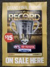
The placeholder cover for the GF record is on the poster that my work was sent. Interesting that the gold effect on the RECORD text is less simplified than the actual cover. But what I actually want to point out is they’ve used a photo from a Geelong vs Fremantle game at Optus Stadium. I’m not fussed about the players not being from competing clubs since this is a placeholder (probably could’ve spot healed them out but whatever). But surely an equivalent photo at the MCG exists, the stadium that it’s always going to be played at other than in extenuating circumstances.
IMG_8478.jpeg
 

Log in to remove this ad.

get stuffed, respectfully. When you finish 1st you don't get told what to wear

So you were quite comfortable with Geelong wearing navy shorts in the 2019 QF against Collingwood then? I mean they finished first, so had all rights to their full home kit yes?

The reality is that if this was a Geelong v Brisbane GF, we'd see the Cats in all white and the Lions in all maroon with zero complaints and we'd be applauding common sense on this board. Yes, I get that Collingwood's home jumper is not a white base like Geelong's, but it does have a significant amount of white, and Brisbane (regardless of which jumper they wear) have none. IF one team has to be in white shorts, then it simply must be Collingwood. The AFL have literally chosen the worst option possible here.
 
Based on which end the cheer squad is?

Cant think of the last time the cup was presented at the Ponsford end, but I think it is cheer squad based so a Collingwood win may see that end used this year.

Logo placement isn't based on cheer squad end. Geelong were at the Punt Rd end last year but logo was toward the Ponsford stand end. I have no idea why they paint the logos the way they do, but there has to be some reason. This is the third year of doing them on the wings and they've done it "backwards" each time. That surely can't be an accident.

They do present the cups with the cheer squad in the background though. I get the reasoning, but I feel its a bit stiff that the cheer squad can't see the cup being presented properly.
 
b4174da182aa09ad96fd08a029908257


Mark Knight posters are out, Brisbane's isn't great but the Collingwood one is class

Ooft I'd be pretty annoyed if I was a Brisbane fan. I mean, the face just looks odd off the bat, but to not be in the proper club colours is criminal. It wont be because he thought they might wear that jumper, he's never done any of them in clash jumpers before. He's probably just trying to appeal to the Fitzroy fans which although admirable, they make up a smaller and smaller portion of the fan base every year.

And honestly, regardless of whatever the meaning behind them is, the tattoos look shit. Knight has a real tendency to try to marry up the mascot with a player. His Saints ones looked like Nick Riewoldt, he had a Dayne Beams Pies one, a Tom Hawkins Cats one, a Buddy Hawks one, a Dusty tigers one... I'm assuming thats where the tatts come from but I don't like it myself.

I remember buying Weg's last ever submission as I left the MCG on Grand final day 2008. Swiftly framed it and it's still hung up in my childhood bedroom.

Obviously biased, but I feel he saved one of his best efforts 'till last.

Grant-54.jpg

I love Weg's style and far prefer it to Knight, but all the Hawks ones pretty much looked the same bar a couple. 08 could be 76, 83 or 86. 71, 78, 88 much the same but flipped. 91 is my favourite of his Hawks posters.

img_0119-jpg.296351
 
I love Weg's style and far prefer it to Knight, but all the Hawks ones pretty much looked the same bar a couple. 08 could be 76, 83 or 86. 71, 78, 88 much the same but flipped. 91 is my favourite of his Hawks posters.

Agree. With '08, I see the Hawk having a mischievous look to it; implying the stolen flag that was.

'89 is beautifully Brereton. I'm sure this inspired Knight's Buddyfied '13 piece.

Logo placement isn't based on cheer squad end. Geelong were at the Punt Rd end last year but logo was toward the Ponsford stand end. I have no idea why they paint the logos the way they do, but there has to be some reason. This is the third year of doing them on the wings and they've done it "backwards" each time. That surely can't be an accident.

They do present the cups with the cheer squad in the background though. I get the reasoning, but I feel its a bit stiff that the cheer squad can't see the cup being presented properly.

Hawthorn lifted the '08 premiership cup beneath the shadows of the Ponsford stand, which was strange considering our cheersquad was at the Punt rd end.
 
Ooft I'd be pretty annoyed if I was a Brisbane fan.

Nup.
I mean, the face just looks odd off the bat, but to not be in the proper club colours is criminal. It wont be because he thought they might wear that jumper, he's never done any of them in clash jumpers before. He's probably just trying to appeal to the Fitzroy fans which although admirable, they make up a smaller and smaller portion of the fan base every year.

Nearly 9,000 Victorian members this year.
 
Logo placement isn't based on cheer squad end. Geelong were at the Punt Rd end last year but logo was toward the Ponsford stand end. I have no idea why they paint the logos the way they do, but there has to be some reason. This is the third year of doing them on the wings and they've done it "backwards" each time. That surely can't be an accident.

They do present the cups with the cheer squad in the background though. I get the reasoning, but I feel its a bit stiff that the cheer squad can't see the cup being presented properly.
My bad, I meant change room position, both Geelong and Collingwood come out of the forward pocket rooms and have right hand side.
 
On AFL360 tonight from Knight:

The two tatoos are

The Skull with the Gabba written on it simbolising going undefeated at home for 2023.

Love Heart with Roy Boys written on it a trbute to Fitzroy.

Not the best way of doing it, but I like what he is trying to do with the Tatts on the Lion.

Apparently the hair style on the magpie has a little bit of Maynard in it.


All Knight posters are submitted to the AFL on the Monday just gone for approval and they do make tweeks appently.
 

(Log in to remove this ad.)

All this talk about posters reminds me: did WEG/Knight do up artwork of all 4 prelim finalists (with obviously only the 2 winners going into print)? Swear i once saw a dogs 97 premiers one while googling around once :sob:

Knight said he spends 1 day on each poster, Collingwoods was done Saturday and Brisbane's Sunday, then submitted to AFL for approval on Monday.
 
All this talk about posters reminds me: did WEG/Knight do up artwork of all 4 prelim finalists (with obviously only the 2 winners going into print)? Swear i once saw a dogs 97 premiers one while googling around once :sob:
yep, there's tons of them

dogs '97
a8bc2f81fe026a3bd8be066f2042b91d.jpg


dogs '98
dcef48ecfe51bc767f23b77639531f4e.jpg


cats '04
c569e68beddc1c1f646fc4a1624b4af1.jpg


dees '98
c58b27eff9d8a1b538a1cc647bbf6afc.jpg
 
My bad, I meant change room position, both Geelong and Collingwood come out of the forward pocket rooms and have right hand side.

It could be something like that. I feel like it has to be some sort of logistical thing anyway. Not sure if they have a predetermined end for the players to warm up in after running out, so they have the logos on those sides to make it easier for the players to line up with the right logo? Just being linked to change rooms by themselves doesn't necessarily make a whole lot of sense when last year they were basically side by side though.

309284231_5844780985541331_5448686057176670272_n.jpg
Noticed logos are ‘backwards’ once again.. Lions left of wing, Pies right..
 

Remove this Banner Ad

Discussion AFL 2023 Finals Series: Photos and Discussion

Remove this Banner Ad

Back
Top