I'd prefer the Home & Away were swapped, but the designs are spot-on (assuming charcoal back for Away & orange back for Home).The orange team:View attachment 1766921
Navigation
Install the app
How to install the app on iOS
Follow along with the video below to see how to install our site as a web app on your home screen.
Note: This feature may not be available in some browsers.
More options
You are using an out of date browser. It may not display this or other websites correctly.
You should upgrade or use an alternative browser.
You should upgrade or use an alternative browser.
Portfolio AFL BY NIKE 2024
- Thread starter muggsy26
- Start date
- Tagged users None
Really good work.The orange team:View attachment 1766921
definitely don't mind the first two! the outer lines of the thick stripes not having the same offset bothers me tho.We have gone for the surfboard stripes for Gold Coast:View attachment 1764216
- Jun 23, 2021
- 2,342
- 2,430
- AFL Club
- Melbourne
- Other Teams
- LA dodgers LA Kings Melbourne Aces
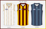
not bad white kit is nice and different blue is good since the hawks have pushed it as an alt colour since the diamond jersey
- Jun 23, 2021
- 2,342
- 2,430
- AFL Club
- Melbourne
- Other Teams
- LA dodgers LA Kings Melbourne Aces
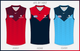
love how you kept the v but had a red and lb kit unfortunate no flaming m or dee jersey
- Jun 23, 2021
- 2,342
- 2,430
- AFL Club
- Melbourne
- Other Teams
- LA dodgers LA Kings Melbourne Aces
youlk* not v
Andonis1997
Sporting masochist
*yokeyoulk* not v
- Jun 23, 2021
- 2,342
- 2,430
- AFL Club
- Melbourne
- Other Teams
- LA dodgers LA Kings Melbourne Aces
couldn't even correct myself  thank you
 thank you
- Jun 23, 2021
- 2,342
- 2,430
- AFL Club
- Melbourne
- Other Teams
- LA dodgers LA Kings Melbourne Aces
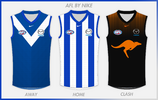
nailed it orange roo is nice could of been bounding roo but this is good home is good and the white vee away is great as well
- May 25, 2009
- 4,044
- 2,808
- AFL Club
- Port Adelaide
Dylan8
Bar Up
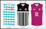
I'd be so open to some zany teal and magenta away strips if we could just wear the bars as our main strip. Another great setPort Adelaide:View attachment 1770870

Fizzler
TAKE BACK PAFC
- Dec 26, 2013
- 13,498
- 18,132
- AFL Club
- Port Adelaide
- Other Teams
- OKC, Coburg, Werribee, Storm, QPR
Awesome stuff, loving how the away and clash are both nods to kits from the 1800s and as for the home... pure beauty. I'm big on the black collar and cuffs and I'd be very curious as to whether you'd have gone a panel on the back or not. Needless to say this has been a ripper of a portfolio and you have my tick of approval for my clubPort Adelaide:View attachment 1770870

muggsy26
Senior List
- Jan 14, 2013
- 294
- 833
- AFL Club
- West Coast
- Thread starter
- #42
No panel on the back, given Collingwood returned to a white base I thought it would make for better contrast if Port had black back with white numbers.Awesome stuff, loving how the away and clash are both nods to kits from the 1800s and as for the home... pure beauty. I'm big on the black collar and cuffs and I'd be very curious as to whether you'd have gone a panel on the back or not. Needless to say this has been a ripper of a portfolio and you have my tick of approval for my club
I'd be so open to some zany teal and magenta away strips if we could just wear the bars as our main strip. Another great set
I think most fans feel this way. Let us honour our traditional strip without any concessions and then see how wacky we can go with teal for alts.
Fizzler
TAKE BACK PAFC
- Dec 26, 2013
- 13,498
- 18,132
- AFL Club
- Port Adelaide
- Other Teams
- OKC, Coburg, Werribee, Storm, QPR
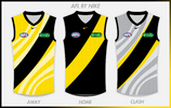
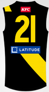
This is peak, love the idea of a split sash for Richmond. Maybe extending it closer to the number would look a little better so it's not just cut by the sponsors (this would probably mean shifting the sponsors a tiny bit) could improve it but still great. Love the tiger print as well on the alts.For those interested this is how I envision the back of the Richmond jumper.
View attachment 1771810
seaforthswan
glebegreyhound
- Apr 18, 2013
- 418
- 532
- AFL Club
- Sydney
- Other Teams
- UTS Bats, Manly Marlins
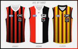
The clash is M I N TSt Kilda:
View attachment 1772883
Chat Pile
Hammers and grease.
- Jun 29, 2021
- 3,916
- 8,937
- AFL Club
- Richmond
Fremantle:View attachment 1762793
Here are the Hawks. View attachment 1767455
these clash jumpers are great. They be my favourite jumpers if they existed.North Melbourne:View attachment 1769111
Yellow numbers. Perfect.For those interested this is how I envision the back of the Richmond jumper.
View attachment 1771813
- Jun 23, 2021
- 2,342
- 2,430
- AFL Club
- Melbourne
- Other Teams
- LA dodgers LA Kings Melbourne Aces
Similar threads
- Replies
- 143
- Views
- 8K
- Replies
- 65
- Views
- 4K
- Replies
- 37
- Views
- 2K


