Portfolio AFL Colour Rush - A Folio By Zoops

Remove this Banner Ad

View attachment 1924995
Greater Western Sydney
The youngest club in the league has not faltered with their identity, however, the moniker of "The Orange Team" deserves a fitting orange guernsey. Instead of the recent trend of the emblem atop a simple field of orange, the Giants' Colour Rush guernsey is somewhat inspired by another staple of Western Sydney sport. The Giants' yoke remains as does the emblem's position in the centre, but is accompanied by five charcoal hoops. Greater Western Sydney's Colour Rush guernsey is not only orange garb but one identifiable as both a footy guernsey and uniquely at home in the GWS gallery of guernseys.​
Not bad. I'd take this over some of our orange & grey creations. (You probably need to lighten the background colour inside the frame, as it tends to wash out the impact of the orange in the jumper, just as a small point.)
 

Log in to remove this ad.

Hawthorn-Presentation-2.png
Hawthorn
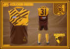
Hawthorn's Colour Rush guernsey celebrates the club's illustrious history but is also born out of its most tumultuous period. Between 1983 and 1991, the Hawks collected five premierships during arguably their most successful period. Throughout this time, Hawthorn's logo, first adopted in 1983, became just as iconic. However, by 1996 this same logo was merely a velcro attachment atop a Melbourne guernsey, so put by club great Don Scott amidst his memorable case against the proposed merger with the Demons. The design in particular is a speculative look a '90s style Hawthorn guernsey, one without diamonds and instead featuring a logo only seen on the proposed alternative Melbourne Hawks guernsey. Moreover on the side of the Hawk can be seen the letter H for Hawthorn in place of what would have been an M, had Hawthorn's supporters not rallied against the proposed merger. Lastly, as a nod to the string of premierships collected between '83 and '91, five stripes are featured in reference to the five premierships won during this time and the gold socks seen throughout the late '80s and '90s return too. Perhaps the most unique, speculative and perhaps even controversial guernsey within the Colour Rush Series is reserved for Hawthorn.

Massive credit to Mero who helped me out with the history behind each Melbourne Hawks design and pin-pointed the M featured in the corner of the alternative Hawk.
 
Melbourne-Presentation-3A.png
Melbourne
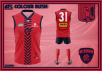
The 1990s gave us many things and among those, the 90s are filled with fond memories for Melbourne supporters. The much-loved 'Flaming Demon' emblem which has only improved with age returns for the first time since 2020. This time, however, it is a lot smaller and features on Melbourne's first mostly red alternate strip since 2015. Accompanying the logo first seen in 1995 is a unique middle stripe, inspired by Melbourne's first VFL guernsey and the iconic vee yoke as both elements are brought together. As the oldest club in the AFL, Melbourne's identity has been both historic, uniquely 70s and 80s with that particular Demon emblem featured above the number, and also more than at home in the 1990s. The Demons' Colour Rush guernsey combines Melbourne's heritage from the Fuschias to the Demons under Daniher and culminates in a long overdue red alternative design.​
 
North-Melbourne-Presentation-8.png
North Melbourne
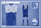
As the Colour Rush premise is inspired by the 50th anniversary of colour TV's impact on football, this anniversary holds even more significance for North Melbourne. 2025 will mark 100 years since North, along with Hawthorn and the Bulldogs entered the VFL and 50 years since the Kangaroos won their first flag. It is only fitting then that North's Colour Rush guernsey is a testament to North's history. The blue design harkens back to North's first strip in the league and the iconic 'Bounding Roo' emblem is featured just below the Heart. The heavy influence from the 1998-2000 Preseason guernsey is matched by extra stripes with their width between each other serving as a loose ode to the facade of the Arden Street Gasometer. North Melbourne's traditional emblem is also featured, accompanied by the years 1975, 1977, 1996 and 1999 in reference to North's premierships. Ultimately, North Melbourne's Colour Rush guernsey celebrates the Kangaroos' history in the VFL/AFL competition.

Credit to Greater Gattsby on the vintage emblem, which is the only high-quality version of the logo I could find.
 
Last edited:
Port-Adelaide-Presentation-6.png
Port Adelaide
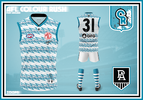
1870 meets the modern day with some '90s flavour thrown in for good measure. Port Adelaide's Colour Rush is heavily inspired by their first-ever guernsey worn from 1870 to 1876 and again in 2005 for Heritage Round. Since their entry into the AFL, Port's identity has developed with the bridge between history and innovation being built bit by bit in recent years. There's no way the traditional Prison Bars would be altered but instead, drawing on Port's innovation and embrace of teal in the '90s this Colour Rush design is an ode to that aforementioned word of innovation. The original hoops of 1870 are replaced by lightning strikes featuring a teal-to-silver gradient accompanied by the original Power Fist emblem. The Port Adelaide Colour Rush guernsey celebrates the Power's uncowardly embrace of teal and innovation, however, also acknowledges their titanic history as a testament to their place in the AFL. Port Adelaide's identity is unique but tradition and innovation can co-exist and Port's wardrobe of jumpers proves it.​
 
View attachment 1927525
Port Adelaide
1870 meets the modern day with some '90s flavour thrown in for good measure. Port Adelaide's Colour Rush is heavily inspired by their first-ever guernsey worn from 1870 to 1876 and again in 2005 for Heritage Round. Since their entry into the AFL, Port's identity has developed with the bridge between history and innovation being built bit by bit in recent years. There's no way the traditional Prison Bars would be altered but instead, drawing on Port's innovation and embrace of teal in the '90s this Colour Rush design is an ode to that aforementioned word of innovation. The original hoops of 1870 are replaced by lightning strikes featuring a teal-to-silver gradient accompanied by the original Power Fist emblem. The Port Adelaide Colour Rush guernsey celebrates the Power's uncowardly embrace of teal and innovation, however, also acknowledges their titanic history as a testament to their place in the AFL. Port Adelaide's identity is unique but tradition and innovation can co-exist and Port's wardrobe of jumpers proves it.​
Oh my ****ing god take every single dollar I own. Take it. It's literally perfect and I'm almost upset this isn't a real kit we're wearing.
 
Oh my ******* god take every single dollar I own. Take it. It's literally perfect and I'm almost upset this isn't a real kit we're wearing.
This is the exact reaction I'd hoped for and then some. This was easily one of my favourites as I've sat on this idea for a long time.
 
View attachment 1927525
Port Adelaide
1870 meets the modern day with some '90s flavour thrown in for good measure. Port Adelaide's Colour Rush is heavily inspired by their first-ever guernsey worn from 1870 to 1876 and again in 2005 for Heritage Round. Since their entry into the AFL, Port's identity has developed with the bridge between history and innovation being built bit by bit in recent years. There's no way the traditional Prison Bars would be altered but instead, drawing on Port's innovation and embrace of teal in the '90s this Colour Rush design is an ode to that aforementioned word of innovation. The original hoops of 1870 are replaced by lightning strikes featuring a teal-to-silver gradient accompanied by the original Power Fist emblem. The Port Adelaide Colour Rush guernsey celebrates the Power's uncowardly embrace of teal and innovation, however, also acknowledges their titanic history as a testament to their place in the AFL. Port Adelaide's identity is unique but tradition and innovation can co-exist and Port's wardrobe of jumpers proves it.​

I’ve enjoyed the portfolio until this. So much of the 90’s horror encapsulated in one guernsey.
 
I’ve enjoyed the portfolio until this. So much of the 90’s horror encapsulated in one guernsey.
That's the vibe I wanted.
the-castle-the-vibe.gif | BigFooty Forum
 

(Log in to remove this ad.)

Richmond-Presentation-8.png
Richmond
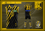
"EAT 'EM ALIVE TIGERS!" Richmond's Colour Rush guernsey takes its inspiration from the '70s and '80s emblem so synonymous with one of the Tigers' most successful periods. Added to this is the foray into the alternative designs of the '90s and early 2000s. The diagonal claw pattern mimics the yellow sash whilst simultaneously splitting the guernsey into predominantly yellow and black halves with the 70s and 80s Tiger emblem returning for its time in the sun. A culmination of Richmond's various guernseys to form something contemporary is rounded out with the yellow numbers best remembered for Matty Knights and the 1995 season. With a golden era and collection of premierships still fresh in the memory, here's another addition to a growing gallery at Tigerland!​
 
St.-Kilda-Presentation-5.png
St. Kilda
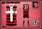
St. Kilda's Colour Rush guernsey takes it right back to the beginning. The Saints' first-ever design of red and black hoops, last seen once as a 140-year celebration in 2013, returns once again. Originally the white, as part of the Saints' red, white and black colour palette was that of a handkerchief and later a yoke to differentiate from rival clubs. Today, that differentiation stems from the iconic cross motif first seen in the 1996 preseason. With a very colourful and unique history of guernseys, St. Kilda's Colour Rush design updates their first ever and arguably one of the more forgotten designs of football history.

As with any footy folio I do, it is impossible not to utilise SFgiant's reworked Saints logo, so credit is due there.
 
Sydney-Presentation-10.png
Sydney
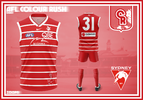
The Swans' Colour Rush guernsey emphasises them as Sydney's team, whilst simultaneously harkening back to their roots as the Bloods. The stylised Opera House motif and Sydney text both of which are derived from the recently adopted club crest, are placed prominently beneath the AFL and QBE logos. The design itself is inspired heavily by the Swans' first-ever red and white design, the iconic South Melbourne hoops. The hoops vary from solid red to that featuring a stylised pattern with the white outline continuing a recent design trend. The Swans' history is further expanded upon as the vintage 'Aut Vincere Aut Mori' crest is featured alongside the 1874 establishment date above the number. The stylised swan of the 90s is featured too, with this design harkening back to the Swans' history whilst affirming that they are Sydney's team.
 
View attachment 1930729
St. Kilda
St. Kilda's Colour Rush guernsey takes it right back to the beginning. The Saints' first-ever design of red and black hoops, last seen once as a 140-year celebration in 2013, returns once again. Originally the white, as part of the Saints' red, white and black colour palette was that of a handkerchief and later a yoke to differentiate from rival clubs. Today, that differentiation stems from the iconic cross motif first seen in the 1996 preseason. With a very colourful and unique history of guernseys, St. Kilda's Colour Rush design updates their first ever and arguably one of the more forgotten designs of football history.

As with any footy folio I do, it is impossible not to utilise SFgiant's reworked Saints logo, so credit is due there.
Pure class. Had the Saints stuck with the hoops it’d be arguably the best home jumper in the league, and if it was paired with their old Panthers nickname (from 1945 while they played at Toorak Park), that would be an elite identity.
Anyway I’m straying from what I was getting at, but combining the hoops and the cross is genius. This is one I’d especially love to get used in the real world, well done.
 
West-Coast-Presentation-1.png
West Coast
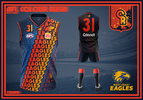
There was only one Eagles' colourway that would receive the Colour Rush treatment. West Coast's Colour Rush design is a blend of their formative years, flirtation with innovation and a nod to a history that never existed. The original eagle and Dynamo text is reimagined in the ochre-to-gold gradient seen on the infamous 2000 away guernsey. The repeated text forms a sash design inspired by that of the WA state side and Eagles 2007 Heritage Round design. Added to this is the retro eagle in place of the WA map and in true Western Australian football fashion, the player's number is featured on the front of the guernsey too. To round out this ode to the Eagles unique gallery features a map of Western Australia with the original ochre eagle emblem placed along the coast, mirroring the iconography of the original ochre guernsey. West Coast fans' love affair with a once maligned design is unique in its own right and in celebration of that comes the Eagles Colour Rush design, a tribute to the unique.​
 
View attachment 1933045
West Coast
There was only one Eagles' colourway that would receive the Colour Rush treatment. West Coast's Colour Rush design is a blend of their formative years, flirtation with innovation and a nod to a history that never existed. The original eagle and Dynamo text is reimagined in the ochre-to-gold gradient seen on the infamous 2000 away guernsey. The repeated text forms a sash design inspired by that of the WA state side and Eagles 2007 Heritage Round design. Added to this is the retro eagle in place of the WA map and in true Western Australian football fashion, the player's number is featured on the front of the guernsey too. To round out this ode to the Eagles unique gallery features a map of Western Australia with the original ochre eagle emblem placed along the coast, mirroring the iconography of the original ochre guernsey. West Coast fans' love affair with a once maligned design is unique in its own right and in celebration of that comes the Eagles Colour Rush design, a tribute to the unique.​

IMG_7976.jpeg
 
View attachment 1933045
West Coast
There was only one Eagles' colourway that would receive the Colour Rush treatment. West Coast's Colour Rush design is a blend of their formative years, flirtation with innovation and a nod to a history that never existed. The original eagle and Dynamo text is reimagined in the ochre-to-gold gradient seen on the infamous 2000 away guernsey. The repeated text forms a sash design inspired by that of the WA state side and Eagles 2007 Heritage Round design. Added to this is the retro eagle in place of the WA map and in true Western Australian football fashion, the player's number is featured on the front of the guernsey too. To round out this ode to the Eagles unique gallery features a map of Western Australia with the original ochre eagle emblem placed along the coast, mirroring the iconography of the original ochre guernsey. West Coast fans' love affair with a once maligned design is unique in its own right and in celebration of that comes the Eagles Colour Rush design, a tribute to the unique.​
Credit Card GIF by Heladi
 
View attachment 1933045
West Coast
There was only one Eagles' colourway that would receive the Colour Rush treatment. West Coast's Colour Rush design is a blend of their formative years, flirtation with innovation and a nod to a history that never existed. The original eagle and Dynamo text is reimagined in the ochre-to-gold gradient seen on the infamous 2000 away guernsey. The repeated text forms a sash design inspired by that of the WA state side and Eagles 2007 Heritage Round design. Added to this is the retro eagle in place of the WA map and in true Western Australian football fashion, the player's number is featured on the front of the guernsey too. To round out this ode to the Eagles unique gallery features a map of Western Australia with the original ochre eagle emblem placed along the coast, mirroring the iconography of the original ochre guernsey. West Coast fans' love affair with a once maligned design is unique in its own right and in celebration of that comes the Eagles Colour Rush design, a tribute to the unique.​
Work From Home Quarantine GIF by Rooster Teeth
 

Remove this Banner Ad

Portfolio AFL Colour Rush - A Folio By Zoops

Remove this Banner Ad

Back
Top