Portfolio AFL x Adidas - Reverse Retro

Remove this Banner Ad

AFL-Reverse-Retro.png

AFL x ADIDAS - REVERSE RETRO

Everything old is new with the adidas Reverse Retro alternate guernseys, a play on all 18 AFL teams' throwback designs with a twist.

During the 2020/21 NHL season, league-wide manufacturer Adidas launched the 'Reverse Retro' series, where past jerseys are reimagined and reversed. Since then, I've conceptualised how a Reverse Retro theme could work in the AFL. The entire design process has been on and off, commencing in August of last year and is finally my first using the Adobe suite. As a result, there's an added speciality to it as each club is revealed daily.

The AFL is turning itself inside out, but in a magical manner, whereby fans and guernsey nerds alike view their favourites... in reverse.
This is AFL x Adidas - Reverse Retro
 
Last edited:
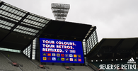
This ought to give everyone an idea of what to expect...
The inspiration once again coming from the NHL.

MCG-Scoreboard.png


Log in to remove this ad.

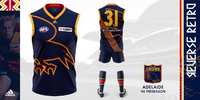
Adelaide: 1996-98 Preseason
Adelaide-Presentation-A.png
An obvious fan favourite is revived with the original crow's return. With a history of previous Adidas designs, Adelaide's Reverse Retro guernsey took on an added importance with a harkening back to the glory period of the late 90s being paramount. This is more than a simple 'reverse' of the past, but rather a remix to breathe new life into an already timeless logo, present on both the guernsey and league-wide Reverse Retro presentation. The return of the 90s flavour is shared by sponsor Toyota, making this a true Camry Crowback.​
 
Last edited:
That's possibly the best design I've seen on Bigfooty!
Didn't originally plan on this jumper but your TikTok's thought otherwise.
 
Adelaide: 1996-98 Preseason
View attachment 1524664

An obvious fan favourite is revived with the original crow's return. With a history of previous Adidas designs, Adelaide's Reverse Retro guernsey took on an added importance with a harkening back to the glory period of the late 90s being paramount. This is more than a simple 'reverse' of the past, but rather a remix to breathe new life into an already timeless logo, present on both the guernsey and league-wide Reverse Retro presentation. The return of the 90s flavour is shared by sponsor Toyota, making this a true Camry Crowback.​
Load_Size_Banner.jpg
 
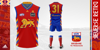
Brisbane: 1995-96 Fitzroy Preseason
Brisbane-Presentation-B.png
Often overlooked in the Lions' wide history of guernseys and colours, their brief foray into the colour of the 90s is brief no more! The Brisbane Lions' Reverse Retro guernsey serves as a homage to Fitzroy and breathes new life into the Roys of old! Whilst the case could be made that the opportunity for the genuine maroon and blue prior to colour tv has been missed, Reverse Retro is all about colour and flavour, and the Lions have certainly remembered this memo.
Fitzroy Forever!
 
Last edited:
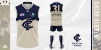
Carlton: 1880-1907 Home
Carlton-Presentation.png
The old dark navy blues are dark no longer, however, the old is certainly relevant. Vintage Carlton of the VFA and VFL's formative years are reimagined as part of the Reverse Retro collection. The original chamois colour now covers most of the guernsey with the navy blue taking the place of the aforementioned chamois. However, what is a Carlton guernsey without the iconic monogram? That logo has evolved just as much as the guernsey itself and is emblazoned across the front, with the original taking its place above the number and like the sponsors, is finished with a patch to complete the vintage aesthetic.​
 
Last edited:
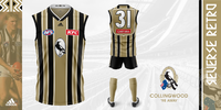
Collingwood: 1998-2000 Away
Collingwood-Presentation.png
The Collingwood Football Club isn't so black and white anymore with this piece from left field. The Magpies' Reverse Retro guernsey takes a look from the late '90s and makes it even more at home in the time period. Collingwood's guernsey celebrates the flavour of '90s alternate guernseys, complete with the shield number panel and encapsulates the ethos of the Reverse Retro concept. Colour and flavour complete this Magpies look!​
 

(Log in to remove this ad.)

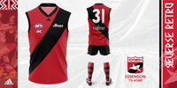
Essendon: 1975-1982 Home
Essendon-Presentation.png
There's something about Essendon and more red, that deserves to be celebrated and seen. The Bombers' Reverse Retro look celebrates the dash of colour found at Windy Hill during the late seventies and early eighties with a standard inverse of the guernsey, but possibly most importantly, the shorts too. With such a consistent guernsey history, give or take a few outliers, Essendon's Reverse Retro get-up was always going to be simple, however, simple doesn't mean dull. This retro Dons celebration wouldn't be complete without the retro Bomber logo and now it finds itself a cosy little spot on the guernsey proper.​
 
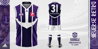
Fremantle: 2001-05 Away
Fremantle-Presentation.png
The anchor is back again, this time truly playing to the tune of Jimi Hendrix's Purple Haze! Rather than reverse the standard red and green anchor, the overlooked alternate anchor gets its moment in the sun with a two-tone purple colour scheme. A lighter alternative to the Dockers' current guernseys, the added white allows the distinctly dominant purple guernsey, not to be too dark. The Dockers and the anchor are two icons and as a result, the Reverse Retro guernsey celebrates the entire history of Fremantle!​
 
Last edited:
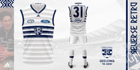
Geelong: 1998 Away
Geelong-Presentation.png
A guernsey deemed too much like a rival club is now firmly a distinct Geelong design! The Cats' Reverse Retro guernsey not only transforms the much-maligned 1998-away guernsey from blue to white but also adds to the distinct three stripes. Silver hoops give the white guernsey a stronger element and provide the Cats' a distinct alternate guernsey, which is still distinctly Geelong!​
 
Geelong: 1998 Away
View attachment 1529718
A guernsey deemed too much like a rival club is now firmly a distinct Geelong design! The Cats' Reverse Retro guernsey not only transforms the much-maligned 1998-away guernsey from blue to white but also adds to the distinct three stripes. Silver hoops give the white guernsey a stronger element and provide the Cats' a distinct alternate guernsey, which is still distinctly Geelong!​
That's fantastic
 
Fremantle: 2001-2005 Away
View attachment 1528580
The anchor is back again, this time truly playing to the tune of Jimi Hendrix's Purple Haze! Rather than reverse the standard red and green anchor, the overlooked alternate anchor gets its moment in the sun with a two-tone purple colour scheme. A lighter alternative to the Dockers' current guernseys, the added white allows the distinctly dominant purple guernsey, not to be too dark. The Dockers and the anchor are two icons and as a result, the Reverse Retro guernsey celebrates the entire history of Fremantle!​
If I was in charge at the Dockers, I'd commission this design to become the home guernsey from this moment on. Stunning.
 
Essendon: 1975-1982 Home
View attachment 1528219
There's something about Essendon and more red, that deserves to be celebrated and seen. The Bombers' Reverse Retro look celebrates the dash of colour found at Windy Hill during the late seventies and early eighties with a standard inverse of the guernsey, but possibly most importantly, the shorts too. With such a consistent guernsey history, give or take a few outliers, Essendon's Reverse Retro get-up was always going to be simple, however, simple doesn't mean dull. This retro Dons celebration wouldn't be complete without the retro Bomber logo and now it finds itself a cosy little spot on the guernsey proper.​


INVERSION WORKS!

Essendon.

MAKE IT %$#@# HAPPEN!
 
Gold Coast: 2011-13 Away
Gold-Coast-Presentation.png
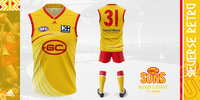
A guernsey fit for the Gold Coast ought to be gold, and thus the Suns' Reverse Retro guernsey takes its inspiration from an overlooked feature of their colour scheme. The fan-favourite wave is back and this time has a dash of red at the expense of the blue. Complete with red shorts, the Suns' Reverse Retro guernsey serves as a homage to the Coast and combines the club's history with the distinct Lifeguard aesthetic and thus, creates a distinct guernsey, which courtesy of some history, is distinctly not only Gold Coast but also a Suns' guernsey!

Massive credit to Mero for the wave too!​
 
Last edited:
Gold Coast: 2011-13 Away
View attachment 1530163
A guernsey fit for the Gold Coast ought to be gold, and thus the Suns' Reverse Retro guernsey takes its inspiration from an overlooked feature of their colour scheme. The fan-favourite wave is back and this time has a dash of red at the expense of the much-maligned blue. Complete with red shorts, the Suns' Reverse Retro guernsey serves as a homage to the Coast and combines the club's history with the distinct Lifeguard aesthetic and thus, creates a distinct guernsey, which courtesy of some history, is distinctly not only Gold Coast but also a Suns' guernsey!

Massive credit to Mero for the wave too!​
Fantastic effort. It makes them so much less generic. The block of red across the shorts and socks works well too.

Great portfolio so far
 
Greater Western Sydney: 2014-15 Away
GWS-Presentation.png
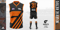
Hot off the hype of the Never Surrender guernseys, the Giants' Reverse Retro guernsey takes heavy inspiration from it and the original 2014-15 away guernsey. This time, there's no white and also, no large block of colour, but rather orange stripes which fill that void and also embed this as a distinct Adidas design. As a broader nod to the Giants' formative seasons, the off-centred logo returns and this guernsey as a whole allows for a broad adoption of multiple colour ways on this design as even in orange, it looks just as good! The GWS Reverse Retro guernsey embodies the giant potential this club has!​
 
Last edited:
Hey Zoops!

I work for Channel 7 covering the 7AFL social media pages. These are amazing! Could we please share these awesome designs with credit to your account? Let me know if you have a Twitter, Instagram or a TikTok page you want featured. Cheers!
Sent you a private message.
 

Remove this Banner Ad

Portfolio AFL x Adidas - Reverse Retro

Remove this Banner Ad

Back
Top