Discussion Bad Graphic Design

Remove this Banner Ad

Maybe I’m biased given my role in the industry, but there is an immense pressure for graphic designers, particularly in sports, to break norms and innovate to build content engagement.

I feel for the designer at Port given they’ve actually put something together that looks really good, is better than what 99.9% of the people having a laugh could do, still has relatively legible text (like, if it took you three seconds to read WELCOME, that’s time you actually engaged with that content) and then not only is your work bagged in the comments, the Port social team then takes a dig on their next post.

I can imagine how I’d feel anyway… 🤷‍♂️
It’s an interesting piece on how our brains work when decoding text. I chose the wrong thread for what I intended to discuss, but I’ll admit it isn’t bad GD.
 

Log in to remove this ad.

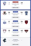
the mix of "team name" & "team name + nickname" is shitting me too
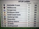
Unfortunately has been par for the course for a long time now. A quick look at the AFLW ladder on the AFL app will show you the same mix of each. It looks a bit odd but I suppose through watching footy over time you get a gauge of which teams use their nickname at all times with varying reasons for each. Pretty obvious for the Doggies given just “Western” sounds weird, Sydney are probably doing to not completely abandon South Melbourne, Gold Coast and GWS are probably trying to get their location and nickname associated with each other given there wasn’t a natural evolution like for the Victorian clubs, etc.
 
Unfortunately has been par for the course for a long time now. A quick look at the AFLW ladder on the AFL app will show you the same mix of each. It looks a bit odd but I suppose through watching footy over time you get a gauge of which teams use their nickname at all times with varying reasons for each. Pretty obvious for the Doggies given just “Western” sounds weird, Sydney are probably doing to not completely abandon South Melbourne, Gold Coast and GWS are probably trying to get their location and nickname associated with each other given there wasn’t a natural evolution like for the Victorian clubs, etc.
It’s all to do with licensing and official AFL names. Gold Coast and GWS also have their nicknames in capitals - expect that for Tasmanian AFL team too. Generally the interstate teams have nicknames attached to their official name to help with promotion and marketing.

Adelaide Crows
Brisbane Lions
Carlton
Collingwood
Essendon
Fremantle
Geelong Cats
Gold Coast SUNS
GWS GIANTS
Hawthorn
Melbourne
North Melbourne
Port Adelaide
Richmond
St Kilda
Sydney Swans
Western Bulldogs
West Coast Eagles

Tasmania DEVILS
 
What’s bad about it?
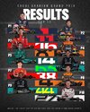
Feels overly busy considering its an image used for a handheld news feed like FB/IG. The results are quite small compared to the huge and half cut off driver numbers in the middle.

Maybe I'm just being overly picky though
 
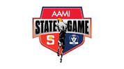
Might be a harsh one here, but it sort of bothers me how there's a lack of consistency between the VFL and SANFL logos used for the State Game logo. Just the S device for the SANFL and the full logo for the VFL when realistically they should have chosen one style and stuck to it. I would've gone the full logos for both personally even though the shields aren't the exact same, at leas they would both say the league's name in both.
1711688391173.png
 

(Log in to remove this ad.)

Seems like an unintentional oversight, but really shouldn’t be a massive problem considering player kits will only from 1-26
But still, I don't understand why Adidas made the font look like this, wouldn't you think to check how it looks for all numbers before finalising it 🤷‍♂️
 

Remove this Banner Ad

Discussion Bad Graphic Design

Remove this Banner Ad

Back
Top