No Oppo Supporters General AFL discussion and other club news

Remove this Banner Ad

Not a Tasmanian local, but currently 15 dollars for a membership, name gets put on the stadium and you get some stickers.

I'm getting behind it cause I reckon a Tas team is good for the league and for the code!
Just got mine too. My reasons are slightly different though. I just think it would be funny for them to have more members than the shinbeggars before they've even got a team.
 

Log in to remove this ad.

They should try and do a design where it’s front facing, yellow and works a red T in there. Make it more inspired by the historical design.

AI concept. Unfortunately I couldn’t get it to understand that a Tasmanian devil was a real animal so this was as close as I could get. The T could also be more subtle if the eyes and nose were slightly red and then an open mouth with a red tongue completes it.

View attachment 1932134
I'm not sure about the "T" but otherwise that looks really awesome.

On SM-S906E using BigFooty.com mobile app
 
They should try and do a design where it’s front facing, yellow and works a red T in there. Make it more inspired by the historical design.

AI concept. Unfortunately I couldn’t get it to understand that a Tasmanian devil was a real animal so this was as close as I could get. The T could also be more subtle if the eyes and nose were slightly red and then an open mouth with a red tongue completes it.

View attachment 1932134
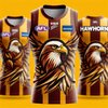
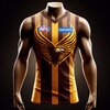
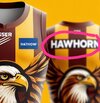
Hey can you run a Hawthorn one through the same AI? I’d love to see what it would come out as.
 

(Log in to remove this ad.)

The A.i seems to be very confused as to the differences between an Eagle and a Hawk
All it can do is plagiarize the stuff it's been trained on, which in terms of sports team graphics will be mostly eagles.
 
The AI jumper looks great.

If AI came up with the actual design they're going with you'd laugh and say AI will never replace real designers.

Why does the jumper need the letter T on it? There's already a bloody map of the state.
The jumper with the T is the foundation jumper, been like this for eons.
 
Call me old fashioned but I don’t like modern graphics on jumpers. Jumper design should be something a child can draw. 2-3 colours max in hoops, stripes, sashes, V’s, solid colours, etc etc

I’ve never been a fan of the overdone graphics on some jumpers.
100%

The graphics of the cartoony mascots date so quickly. Something timeless about the simplicity of traditional strips.
 

Remove this Banner Ad

No Oppo Supporters General AFL discussion and other club news

Remove this Banner Ad

Back
Top