Navigation
Install the app
How to install the app on iOS
Follow along with the video below to see how to install our site as a web app on your home screen.
Note: This feature may not be available in some browsers.
More options
-
 BigFooty AFLW Notice Img
AFLW 2024 - Round 10 - Chat, game threads, injury lists, team lineups and more.
You are using an out of date browser. It may not display this or other websites correctly.
You should upgrade or use an alternative browser.
You should upgrade or use an alternative browser.
Workshop Jumper Ideas for 2025
- Thread starter Rubber Arm
- Start date
- Tagged users None
- Jun 23, 2021
- 2,230
- 2,146
- AFL Club
- Melbourne
- Other Teams
- LA dodgers LA Kings Melbourne Aces
- Jun 12, 2012
- 21,038
- 67,361
- AFL Club
- Port Adelaide
There’s a big big dong
Sam Hall
Senior List
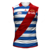
I swear to god New Balance **** up our guernseys every single year to the point where they look like something I've mocked up here. They've gotten our colours wrong for years and we're now at a point where the red is becoming a pale pink and the blue is bordering on a really dark purple.
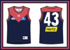
2024
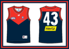
Here is a redesign for 2025. Brighter red and a more appropriate blue with a bigger, wider yoke.

2024

Here is a redesign for 2025. Brighter red and a more appropriate blue with a bigger, wider yoke.
Freight Train
Maccas footy aficionado
I swear to god New Balance * up our guernseys every single year to the point where they look like something I've mocked up here. They've gotten our colours wrong for years and we're now at a point where the red is becoming a pale pink and the blue is bordering on a really dark purple.
View attachment 1928958
2024
View attachment 1928968
Here is a redesign for 2025. Brighter red and a more appropriate blue with a bigger, wider yoke.
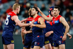
I’d say it’s more likely how it’s showing up under certain lighting - I think that’s a bit exaggerated, especially compared to say Richmond with BLK.
Sam Hall
Senior List
I agree my 2024 design looks exaggerated but I did extract the colours from a retail 2024 guernsey and that’s what it came back with.I’d say it’s more likely how it’s showing up under certain lighting - I think that’s a bit exaggerated, especially compared to say Richmond with BLK.
View attachment 1929036
Regardless, the colours aren't right and just about any Melbourne fan could tell you that. A yoke re-design is a good idea anyway. There’s a night and day difference when you compare your physical guernseys, most notably a New Balance from 2024 vs a Reebok from 2008. The old Reebok colours are vastly superior.
I also own 8 different New Balance Melbourne guernseys and they’re all slightly different colours each year. Here you can see the difference between a 2019 and a 2022 when there’s suppose to be zero difference. There’s no sun damage with either of these jumpers too. You can see how different the blue is.
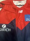
I agree my 2024 design looks exaggerated but I did extract the colours from a retail 2024 guernsey and that’s what it came back with.
Regardless, the colours aren't right and just about any Melbourne fan could tell you that. A yoke re-design is a good idea anyway. There’s a night and day difference when you compare your physical guernseys, most notably a New Balance from 2024 vs a Reebok from 2008. The old Reebok colours are vastly superior.
I also own 8 different New Balance Melbourne guernseys and they’re all slightly different colours each year. Here you can see the difference between a 2019 and a 2022 when there’s suppose to be zero difference. There’s no sun damage with either of these jumpers too. You can see how different the blue is. View attachment 1929137
Freight Train will attest how hard it is to have the colour in mind print correctly, might be a case of the colour just coming out wrong
- Aug 22, 2019
- 2,217
- 3,176
- AFL Club
- Brisbane Lions

Freight Train
Maccas footy aficionado
I agree my 2024 design looks exaggerated but I did extract the colours from a retail 2024 guernsey and that’s what it came back with.
Regardless, the colours aren't right and just about any Melbourne fan could tell you that. A yoke re-design is a good idea anyway. There’s a night and day difference when you compare your physical guernseys, most notably a New Balance from 2024 vs a Reebok from 2008. The old Reebok colours are vastly superior.
I also own 8 different New Balance Melbourne guernseys and they’re all slightly different colours each year. Here you can see the difference between a 2019 and a 2022 when there’s suppose to be zero difference. There’s no sun damage with either of these jumpers too. You can see how different the blue is. View attachment 1929137
Freight Train will attest how hard it is to have the colour in mind print correctly, might be a case of the colour just coming out wrong
Definitely plenty of variables when it comes to sublimation, including fabric, inks, factory, machine used, how it presents under different lighting etc.
One thing that does come to mind though is that perhaps the colours are going more in line with whatever the “true” club colours are, which might not necessarily be the most vibrant or deep shades of red or navy. These things all get approved at a club level as well.
- Aug 22, 2019
- 2,217
- 3,176
- AFL Club
- Brisbane Lions

Sam Hall
Senior List
- Jun 23, 2021
- 2,230
- 2,146
- AFL Club
- Melbourne
- Other Teams
- LA dodgers LA Kings Melbourne Aces
this is even better very nice
- Mar 30, 2014
- 2,752
- 4,700
- AFL Club
- Brisbane Lions

- Other Teams
- Dolphins, Seattle Kraken
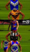
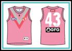
Probably better doing that grey as white as it gets lost, but would be neat seeing Pink PowerPort Adelaide "Magenta" clash strip. Inspired by Penrith in the NRL. View attachment 1930038View attachment 1930035
Sam Hall
Senior List
Probably better doing that grey as white as it gets lost, but would be neat seeing Pink Power
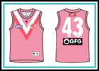 I used the same shade of "silver" from their silver away guernsey from a couple of years ago. I thought it would be a good idea to incorporate silver somehow as it is a club colour, even though its rarely seen. The silver makes it feel like more of a Port guernsey in my opinion. The white looks good too and I can see why some would like it more but in my opinion it makes the guernsey look more like a breast cancer charity jumper rather than a true third kit.
I like to see these AFL 23 custom kits but I think some of your colours are too bright and saturated. I think you could be a bit more careful with logo placement too although I know the controls are very touchy.
- Aug 22, 2019
- 2,217
- 3,176
- AFL Club
- Brisbane Lions

Yeah I agree I probably went too far with the saturation and the logo placement is a pain in this game, there's no way to properly align anything. It looked 10x better on my phone than my on laptop.I like to see these AFL 23 custom kits but I think some of your colours are too bright and saturated. I think you could be a bit more careful with logo placement too although I know the controls are very touchy.
Last edited:
Supercheapgiants
As long as Giants win
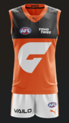
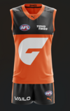
Well there was a bit of debate about GWS's clash (which respectfully could've been better) I reckon this could be a simple solution, follows in line with the home kit and would look alright. Note: The back is orange but has a little bit of charcoal like Melbourne's guernsey. Also file was massive so just screenshotted it 


- Jun 23, 2021
- 2,230
- 2,146
- AFL Club
- Melbourne
- Other Teams
- LA dodgers LA Kings Melbourne Aces
exactly what i was thinking way betterWell there was a bit of debate about GWS's clash (which respectfully could've been better) I reckon this could be a simple solution, follows in line with the home kit and would look alright. Note: The back is orange but has a little bit of charcoal like Melbourne's guernsey. Also file was massive so just screenshotted it
View attachment 1934084View attachment 1934085
Solid effort, love the creative license with the shorts.
There’s a new stitching style this year for New Balance/Belgravia but doubt that will make a difference with the colours.I swear to god New Balance * up our guernseys every single year to the point where they look like something I've mocked up here. They've gotten our colours wrong for years and we're now at a point where the red is becoming a pale pink and the blue is bordering on a really dark purple.
View attachment 1928958
2024
View attachment 1928968
Here is a redesign for 2025. Brighter red and a more appropriate blue with a bigger, wider yoke.
I wouldn’t think Melbourne would provide different PMS colours year to year unless they have a rebrand. So it’d be down to manufacturing.
Neckline sponsors are also here to stay unfortunately, especially with NB teams as they don’t offer cash for it. Zurich would be requesting their logo in a box to have it standout against the red too.
Sam Hall
Senior List
Feraligatr
Werribee Tigers 2024 VFL Premiers 🐅
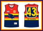
I usually don't like number panels but this one I can get behind.I'd really like to see Adelaide bring back their first away guernsey from 1999-2005. Their best guernsey in my opinion.
View attachment 1937183
Cody_
♛
- Aug 25, 2014
- 7,733
- 11,832
- AFL Club
- Richmond
Hey everyone, been a while since I posted one of these. Had some downtime at work so excuse the old Dylan template as that was all I can find and I don't have access to my templates atm but I thought i'd whip up what I would like to see North wear in 2025. I love the bounding roo but seeing it move as a permanent home strip seems far off unfortuently.
Home
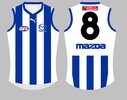
Away
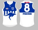
Clash
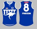
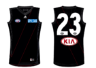
andddd also had a crack at a Carlton clash strip....
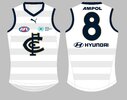
Home

Away

Clash

andddd also had a crack at a Carlton clash strip....

Similar threads
- Replies
- 65
- Views
- 6K
- Replies
- 726
- Views
- 84K


