Workshop Jumper Ideas for 2025

Remove this Banner Ad

Another thing that people have been critical of Nike for doing is all these alternate kits that don’t really have much of a connection to the actual team. Some of them might look cool but on the whole I think the quality of alternate kits has been trending down slightly since the 2017 ones that had a bit more of an obvious connection to the teams and their cities. The problem is Nike needs to keep innovating and creating more designs that people will hopefully want to buy. I don’t think that’s a trend we should follow in the AFL. If individual clubs want to innovate then by all means go for it, but Collingwood’s fans as an example will overwhelmingly be opposed to having a flashy and bright design forced on to them.
even if the afl hypothetically signed a deal with nike i doubt teams would be wearing all these crazy alternate and city jumpers. if you look at the nfl, a league with a similar season length (17 games), even though they have a deal with nike (and have for a while) they've never brought out a whole suite of alternate jerseys, the most innovative thing they done was the colour rush uniform for thursday night games. the most they'd ever do in the afl would be giving every team a different guernsey for gather round, which would still anger a lot of fans. if the afl wants to sign with one manufacturer then they need to pick a smaller company and make each team have a jumper set of 2-3 jumpers + indigenous and maybe a retro/heritage design.
 
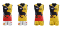
Just a couple thoughts for an Adelaide yellow guernsey, all with a yellow back similar to the current clash:
Crows Clash Ideas.png
edit: just realised option 1 and 3 are basically the same as current clash, tho I don't see why a yellow back couldn't work with these.
 
Just a couple thoughts for an Adelaide yellow guernsey, all with a yellow back similar to the current clash:

edit: just realised option 1 and 3 are basically the same as current clash, tho I don't see why a yellow back couldn't work with these.
The front of 1 and 3 still presents the same three colours in big blocks. That's what needs to be avoided.
 

Log in to remove this ad.

The front of 1 and 3 still presents the same three colours in big blocks. That's what needs to be avoided.

I felt like McKay in his 4 handballs that resulted in crows goals last night, 2 of them I thought he mistook the jumper for one of our players, as one side has a big dark blue and red block, which side on shows zero yellow.
 
I felt like McKay in his 4 handballs that resulted in crows goals last night, 2 of them I thought he mistook the jumper for one of our players, as one side has a big dark blue and red block, which side on shows zero yellow.
Yep. The jumper is nice in isolation but isn't an effective clash jumper against Essendon. More yellow is required. The 2021 yellow jumper was perfect.

Adelaide-2021-ClashY.gif
 
I felt like McKay in his 4 handballs that resulted in crows goals last night, 2 of them I thought he mistook the jumper for one of our players, as one side has a big dark blue and red block, which side on shows zero yellow.
One was because Keays called for the handball, and McKay didn't look.
 
Just a couple thoughts for an Adelaide yellow guernsey, all with a yellow back similar to the current clash:
View attachment 2053754
edit: just realised option 1 and 3 are basically the same as current clash, tho I don't see why a yellow back couldn't work with these.
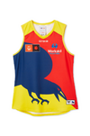
The Crows AFLW team are wearing an almost reversed version of the jumper with a yellow back this coming season, to me it makes sense for the crows to wear all three variations of the '96 pre-season' jumper (Classic, Gather Round, and AFLW) as away/clash jumpers.

1721803484881.png
 
The only reason people like that Crows jumper is because it has their best logo.

The front has a half-arsed design with no clear predominant colour and with the back it becomes an equally clumsy clash attempt.

Their Gather Round design is proof you can play with the logo and do a fair bit with it.

Half the battle is unlike Sydney or St Kilda, you can't do just do anything with their colours – you really have to work with the balance. and that balance is generally best met with a dark base.
Yellow base doesn't work for the Crows IMO.
Red looks way easier on the eye.
 
Yellow base doesn't work for the Crows IMO.
Red looks way easier on the eye.
Issue with red is its either a dominant colour (Sydney, Gold Coast), pops a huge amount against other colours (Dons, Saints, Dees, and yes it's orange but GWS even) and the mix of colours just creates a mess v Brisbane (but what match up does look good against them... Freo, Port, Cats maybe).
 

(Log in to remove this ad.)

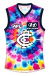
This is more a joke than anything, because the idea made me laugh when people mentioned how same-same all of Carlton's guernseys have been throughout their history.

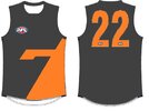
I present to you; the "Screw you, we're not boring, see?" clash guernsey.
View attachment 2057914
We'll lose about 30k of our members if we ever put something like that out.

I love it.
 
The Crows AFLW team are wearing an almost reversed version of the jumper with a yellow back this coming season, to me it makes sense for the crows to wear all three variations of the '96 pre-season' jumper (Classic, Gather Round, and AFLW) as away/clash jumpers.

View attachment 2057558
I feel like the almost fluro yellow of the women's kit would great as a third kit for the mens. Especially against the likes of Brisbane, better than having to use their Gather round kit again.
 
I feel like the almost fluro yellow of the women's kit would great as a third kit for the mens. Especially against the likes of Brisbane, better than having to use their Gather round kit again.
We love the gather round kit though
 
Yeah the Gather round kit is a fantastic, but not great as a clash jumper against Brisbane.
Not sure why the crows chose to keep the red jumper over yellow one. It would have been perfect against Brisbane
 

Remove this Banner Ad

Workshop Jumper Ideas for 2025

Remove this Banner Ad

Back
Top