jumperfan
Premium Platinum
- Nov 17, 2023
- 2,155
- 4,198
- AFL Club
- St Kilda
- Other Teams
- Footy
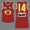
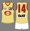
I think that's part of the issue though? They've tried to include 4 or 5 different design elements in it but they all kind of cancel each other out, and as a result it just looks muddled and messy. It was compared to the Green Bay Packers logo in another thread, and I can definitely see the similarities between the two, but that one works because the sole focus is on the G. In the Gold Coast logo the G is only vaguely recognisable, as are all the other elements.It's a simple logo that has lots of depth.
I see a G, a C, a S, a footy, a sun, a reflection of water, a horizon.
It's a grower not a show'er



 )
)