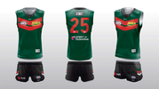
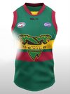
Just reused logos from another design... is there something wrong with BLK these days?
Navigation
Install the app
How to install the app on iOS
Follow along with the video below to see how to install our site as a web app on your home screen.
Note: This feature may not be available in some browsers.
More options
-
 BigFooty AFLW Notice Img
AFLW 2024 - Round 10 - Chat, game threads, injury lists, team lineups and more.
You are using an out of date browser. It may not display this or other websites correctly.
You should upgrade or use an alternative browser.
You should upgrade or use an alternative browser.
Discussion Tasmania AFL Jumper Design
- Thread starter fargothegreat
- Start date
- Tagged users None
A Really quite striking looking kit. Well done.My Tassie concept... I realised close to the end that it is similar to South Sydney in the NRL.
With the design I was thinking of Manchester United's recent kit with the shallow chevron, the dash of red on the green makes me think of apples for some reason (which seemed fitting for the 'Apple Isle').
I found black shorts balanced the design better then green and gave the outfit a more intimidating look.
The logo I started off with a simple Tasmania shape and was hoping to work a Devil into it.
View attachment 1605674
a nice, simple, clean design ..... great effortJust reused logos from another design... is there something wrong with BLK these days?
would a black collar work better than the white?
- Oct 27, 2016
- 6,080
- 11,120
- AFL Club
- Collingwood
- Other Teams
- Packers, Raptors, Renegades
I don't mind this, the green/red colour scheme is so under-used at the professional level besides the Rabbitohs of course.My Tassie concept... I realised close to the end that it is similar to South Sydney in the NRL.
With the design I was thinking of Manchester United's recent kit with the shallow chevron, the dash of red on the green makes me think of apples for some reason (which seemed fitting for the 'Apple Isle').
I found black shorts balanced the design better then green and gave the outfit a more intimidating look.
The logo I started off with a simple Tasmania shape and was hoping to work a Devil into it.
View attachment 1605674
This is actually pretty similar to one of my first ever footy jumper designs way back in 2017.

I don't mind this, the green/red colour scheme is so under-used at the professional level besides the Rabbitohs of course.
This is actually pretty similar to one of my first ever footy jumper designs way back in 2017.
View attachment 1609462
I did notice some similar designs in the threads with chevrons... I didn't see that one though.
I think red does really pop on a dark green.
My Tassie idea started by messing about with the Dees colours as I think it looks sharp.
Fizzler
TAKE BACK PAFC
- Dec 26, 2013
- 13,443
- 18,019
- AFL Club
- Port Adelaide
- Other Teams
- OKC, Coburg, Werribee, Storm, QPR
I think this is the most feasible Tassie design I’ve seen. Much like how Adelaide didn’t use the SA royal blue, this has a different shade of Green to the Tassie state colours. Also the design is relevant to the Tassie Devil mascot with the v shaped fur print.
Thanks for keeping it open guys!View attachment 382049
Aut Vincere Aut Mori
Debutant
- Jul 21, 2020
- 89
- 78
- AFL Club
- Sydney
Congratulations to all those contributions. All of the designs looked fabulous (maybe excluding the lime and black). For reference, the Tasmania State of Origin colours were green, gold and primrose. Any of the designs would be excellent but if the Gold Coast Suns ubniform is any guide, the AFL will get the work experience kid to design the Tassie guernsey.
blackbelair
Senior List
- Jun 29, 2021
- 299
- 248
- AFL Club
- Sydney
WinnerHow about we blend the history of the colours with the old vfl logo...liked the 2 head concept....maybe re work it to look like a traditional 2 headed devil
- Oct 27, 2016
- 6,080
- 11,120
- AFL Club
- Collingwood
- Other Teams
- Packers, Raptors, Renegades
- Jun 23, 2021
- 2,217
- 2,123
- AFL Club
- Melbourne
- Other Teams
- LA dodgers LA Kings Melbourne Aces
yellow looks better, bit to Christmas like
Fizzler
TAKE BACK PAFC
- Dec 26, 2013
- 13,443
- 18,019
- AFL Club
- Port Adelaide
- Other Teams
- OKC, Coburg, Werribee, Storm, QPR
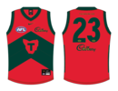
Solidddddd, I reckon the Christmas connotations would disappear as this set would become synonymous with the AFL side. But I love dodging the full red/green/gold state colours for something inspired by it and not fully copying it. The old Tassie VFL team had the right idea with the black/green/bright yellow colour scheme but their design was super modern, for something a bit simpler I think your colour scheme is a winner.Decided to recolour my Tasmania concept in that Red, Green White scheme and I don't think it looks too bad. Yellow does look better but I feel like there's too much of that in the league at the moment.
View attachment 1676170View attachment 1676171View attachment 1676173
- Oct 27, 2016
- 6,080
- 11,120
- AFL Club
- Collingwood
- Other Teams
- Packers, Raptors, Renegades
yeah that's fair enough, although the Rabbitohs rock the look pretty goodyellow looks better, bit to Christmas like
- Oct 27, 2016
- 6,080
- 11,120
- AFL Club
- Collingwood
- Other Teams
- Packers, Raptors, Renegades
Cheers cob, yeah I initially didn't like my own use of a bright red but I actually have really warmed up to it. I think using the Dark-red/maroon would conflict with Brisbane too much. The kit I came up with before does give off Adelaide vibes a bit though so red, white and green might be to way to go but I don't wanna speak on Tasmanian's behalf as it is their team.Solidddddd, I reckon the Christmas connotations would disappear as this set would become synonymous with the AFL side. But I love dodging the full red/green/gold state colours for something inspired by it and not fully copying it. The old Tassie VFL team had the right idea with the black/green/bright yellow colour scheme but their design was super modern, for something a bit simpler I think your colour scheme is a winner.
- Jun 23, 2021
- 2,217
- 2,123
- AFL Club
- Melbourne
- Other Teams
- LA dodgers LA Kings Melbourne Aces
can't argue with thatyeah that's fair enough, although the Rabbitohs rock the look pretty good
- Dec 13, 2016
- 1,057
- 2,235
- AFL Club
- Brisbane Lions

- Other Teams
- Arsenal, Melb City, Storm, Stars
I do wonder whether they'll go with the traditional green, red, yellow (and/or white) and be called the Devils or if they go with something completely different in terms of colours, mascot etc..
EDIT/UPDATE:

 www.foxsports.com.au
EDIT/UPDATE:
AFL boss’ five-word statement confirms Tassie to become AFL’s 19th team... but nickname drama looms
AFL boss’ five-word statement confirms Tassie to become AFL’s 19th team... but nickname drama looms
- Jun 23, 2021
- 2,217
- 2,123
- AFL Club
- Melbourne
- Other Teams
- LA dodgers LA Kings Melbourne Aces
wouldn't work but when i was messing around with chat gpt they suggest red black and white since they are the colour of the tassie devil
- Aug 4, 2013
- 1,004
- 2,066
- AFL Club
- West Coast
- Other Teams
- Perth Scorchers, Gladbach, Kyoto Sanga
Let's just hope that whatever design and colours we end up with, it doesn't involve a garish logo slapped on the chest, possibly excepting a monogram of some sort
- Jun 23, 2021
- 2,217
- 2,123
- AFL Club
- Melbourne
- Other Teams
- LA dodgers LA Kings Melbourne Aces
i agree only logo the would be fine is the map but its needs to be a bit more than thatLet's just hope that whatever design and colours we end up with, it doesn't involve a garish logo slapped on the chest, possibly excepting a monogram of some sort
- Jun 23, 2021
- 2,217
- 2,123
- AFL Club
- Melbourne
- Other Teams
- LA dodgers LA Kings Melbourne Aces
i think i would be a great idea for them to strike a deal with warner bros call the stadium discovery or wb discovery stadium and then use taz as a mascot works perfectly
- Aug 4, 2013
- 1,004
- 2,066
- AFL Club
- West Coast
- Other Teams
- Perth Scorchers, Gladbach, Kyoto Sanga
I don't like the map, I get there's history but it looks incredibly dated.i agree only logo the would be fine is the map but its needs to be a bit more than that
- Jun 23, 2021
- 2,217
- 2,123
- AFL Club
- Melbourne
- Other Teams
- LA dodgers LA Kings Melbourne Aces
- Jun 23, 2021
- 2,217
- 2,123
- AFL Club
- Melbourne
- Other Teams
- LA dodgers LA Kings Melbourne Aces
you could even make wb a sponser they are quite big in aus anyway with wbkids would work great and be a good partnership
Similar threads
- Replies
- 8
- Views
- 795
- Replies
- 0
- Views
- 422


