Workshop Template Feedback Thread

Remove this Banner Ad

Final update. Next mission - to convert it to a footy template. Wish me luck. I know the socks look shit, but I'll fix that when I'm ready, then it'll be an AFL template. Does my attempt at realism work?
View attachment 202543
not bad but I cant see it coming anywhere near beating Alice Springs :p:p
 
You've come a long way Fizzler.

Just don't stop now. :) keep improving continuously
Cheers man. Once it becomes a footy template, it'll be groundbreaking
not bad but I cant see it coming anywhere near beating Alice Springs :p:p
What are you on?


And can I have some?
 

Log in to remove this ad.

Bit of a mashup between a few different templates here, but I think it's come up alright.
I'm mostly concerned about Shading, collar, and size here, but obvs I'm open to any criticism.
gftpxIx.png

Also, I've got that annoying colour issue again, WTF?
 
Bit of a mashup between a few different templates here, but I think it's come up alright.
I'm mostly concerned about Shading, collar, and size here, but obvs I'm open to any criticism.
gftpxIx.png

Also, I've got that annoying colour issue again, WTF?
Ridda all the shadow at the bottom of the jumper
 
This isn't the place to post this but...

I've just found a really great website, which is great for resource images for tracing logos.

http://logosworld.info/14846-2/

(Down the bottom are some of the suggested ones, if you want to keeplooking around.)

Its much better than going on Google Images IMHO.
 
Shorts have diminished curvature. Cuffs and socks are improved but might still need a little more work. Next thing I'll be working on is resizing the template for downsizing.

Side note: New (modified) presentation template unveiled for 2016


Buffalo%2BWings%2BFooty.png
 
Shorts have diminished curvature. Cuffs and socks are improved but might still need a little more work. Next thing I'll be working on is resizing the template for downsizing.

Side note: New (modified) presentation template unveiled for 2016


Buffalo%2BWings%2BFooty.png
Fix the socks.

Change the collar and/or make it bigger.

And then your onto a winner.
 

(Log in to remove this ad.)

Fix the socks.

Change the collar and/or make it bigger.

And then your onto a winner.
Not sure how to fix the socks further at the moment; but I can't imagine that the collar can be enlarged that much, lest you mean widening the base at the shoulders... :/

I'm really struggling to tell what's shading and what's design
I went to hockey for jumper designs... that is why you can't tell (purple in particular).
 
Shorts have diminished curvature. Cuffs and socks are improved but might still need a little more work. Next thing I'll be working on is resizing the template for downsizing.

Side note: New (modified) presentation template unveiled for 2016


Buffalo%2BWings%2BFooty.png
Start again.

The problem with taking a hockey jersey and lopping off the sleeves is the end result looks like an NFL jersey stuffed full of padding. It's not even close to a skintight Aussie rules jumper. I'd recommend completely redrawing this. There are many other templates available you can steal ideas from as well as an infinite number of photos of jumpers on the internet you can trace. Since you're using a bitmap raster program, I'd recommend tracing/copying a flat jumper like this for the front and this for the rear.

After you fix the jumper, you can go after the shorts. Since the jumper is flat, the shorts should also be flat. I'd recommend just taking ScottFreo's shorts template and modifying it to suit your guernsey.

The shorts look like they were drawn to accommodate a wearer with clubfoot. These also need to be completely redrawn. E92 has a pretty slick sock template on his NAFL entry you can copy or this image is a decent starting point for some flat socks.

You've gone way overboard with the shading and grey lines thing (I don't even know what they're meant to be). I'd actually drop it completely, because shading ain't the easiest thing to do, and if you can't do it properly, then it just looks awful.

Finally, that background is giving me a migrane. Flat backgrounds tend to look better than busy ones filled with gradients, images and other effects.

You will also need to draw the template, at least, three times bigger than that, otherwise your final product after resizing will be, like, 100px x 100px. Around or above 4000px x 4000px should be big enough.

I hope this hasn't come off as too harsh.

Not the slightest, I've had many failures with templates (which I'll brief later).

I'm not a fan of any of the rest to be quite honest, but the most basic is not going to be good enough anymore. :/ As for the shading, I was thinking of it, but wanted to see what the most recent example did. As for the background, I straight out didn't make it opaque [flat] enough (for several reasons, unintentionally). I've had trouble downsizing other templates, so I gave up on those and went smaller. But based on what I've been told, I'll need to go back to that. The template I used most recently is my... 7th, I think? Can't remember how many I deleted over the course of the past five years. I might take the basic on that I used to use and play with that for the short term seeing as I'm out of ideas at the moment.
 
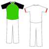
Creating a Cricket template for PS, I didn't trace anything, so where do I improve. I know it looks shithouse btw.
View attachment 206117
Pad stripes go all the way up,with a knee roll consisting of a few hoops, if that's the sort of stuff you want.
Also take into account there are lots of articles of clothing a cricketer may choose to wear.
 
Pad stripes go all the way up,with a knee roll consisting of a few hoops, if that's the sort of stuff you want.
Also take into account there are lots of articles of clothing a cricketer may choose to wear.
I've traced something else (without pads) and want sidepanels but I'm struggling with that. It's for a BBL kit history, so I'm just going with what the average player wears (so no towels or one arm sleeves etc.)
How does this look?
upload_2016-1-12_11-17-53.png
 
I've traced something else (without pads) and want sidepanels but I'm struggling with that. It's for a BBL kit history, so I'm just going with what the average player wears (so no towels or one arm sleeves etc.)
How does this look?
View attachment 206180
Yeah that's classy. In the BBL I think most players just wear the shirts anyway.
 

Remove this Banner Ad

Workshop Template Feedback Thread

Remove this Banner Ad

Back
Top