Discussion TV Broadcast Graphics - Designs & Discussion

Remove this Banner Ad

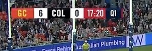
I didn’t hate 10’s football scoreboard & it could work in AFL with some tweaks - bit bigger & expanded to fit scores of 100 for both etc

View attachment 1479973

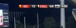
I do agree that 9’s leauge scoreboard won’t work with AFL but this could (again with tweaks)

View attachment 1479976
My understanding is that AFL prefers "stacked" scores (think the late 90s to early 2000s) - the "clock middle" layout is really a soccer thing that most other codes (excluding Gaelic football) have just accepted in one form or another.

Part of this comes down to GFX systems designed primarily for football being tweaked to accommodate rugby, AFL, etc. - a lot of these have preset layouts but the back-end can be modified for other sports.
 

Log in to remove this ad.

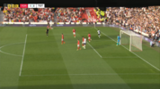
7 must have a budget version of their graphics for the vfl.

Photo 1 dees v swans from earlier this season. Looks cleaner

Photo 2is from the qualifying final on the weekend. Look at the swans logo. A lot less detail. I wonder if it’s like this for all teams. Vfl one is slightly bigger
View attachment 1493903View attachment 1493902
Different production companies too, VFL for 7 (and SANFL, WAFL and AFLW) is produced by JAMTV, whereas I think their AFL is done by NEP.
 
Different production companies too, VFL for 7 (and SANFL, WAFL and AFLW) is produced by JAMTV, whereas I think their AFL is done by NEP.
Probably different software/hardware too - it's pretty close in fairness. Nine used to do the same when they had schoolboy NRL or reserve grade games like the QLD Cup. Same aesthetic overall but definitely a lower quality and less functional version to reduce cost.
 
7 must have a budget version of their graphics for the vfl.

Photo 1 dees v swans from earlier this season. Looks cleaner

Photo 2is from the qualifying final on the weekend. Look at the swans logo. A lot less detail. I wonder if it’s like this for all teams. Vfl one is slightly bigger
View attachment 1493903View attachment 1493902
I would say the second version is closer to the actual logo. The 'opera house' feather line on the neck is much too thick in photo 1, and the facial features are too bold. It may have been an attempt to make the logo work better in this tiny form.
 

(Log in to remove this ad.)

7 must have a budget version of their graphics for the vfl.

Photo 1 dees v swans from earlier this season. Looks cleaner

Photo 2is from the qualifying final on the weekend. Look at the swans logo. A lot less detail. I wonder if it’s like this for all teams. Vfl one is slightly bigger
View attachment 1493903View attachment 1493902

I still don’t get why Melbourne’s number text is silver instead of white. It’s been that way the entire time. Almost like it hasn’t been picked up by anyone and has just remained as so
 
I still don’t get why Melbourne’s number text is silver instead of white. It’s been that way the entire time. Almost like it hasn’t been picked up by anyone and has just remained as so
I think it looks good like that. Almost like it speaks to the Demons’ “affluent” roots
 
Expected Look for the Grand Final, hopefully the last time we see this scoreboard :)
View attachment 1512595

Why? Probably my fave graphic ever, logos are way more interesting/visually appealing than a word and the colour/g.b.t combo is awesome. Pretty simple as well.
 

Remove this Banner Ad

Discussion TV Broadcast Graphics - Designs & Discussion

Remove this Banner Ad

Back
Top