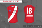
Portfolio 2025 Reverse Retro

Remove this Banner Ad

Pre-amble:
I know it's an idea that's been done. In my ignorance I didn't know that, however, until I searched yesterday to check if it had. And it has, by Zoops, in spectacular fashion (I haven't posted on this board in years so I've missed a lot of probably amazing portfolios and concepts). But I had started on some clash jumpers that had morphed into re-coloured retro designs for fun - because, hey, retro, specifically 90s nostalgia, is back in - and I loved the real life NHL series. I was going to dump these in the 2025 Jumper Ideas thread (mostly because I don't think these are unique or interesting enough designs on their own to warrant a new thread, let alone copycat thread) but I figured I am just going to wind up spamming that thread so I'll chuck them in here on there own.

In fairness to myself, basically none of the retro designs are copies of the ones you can find in Zoops' thread (that was a lucky accident). At least so far (I haven't finished 1/3rd of them yet).


That's more words than I'll use to describe the actual portfolio but basically it just reverse coloured older designs - pre-season and heritage round designs, mostly.

I will not be posting in alphabetical order.


Brisbane Lions
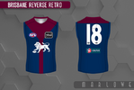
Bris RRa 25 copy.png

This is one of the few with mixed elements, since technically there's no blue on the original Fitzroy jumper. It's more of a flip of the 2012 Hall of Fame jumper, inspired by that Fitzroy jumper, with the Lion on front in place of the FFC monogram.


Collingwood
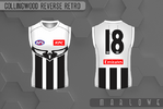
Coll RRa 25 copy.png


A white and black reversed version of their 2000s swooping magpie away jumper.
 
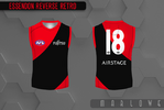
Essendon
Ess RRa 25 copy.png

Kudos to the Bombers for having the least varied uniform history of the AFL/VFL. Doesn't give you many options to choose from. The obvious first option is maybe a nice thin elegant black sash to match their heritage round look from 2003, or just a nice sash in general. Could play around with the grey clash from 2012-2015. Could go white. Figured I'd go with the 2007-2011 'thick sash' clash, just because I find it funny to make a team who has such disdain for wearing a black sash wear the biggest black sash they possibly could.

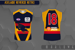
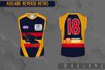
Adelaide
Adel RRa 25 copy.png

The Crows, on the other hand, have a lot of nice options to choose from - as many monstrosities, though. I thought I'd split the difference with their weird 2006-07 Adidas away jumper, with that weirdly thick piping that always made me hard to discern whether it was a blue jumper with red piping or a red jumper with lots of big navy splotches. Decided to keep the blue where it was and switch the red and yellow.
 

Attachments

  • Adel RRa 25 copy.png
    Adel RRa 25 copy.png
    194.4 KB · Views: 184
Last edited:
Essendon
View attachment 2178462

Kudos to the Bombers for having the least varied uniform history of the AFL/VFL. Doesn't give you many options to choose from. The obvious first option is maybe a nice thin elegant black sash to match their heritage round look from 2003, or just a nice sash in general. Could play around with the grey clash from 2012-2015. Could go white. Figured I'd go with the 2007-2011 'thick sash' clash, just because I find it funny to make a team who has such disdain for wearing a black sash wear the biggest black sash they possibly could.

Adelaide
View attachment 2178463


The Crows, on the other hand, have a lot of nice options to choose from - as many monstrosities, though. I thought I'd split the difference with their weird 2006-07 Adidas away jumper, with that weirdly thick piping that always made me hard to discern whether it was a blue jumper with red piping or a red jumper with lots of big navy splotches. Decided to keep the blue where it was and switch the red and yellow.
This is almost too weird NOT to like
 

Log in to remove this ad.

This is almost too weird NOT to like
Thanks, that's the vibe I'm going for.

In a similiar vein.

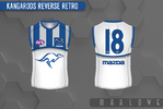
North Melbourne
Kang RRa 25 copy.png

Another slightly forgotten 2000s relic. I guess it was their attempt to evolve the bounding roo jumper, but they added silver for some reason. I've reversed the navy and white except for the yoke.
 
Pre-amble:
I know it's an idea that's been done. In my ignorance I didn't know that, however, until I searched yesterday to check if it had. And it has, by Zoops, in spectacular fashion (I haven't posted on this board in years so I've missed a lot of probably amazing portfolios and concepts). But I had started on some clash jumpers that had morphed into re-coloured retro designs for fun - because, hey, retro, specifically 90s nostalgia, is back in - and I loved the real life NHL series. I was going to dump these in the 2025 Jumper Ideas thread (mostly because I don't think these are unique or interesting enough designs on their own to warrant a new thread, let alone copycat thread) but I figured I am just going to wind up spamming that thread so I'll chuck them in here on there own.

In fairness to myself, basically none of the retro designs are copies of the ones you can find in Zoops' thread (that was a lucky accident). At least so far (I haven't finished 1/3rd of them yet).


That's more words than I'll use to describe the actual portfolio but basically it just reverse coloured older designs - pre-season and heritage round designs, mostly.

I will not be posting in alphabetical order.


Brisbane Lions
View attachment 2177962

This is one of the few with mixed elements, since technically there's no blue on the original Fitzroy jumper. It's more of a flip of the 2012 Hall of Fame jumper, inspired by that Fitzroy jumper, with the Lion on front in place of the FFC monogram.


Collingwood
View attachment 2177964


A white and black reversed version of their 2000s swooping magpie away jumper.
Pies one is definitely the most plausible to be eventualised.
 
Fremantle
Freo RRa 25 copy.png

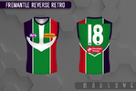
Underrated Fremantle jumper. I think the 3D anchor has the best design (anchor aside) but I love the back of this (with the anchor outline), and I think it works well in green.

St. Kilda
StK RRa 25 copy.png

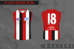
I guess it's technically a reverse of their "original" jumper but I was basing it more on their modern equivalents - the 1996 centenary jumper and the 2018 Moorabbin. St. Kilda don't play around with red reverse of any of their various striped jumpers, I think there's some real potential there.

Port Adelaide
Port RRa 25 copy.png

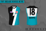
Much like Freo, a return to an early 2000s design. Chose this over their away jumper at the time because much like Freo's anchor, I think that's still a good enough design to wear for real. Whereas this is kind of a relic of the past.
 
Last edited:
West Coast
WCE RRa 25 copy.png
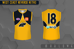
Pretty straight swap with their late 90s navy wings home jumper. Kind of the only permeation of the wings they haven't really worn. Maybe my most controversial opinion is that I still think the Eagles should wear navy for night matches (although I can't imagine they're getting many of those atm).

Melbourne
Melb RRa 25 copy.png
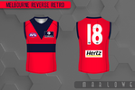
Reverse of the 2004-2005 Heritage round jumper. This was the one that inspired this idea because I was fooling around with red Dees jumpers that don't feature a flaming M and aren't an inverse (as there's potential there but the designs would be very heritage themed). I kind of like that the red space between the high V and hoop looks like an M (not as pronounced by my design).

Geelong
Geel RRa 25 copy.png
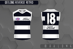
Basically last season's retro with the blue and white flipped. As an aside, I think Geelong are the one team who could change their base and hoops design every season ala Barcelona and still have a decent looking kit.
 
Western Bulldogs
WB RRa 25 copy.png
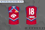
Bulldogs have a ton of potential obscure options but it's hard to ignore the allure of a red diamond dog.

Richmond
Rich RRa 25 copy.png
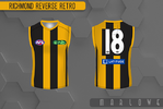
A yellow and black reverse of these 2003 Heritage round jumper. I like Richmond in hoops and stripes. Maybe because yellow & black is reminiscent of a Bee more than a Tiger.

Sydney
Syd RRa 25a copy.png Was going to be a red V jumper but I thought the sash was slightly more obscure and the red V is one of those designs I feel like the Swans could adapt whereas the sash is permanently in their past.
 

Remove this Banner Ad

Portfolio 2025 Reverse Retro

Remove this Banner Ad

Back
Top