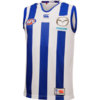
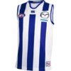
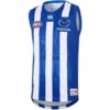
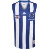
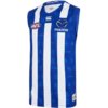
Well, in principle they are sacrosanct too. Personally though, they hold little emotional/parochial attachment for me compared to the red/chevron jumper so I'd probably be less inclined to object.View attachment 727441View attachment 727442
Would love to see these perhaps given a go as a nod to the state jumper, while also remaining neutral.
Navigation
Install the app
How to install the app on iOS
Follow along with the video below to see how to install our site as a web app on your home screen.
Note: This feature may not be available in some browsers.
More options
-
 BigFooty Tipping Notice Img
Weekly Prize - Join Any Time - Tip Round 0
The Golden Ticket - MCG and Marvel Medallion Club tickets and Corporate Box tickets at the Gabba, MCG and Marvel.
You are using an out of date browser. It may not display this or other websites correctly.
You should upgrade or use an alternative browser.
You should upgrade or use an alternative browser.
Workshop Jumper Ideas For 2020
- Thread starter Red Crow
- Start date
- Tagged users None
- Status
- Not open for further replies.
cannavo
Binging the YT algorithm
- Moderator
- #253
Now that Port have confirmed the Prison Bars will be worn for the Showdowns next year, I'd like to see the Crows wear a replica of a SA State of Origin guernsey against them but not with the names on it like that failed attempt in 2014
View attachment 727216
I would also like them to wheel out a version of the 1930 SA guernsey for maybe the away Showdown or go back to their 1991 guernsey

- Aug 22, 2019
- 2,239
- 3,210
- AFL Club
- Brisbane Lions

- Oct 10, 2018
- 1,840
- 3,988
- AFL Club
- North Melbourne
- Other Teams
- ^ I don't actually go for North.
Why? HahaView attachment 735397
Essendon with UA's Soccer template
Cody_
♛
- Aug 25, 2014
- 7,734
- 11,833
- AFL Club
- Richmond
I'm sorry but what the f*ck is this trying to achieve?View attachment 735397
Essendon with UA's Soccer template
- Oct 27, 2016
- 6,097
- 11,185
- AFL Club
- Collingwood
- Other Teams
- Packers, Raptors, Renegades
I think it's his NAFL submissionI'm sorry but what the f*ck is this trying to achieve?
Freight Train
Maccas footy aficionado
I think it's his NAFL submission
the great greater greatest great big essendon-tullamarine bomberbears
Saintly Viewed
.
- Aug 10, 2015
- 48,085
- 39,987
- AFL Club
- Collingwood
Something simple.
GWS when they wear the predominant orange (with charcoal blue etc) why don’t they make their numbers white?
Would look much better.
(ps feeds into my long campaign to have Collingwood jumpers with black numbers on white background as looks superior and far easier to see at games and on TV)
GWS when they wear the predominant orange (with charcoal blue etc) why don’t they make their numbers white?
Would look much better.
(ps feeds into my long campaign to have Collingwood jumpers with black numbers on white background as looks superior and far easier to see at games and on TV)
- Dec 18, 2014
- 4,307
- 12,435
- AFL Club
- North Melbourne
- Other Teams
- Pierce & Pierce, Stratton Oakmont
It would be splendid to see Canterbury actually try something different for once. I’m getting sick of buying the same jumper template.
- Dec 18, 2014
- 4,307
- 12,435
- AFL Club
- North Melbourne
- Other Teams
- Pierce & Pierce, Stratton Oakmont
SaadyArmy
Team Captain
- Jan 31, 2017
- 411
- 491
- AFL Club
- Gold Coast
Isn’t that good, so that you don’t have to buy a new jumper every year?
On iPhone using BigFooty.com mobile app
On iPhone using BigFooty.com mobile app
- Sep 22, 2011
- 42,603
- 93,633
- AFL Club
- Essendon
IIRC - Gold Coast originally planned to not have a moniker - to let it develop organically while existing as Gold Coast Football Club, but then a year later they decided they were the suns, and organic growth did not occur in any regard.
They started their existence in the TAC Cup, then the VFL, the Giants followed a similar path except playing in the NEAFL instead of the VFL.
At the time, when they competed to ready their rookie squad for the AFL - as I’m sure all of us remember - they wore jumpers indicative of a blank canvas, as teams in the midst of formation - the difference here is that GWS actually built a brand from there, they ditched the home brand blue jumper/white V/footy logo for an actual identity that represents their stake of Sydney.
Gold Coast set a poor precedent in mostly all regards - they’ve basically never changed their look, other than that their jumper was gold in the TAC Cup then red in the VFL - they’ve held on to this identity-lacking design for a decade now while keeping the side panels they added in 2011, which was in-vogue at the time.
So for me, that’s the best explanation as to why GC17 look so s**t. They wear the strip of an expansion team exploratory committee that has yet to develop an identity, and have done for 10 years.
It’s like if an Olympic Bid was successful then never adapted an event logo - just sticking with what won them the bidding process.
Correct. They originally launched as “Gold Coast Football Club” and made a point of not having a nickname etc, saying it would grow. It’s often forgotten.
Then out of nowhere came this “Suns” garbage.
- Sep 22, 2011
- 42,603
- 93,633
- AFL Club
- Essendon
View attachment 727441View attachment 727442
Would love to see these perhaps given a go as a nod to the state jumper, while also remaining neutral.
They could go with this strip... great colours

- Dec 18, 2014
- 4,307
- 12,435
- AFL Club
- North Melbourne
- Other Teams
- Pierce & Pierce, Stratton Oakmont
Not when it’s the same jumper 5 years in a row.Isn’t that good, so that you don’t have to buy a new jumper every year?
On iPhone using BigFooty.com mobile app
- Jan 16, 2019
- 1,001
- 1,328
- AFL Club
- West Coast
think you'll find most clubs do that?Not when it’s the same jumper 5 years in a row.
- Dec 18, 2014
- 4,307
- 12,435
- AFL Club
- North Melbourne
- Other Teams
- Pierce & Pierce, Stratton Oakmont
Most clubs change the template every 2-3 years.think you'll find most clubs do that?
Sparkle
Simpson for Strawberry
Most clubs change the template every 2-3 years.
Or in the case of the Cats, we've had template/logo/manufacturer changes ever year since 2016.
I'm not sure what I'd rather, constant change or the status quo. I guess with the constant change everything's fresh and new, whereas the status quo can get boring after a while
Essentially a Freo-Fitzroy merger.2 Gold Coast Ideas
Yeah, i guess, i wanted a traditional lookEssentially a Freo-Fitzroy merger.
Sadly it has the same issue as most designs that try to incorporate all 3 colours. If you have a mostly red design, it's very hard to avoid looking like a Fitzroy jumper and if you have too much blue it ends up looking like an Adelaide jumper.Yeah, i guess, i wanted a traditional look
- Oct 30, 2014
- 4,745
- 9,673
- AFL Club
- Western Bulldogs
Answer is easy. Change the colours. They are Gold Coast so I expect Gold, then maybe light blue (same as NSW state of origin?). They would clash with no one ever, so could build brand by being instantly recognisable, never having to wear a clash guernsey. A point of difference from their Queensland rival, and Adelaide and even Bulldogs too. Light blue guernsey with gold sash! Simple, traditional, says Gold Coast straight away. But people get paid lots of money to design logos and uniforms when tradition and simplicity will work.Sadly it has the same issue as most designs that try to incorporate all 3 colours. If you have a mostly red design, it's very hard to avoid looking like a Fitzroy jumper and if you have too much blue it ends up looking like an Adelaide jumper.
Change red to yellow.2 Gold Coast Ideas
Change yellow to blue
Change blue to red
?
- Status
- Not open for further replies.
Similar threads
- Replies
- 16
- Views
- 817
- Replies
- 7
- Views
- 540
- Replies
- 726
- Views
- 86K


