Workshop Jumper Ideas for 2022

Remove this Banner Ad

Looks great! Personally I'd love to see it back but only if it's once or twice a year as sort of a semi-throwback. I love the kit, but I feel like the dark kit is a lot stronger as our home and, as weird as this sounds, it has so much history now that it almost doesn't feel right to just ditch it the same way we ditched the traditional kit.

Would be a good kit to wear versus Carlton, Adelaide and Swans too perhaps.
Few times a year is reasonable, I doubt AFL would let them with the potential kit clashes it could cause. Definitely agree with using it against Carlton, there was a big clash with our normal home jumper this year
 
Looks great! Personally I'd love to see it back but only if it's once or twice a year as sort of a semi-throwback. I love the kit, but I feel like the dark kit is a lot stronger as our home and, as weird as this sounds, it has so much history now that it almost doesn't feel right to just ditch it the same way we ditched the traditional kit.

Would be a good kit to wear versus Carlton, Adelaide and Swans too perhaps.

I’d like something like that worn against Sydney, Gold Coast, Western Bulldogs and West Coast. The black shirts wouldn’t create a clash.
 

Log in to remove this ad.

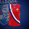
Dogs return to a red clash, whilst also making a nod to their untapped VFA history... Sounds good to me.
Bulldogs-Away-'22.png
 
Last edited:
It would be really cool if teams had clash jumpers based off old designs that they used to wear, in the early VFL days. Means the designs will mean more than gimmicky logos on the front. This could also be a way of integrating non traditional colours onto guernseys as well if you like.

You could have Carlton using a navy saddle on their clash jumper like they did with the chamois on their original Guernsey. Hawthorn could have a mainly brown Guernsey, with a thin gold V. Melbourne a mainly red jumper with a navy stripe down the middle (inverse of first jumper) and St Kilda could return their red and black hooped Guernsey with white yoke.
Second this. My favourite thing next to a good throwback jumper is a throwback-inspired jumper. You see it quite often in the NBA, little nods to the past but given a modern touch. I like the idea of Carlton coming out with a jumper that has their first monogram and a little outline of the chamois.
 
Here's a quick mockup of the traditional kit if it were to come back. Looks neat but I can see this causing more issues than it's worth if it were to become our home set again.

View attachment 1247901
Can wear this strip against Adelaide,Brisbane, Carlton, Essendon, Gold Coast, Giants, Hawks, Dees, Tigers, Swans, Eagles, Dogs. I don’t see a clash with these teams. Could ever wear the white jumper and white shorts in home games against other teams to avoid a clash like North Melbourne previously.
 
Dogs return to a red clash, whilst also making a nod to their untapped VFA history... Sounds good to me.
View attachment 1247678
Whilst i don't mind this at all design-wise (very clean imo) the league already has two sashes, and the actual kit this is based off was only worn for about 8 years in the VFA. In saying that thought the vertical stripe one was only like 6 years total, and they did a heritage kit based around it so they may do something like it anyway
 

(Log in to remove this ad.)

The one thing I would like to see with the dees jumper is a larger yoke. always has looked comically small since new balance took over, and would get rid of the need for a box around the zurich logo.

Yeah definitely agree that it needs to come out more. The current design looks quite tucked away, which would be alright if there was some kind of element underneath such as a monogram but there isn't so it's just comes across as just an empty jumper.
 
I just did a quick edit of this on Paint while I had the idea in my head, but if Melbourne weren't too keen to go with a straight inverse, perhaps just enlarging the yoke to make it more red based would achieve a similar contrast. Basically Melbourne's version of Essendon's 'Big Red Sash' design

1632821219216.png
 
Sam Petrevski-Seton would need a long-sleeved jumper.
He's got nothing on Jan Vennegoor of Hesselink
article-2450724-0540F5780000044D-278_634x459.jpg
 
I just did a quick edit of this on Paint while I had the idea in my head, but if Melbourne weren't too keen to go with a straight inverse, perhaps just enlarging the yoke to make it more red based would achieve a similar contrast. Basically Melbourne's version of Essendon's 'Big Red Sash' design

View attachment 1248315
You know what just make it 100% yoke
 

Yep, this is such a no brainer. Have it alongside the royal clash, and just use whichever is most appropriate.

The only thing I would say though is it should be paired with red shorts, as every red jumper should in my view. Sydney/Gold Coast barely clash with anyone wearing full red. Bombers/Crows/Dees using a red jumper should follow the same system.

The one thing I would like to see with the dees jumper is a larger yoke. always has looked comically small since new balance took over, and would get rid of the need for a box around the zurich logo.


Agree with this too. The smaller/deeper yoke was introduced a decade or so ago now, when Cameron Schwab wanted the jumper to be more like those from old times - smaller V, darker red and blue. It was a nice idea in theory, but the practicalities weren't great. The red looked pink, and with modern sponsors the V gets lost. That was also the time they introduced the incomplete circle of stars to represent the premierships won in the past and future. In some way its a shame that got dropped as they'd finally be able to add to it.
 

Remove this Banner Ad

Workshop Jumper Ideas for 2022

Remove this Banner Ad

Back
Top