Workshop Jumper Ideas for 2025

Remove this Banner Ad

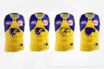
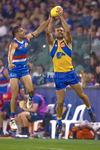
West Coast execs right now:

View attachment 1957402

In seriousness though, footy jumpers are becoming less and less of a needle mover, unless it’s retro, retro-adjacent or outlandish.

The European football comparison is a moot point - you’re comparing apples to oranges. Football kits are becoming more and more fashion forward and in general, it’s a lot more socially acceptable to wear a jersey out (a t-shirt) as opposed to a footy jumper (basically a vest/tanktop.)

Adding a white clash to West Coast’s set might sell a few jumpers but there’s better ways to make money in terms of club merchandise than adding another jumper into the set and diluting the brand. I wouldn’t be caught dead wearing a footy jumper to the shops, but I would wear a vintage Mitchell & Ness collab tee, for instance.

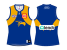
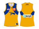
If you wanna see what it’d look like, I made it back when it was being speculated (this was before the rebrand was officially launched) and honestly, I’m glad it never came to fruition.

View attachment 1957409

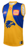
My problem with the yellow one is the eagle is an outline. Would look better colored in. That and with blue shorts would look amazing. Not gonna happen, but just saying.
 
My problem with the yellow one is the eagle is an outline. Would look better colored in. That and with blue shorts would look amazing. Not gonna happen, but just saying.

Again, another one I mocked up 5-6 years ago and I still firmly believe that it doesn’t look better - the logo was designed for the majority of the head to be the lighter colour, as those darker sections create the shadows.

IMG_8155.jpeg

Side note: I weirdly vividly remember mocking these up whilst sitting in an office up in Kununurra in 2017. Life’s changed a bit since then. Here’s the original post:
nope.

D6u8dul.png


not sure why people are opposed to the idea of an outlined logo. when you think about it, not many clubs recolour their logo anyway and we haven't done a recoloured logo since the original peril (and its' subsequent heritage/one-off appearances).
 
Again, another one I mocked up 5-6 years ago and I still firmly believe that it doesn’t look better - the logo was designed for the majority of the head to be the lighter colour, as those darker sections create the shadows.

View attachment 1957747

Side note: I weirdly vividly remember mocking these up whilst sitting in an office up in Kununurra in 2017. Life’s changed a bit since then. Here’s the original post:

I do like the one on the left, looks stronger to me.
 

Log in to remove this ad.

Again, another one I mocked up 5-6 years ago and I still firmly believe that it doesn’t look better - the logo was designed for the majority of the head to be the lighter colour, as those darker sections create the shadows.

View attachment 1957747

Side note: I weirdly vividly remember mocking these up whilst sitting in an office up in Kununurra in 2017. Life’s changed a bit since then. Here’s the original post:
I do like option #1
 
I agree that a solid blue headed eagle would be better as a general statement, and perhaps that’s something that should have been better accounted for in the logo design, but with the current logo (which is one of the best logos in Australian sport), it just doesn’t work.
 
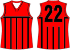
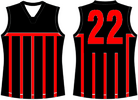
Tasmania will be the 19th AFL side. If I was the AFL I would have a top end side as the 20th side in the AFL I would call the "North Australia Football Club" and the home games would be in: Cairns [North QLD], Broome [North WA], Darwin [NT], Alice Springs [NT]. I would have the prison bars design in Red and Black opposite to Essendon. Home uniform would be Red jumper, red collars, Black bars front and back, black numbers, red shorts with 2 black side stripes on both sides of the shorts for home, white shorts away, Red ruck socks with 3 black hoop stripes. Clash uniform would be black jumper, black collars, red bars front and back, red numbers, white shorts, Red ruck socks with 3 black hoop stripes. If this was to happen games west as Perth, top end [Broome, Darwin, Cairns, Alice Springs], as south as Hobart, the AFL comp would be in more areas than it is now. I did these jumpers a few weeks back from memory.
 

Attachments

  • 01-North Australia Home.png
    01-North Australia Home.png
    9.4 KB · Views: 40
  • 02-North Australia Clash.png
    02-North Australia Clash.png
    9 KB · Views: 32
Last edited:
Tasmania will be the 19th AFL side. If I was the AFL I would have a top end side as the 20th side in the AFL I would call the "North Australia Football Club" and the home games would be in: Cairns [North QLD], Broome [North WA], Darwin [NT], Alice Springs [NT]. I would have the prison bars design in Red and Black opposite to Essendon. Home uniform would be Red jumper, red collars, Black bars front and back, black numbers, red shorts with 2 black side stripes on both sides of the shorts for home, white shorts away, Red ruck socks with 3 black hoop stripes. Clash uniform would be black jumper, black collars, red bars front and back, red numbers, white shorts, Red ruck socks with 3 black hoop stripes. If this was to happen games west as Perth, top end [Broome, Darwin, Cairns, Alice Springs], as south as Hobart, the AFL comp would be in more areas than it is now. I did these jumpers a few weeks back from memory.
crickets chirping
 
Anyone have Imach’s west coast rebrand concept from say 10 or so years ago? I think that was an amalgamation of the original eagle head and the ochre one we had between 2000-2017. Something that made it so strong was the fact it could be reversed onto both yellow and blue backgrounds and it very much felt like a west coast logo with the distinguishable Beek and eagle eyes that the original logos consisted of.
 
Again, another one I mocked up 5-6 years ago and I still firmly believe that it doesn’t look better - the logo was designed for the majority of the head to be the lighter colour, as those darker sections create the shadows.

View attachment 1957747

Side note: I weirdly vividly remember mocking these up whilst sitting in an office up in Kununurra in 2017. Life’s changed a bit since then. Here’s the original post:
Someone gets it. 👏 The logo is meant to be blue and gold, not one colour. And the main keyline should always be the darkest colour and never reverse.

Reason why the reverse logo was edited end of 2021 and added a yellow keyline, so that when it was reproduced or used by third parties it wasnt just a yellow logo. Happened a lot - think fox may even still use a 3d version that’s just yellow.

From a graphic design stand point it would be great to maybe one day move it over to the actual royal jumper so it’s in line with branding but don’t think it will happen due to the outcry it would probably cause.

I agree that a solid blue headed eagle would be better as a general statement, and perhaps that’s something that should have been better accounted for in the logo design, but with the current logo (which is one of the best logos in Australian sport), it just doesn’t work.
Shout out RARE, who never properly finished the logo.
 
Because I didn't know the Navy Blue Rob did I did my own Navy Blue: West Coast Eagles Navy Blue: red 9, green 18, blue 72 [Navy Blue shade red 7, green 15, blue 56]

I think my Navy Blue is darker Navy Blue to what Rob has. I didn't know the Navy blue I tried to get it close to what Rob did. The West Coast Eagles Colours I did are:
West Cost Eagles Royal blue: red 11, green 44 and blue 174 [Royal blue shade red 10, green 38, blue 154]

West Coast Eagles Gold: red 255, green 204, blue 28 [Gold shade red 215, green 167, blue 0]

West Coast Eagles Navy Blue: red 9, green 18, blue 72 [Navy Blue shade red 7, green 15, blue 56]
Take care everyone

RGB values are
Royal: 0,48,135
Gold: 242,169, 0
Navy: 0, 32, 91
 
My problem with the yellow one is the eagle is an outline. Would look better colored in. That and with blue shorts would look amazing. Not gonna happen, but just saying.
Yeah, that should be West Coast's definitive clash uniform with the blue Eagle and blue shorts, looks terrible in its current state.
 
Again, another one I mocked up 5-6 years ago and I still firmly believe that it doesn’t look better - the logo was designed for the majority of the head to be the lighter colour, as those darker sections create the shadows.

View attachment 1957747

Side note: I weirdly vividly remember mocking these up whilst sitting in an office up in Kununurra in 2017. Life’s changed a bit since then. Here’s the original post:
Maybe West Coast should just wear a replica of the very first guernsey for the clash, not even bother using that Eagle for the gold uniform.
imagerender (2).jpg imagerender (3).jpg
I prefer the 2011 version of it with the smaller wings that are further away from the centre, which brings more focus to the Eagle and I think the Eagle being slightly higher up looks better, of course excluding all that newspaper text down the bottom, which is an eyesore.
 
Last edited:

(Log in to remove this ad.)

Had a go at tweaking the logo a bit a few years ago, works slightly better than the current clash when inversed. But honestly the normal logo on the clash has started to grow on me a bit more. Would be nice if they started wearing blue shorts with it when white shorts aren't completely necessary.
wc logo update2.png
1713167962049.png
 

Attachments

  • 1713168151975.png
    1713168151975.png
    778.4 KB · Views: 33
Had a go at tweaking the logo a bit a few years ago, works slightly better than the current clash when inversed. But honestly the normal logo on the clash has started to grow on me a bit more. Would be nice if they started wearing blue shorts with it when white shorts aren't completely necessary.
View attachment 1960518
View attachment 1960517
What does it look like when you give the head a white outline?
 

I respect the efforts and get the parallels everyone wants to make with the original club logo, which was a simple design made up of 3 separate shapes and the design of it isn’t altered by colour.

But the current logo just cannot be resolved inverted as the inner shapes of the logo must be the lighter colour as that’s just how it was designed to work.

The top photo the logo is very legible and identifiable, the bottom especially in and around the altered eye its really hard to make out what it is.

The logo on the clash is correct as is. If there was ever to be a change to the logo it would be on the home royal with an added yellow keyline like the attached.
 

Attachments

  • IMG_0938.jpeg
    IMG_0938.jpeg
    61.5 KB · Views: 35
Tasmania will be the 19th AFL side. If I was the AFL I would have a top end side as the 20th side in the AFL I would call the "North Australia Football Club" and the home games would be in: Cairns [North QLD], Broome [North WA], Darwin [NT], Alice Springs [NT]. I would have the prison bars design in Red and Black opposite to Essendon. Home uniform would be Red jumper, red collars, Black bars front and back, black numbers, red shorts with 2 black side stripes on both sides of the shorts for home, white shorts away, Red ruck socks with 3 black hoop stripes. Clash uniform would be black jumper, black collars, red bars front and back, red numbers, white shorts, Red ruck socks with 3 black hoop stripes. If this was to happen games west as Perth, top end [Broome, Darwin, Cairns, Alice Springs], as south as Hobart, the AFL comp would be in more areas than it is now. I did these jumpers a few weeks back from memory.
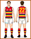
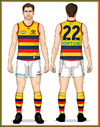
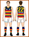
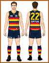
Mero Adelaide Crows 2021 Uniforms but with my Navy blue sock for main uniform, Gold socks for clash 1, Red socks clash 2. Socks sane design as the home socks design. Also the red version I added Navy Blue Collars.
 

Attachments

  • 04-Adelaide-Clash-Uniform2021R-Back long ruck socks.png
    04-Adelaide-Clash-Uniform2021R-Back long ruck socks.png
    57.1 KB · Views: 52
  • 03-Adelaide-Away-Uniform2021C-Back long ruck socks.png
    03-Adelaide-Away-Uniform2021C-Back long ruck socks.png
    57.2 KB · Views: 52
  • 02-Adelaide-Home-Whiteshorts-Uniform2021W-Back long ruck socks.png
    02-Adelaide-Home-Whiteshorts-Uniform2021W-Back long ruck socks.png
    58.1 KB · Views: 50
  • 01Adelaide-Home-Uniform2021Back long ruck socks.png
    01Adelaide-Home-Uniform2021Back long ruck socks.png
    54.4 KB · Views: 53
West Coast original plan was wear blue shorts at home and Gold shorts away. That is what Rob said in his podcast.
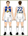
I have completed the white ruck socks with royal Blue and Gold on the top part of the socks.

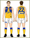
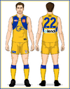
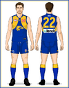
Royal Blue uniform at home only. Gold uniform away, option 1 if AFL allowed West Coast Gold shorts for away uniform in all games the away Gold uniform is worn, Option 2 Gold shorts away against Sydney and Geelong, white short for the other away games, Clash uniform white one for away games against Hawthorn. I like White clash uniform with these complete socks.
 

Attachments

  • 04-West-Coast-Uniform2021Jason3 long ruck socks.png
    04-West-Coast-Uniform2021Jason3 long ruck socks.png
    44.7 KB · Views: 49
  • 03-West-Coast-Uniform2021Jason2 long ruck socks.png
    03-West-Coast-Uniform2021Jason2 long ruck socks.png
    42.8 KB · Views: 47
  • 02-West-Coast-Uniform2021Jason1 long ruck socks.png
    02-West-Coast-Uniform2021Jason1 long ruck socks.png
    42.2 KB · Views: 38
  • 01-West-Coast-Home-Uniform2021Back with long ruck socks.png
    01-West-Coast-Home-Uniform2021Back with long ruck socks.png
    42.1 KB · Views: 44
I have completed the white ruck socks with royal Blue and Gold on the top part of the socks.

Royal Blue uniform at home only. Gold uniform away, option 1 if AFL allowed West Coast Gold shorts for away uniform in all games the away Gold uniform is worn, Option 2 Gold shorts away against Sydney and Geelong, white short for the other away games, Clash uniform white one for away games against Hawthorn. I like White clash uniform with these complete socks.
That all white kit looks sick, I think FT did something similar when the new Eagles logo dropped but would be an awesome kit to bring out for Gather Round next year. Reminds me of the LA Lakers 'white-out' kits
 
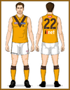
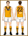
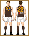
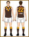
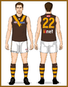
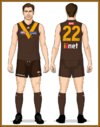
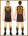
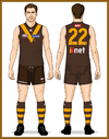
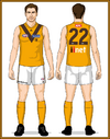
Hawthorn in the V design home ones 3 different socks Brown jumper home, Gold clash jumper
[Hoop Ruck socks, 1925 design socks, Plain Brown sock] socks for home uniform. White shorts for away games.

Gold clash uniform, Gold collars, white shorts [Gold socks with 3 brown hoop stripes, 1933 style socks, plain Gold socks] The Gold Ruck socks with 3 brown hoop stripes I just done that. my next post will be the hawthorn Stripes version with all these socks options Brown Jumper I want to be home ones. These are the old Hawthorn brown. The new hawthorn brown is better brown.
 

Attachments

  • 04-Hawthorn-Uniform-Jason-Clash Gold collars Long Ruck Socks.png
    04-Hawthorn-Uniform-Jason-Clash Gold collars Long Ruck Socks.png
    41.6 KB · Views: 29
  • 04-Hawthorn-Uniform-Jason-Clash Long Gold ruck socks with 3 brown stripes Gold collars.png
    04-Hawthorn-Uniform-Jason-Clash Long Gold ruck socks with 3 brown stripes Gold collars.png
    40.8 KB · Views: 25
  • 03-Hawthorn-Uniform-Jason-Away With long Brown ruck socks.png
    03-Hawthorn-Uniform-Jason-Away With long Brown ruck socks.png
    39.9 KB · Views: 23
  • 03-Hawthorn-Uniform-Jason-Away long ruck socks.png
    03-Hawthorn-Uniform-Jason-Away long ruck socks.png
    39.8 KB · Views: 23
  • 03-Hawthorn-Uniform-Jason-Away long Brown ruck socks with 3 Gold hoop stripes.png
    03-Hawthorn-Uniform-Jason-Away long Brown ruck socks with 3 Gold hoop stripes.png
    40.7 KB · Views: 23
  • 02-Hawthorn-Uniform-Jason-Home With long brown ruck socks.png
    02-Hawthorn-Uniform-Jason-Home With long brown ruck socks.png
    124.5 KB · Views: 28
  • 02-Hawthorn-Uniform-Jason-Home long ruck socks.png
    02-Hawthorn-Uniform-Jason-Home long ruck socks.png
    124.7 KB · Views: 26
  • 02-Hawthorn-Uniform-Jason-Home long brown ruck socks with 3 gold hoop stripes.png
    02-Hawthorn-Uniform-Jason-Home long brown ruck socks with 3 gold hoop stripes.png
    40.4 KB · Views: 27
  • 04-Hawthorn-Uniform-Jason-Clash with Gold collars and long Gold ruck socks.png
    04-Hawthorn-Uniform-Jason-Clash with Gold collars and long Gold ruck socks.png
    41.7 KB · Views: 22

Remove this Banner Ad

Workshop Jumper Ideas for 2025

Remove this Banner Ad

Back
Top