Discussion Logo Discussion Thread

Remove this Banner Ad

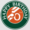
I decided to create a Happy 50th Birthday logo thingo for my Dad, based off of the Roland Garros logo (it's his favourite tennis tournament). Was thinking I could make it a cake topper for him or something. All the text in my logo was traced and then made into shapes. Letters rotated individually... All because I have photoshop, and I rotated the text too early to warp it properly.

His name is where the 'PARIS' text is, but, some privacy is good every now and then ;)
Screen Shot 2019-02-18 at 7.42.41 pm.png Screen Shot 2019-02-18 at 7.42.19 pm.png
 
I decided to create a Happy 50th Birthday logo thingo for my Dad, based off of the Roland Garros logo (it's his favourite tennis tournament). Was thinking I could make it a cake topper for him or something. All the text in my logo was traced and then made into shapes. Letters rotated individually... All because I have photoshop, and I rotated the text too early to warp it properly.

His name is where the 'PARIS' text is, but, some privacy is good every now and then ;)
View attachment 621537View attachment 621538
:clapping: send :clapping: this :clapping: to :clapping: the :clapping: club :clapping: baker :clapping:
 

Log in to remove this ad.

I decided to create a Happy 50th Birthday logo thingo for my Dad, based off of the Roland Garros logo (it's his favourite tennis tournament). Was thinking I could make it a cake topper for him or something. All the text in my logo was traced and then made into shapes. Letters rotated individually... All because I have photoshop, and I rotated the text too early to warp it properly.

His name is where the 'PARIS' text is, but, some privacy is good every now and then ;)
View attachment 621537View attachment 621538

It would be good just for appearance to have a name were Paris is. You could put Father there, just to keep his name private. The logo looks different without the word underneath. Just a name to show what you have created, you could use Roland as in Roland Garros.


It is a logo that we won't see much of in Australia with Avon leaving the country.
 
Just want to grab everyone's thoughts on the eyes for these two logos.

1553416890575.png 1553416911679.png

Left logo I have altered the original eyes to have and iris. Adds a bit more personality.

Right logo is purely the original 'phantom' eyes I call em.

My dad likes the phantom eyes, I like the altered ones so I thought why not ask the board for the tie-breaker ;)

The reason I like the other eyes is because it ties in more closely with the old logo. As you can see it clearly needed an upgrade.
blackburn-logo-large-200x148.png
 
Last edited:
Just want to grab everyone's thoughts on the eyes for these two logos.

View attachment 641076View attachment 641077

Left logo I have altered the original eyes to have and iris. Adds a bit more personality.

Right logo is purely the original 'phantom' eyes I call em.

My dad likes the phantom eyes, I like the altered ones so I thought why not ask the board for the tie-breaker ;)
phantom eyes for mine
 
Just want to grab everyone's thoughts on the eyes for these two logos.

View attachment 641076View attachment 641077

Left logo I have altered the original eyes to have and iris. Adds a bit more personality.

Right logo is purely the original 'phantom' eyes I call em.

My dad likes the phantom eyes, I like the altered ones so I thought why not ask the board for the tie-breaker ;)

The reason I like the other eyes is because it ties in more closely with the old logo. As you can see it clearly needed an upgrade.
View attachment 641097
Yeah, the phantom eyes work much better, the other things I would tweak would be the stroke around the panther (it doesn't follow the ear on the right side) and the kerning could use a bit of touching up. Other than that though, a nice upgrade.
 

(Log in to remove this ad.)

Just want to grab everyone's thoughts on the eyes for these two logos.

View attachment 641076View attachment 641077

Left logo I have altered the original eyes to have and iris. Adds a bit more personality.

Right logo is purely the original 'phantom' eyes I call em.

My dad likes the phantom eyes, I like the altered ones so I thought why not ask the board for the tie-breaker ;)

The reason I like the other eyes is because it ties in more closely with the old logo. As you can see it clearly needed an upgrade.
View attachment 641097
Whats your connection to the club?
 
Whats your connection to the club?
From what my dad has told me our family has had involvement with the club through the generations in multiple roles. My Pa lived right across from the road and gained a reputation for being feral towards the umpires. My Dad is a member and I usually get down to a handful of games every year to support the boys. Would've played for them in juniors if it wasn't such a travel.
 
From what my dad has told me our family has had involvement with the club through the generations in multiple roles. My Pa lived right across from the road and gained a reputation for being feral towards the umpires. My Dad is a member and I usually get down to a handful of games every year to support the boys. Would've played for them in juniors if it wasn't such a travel.
I'm in the area, I never played for them as I had a connection to Templestowe and played there
 
Was watching The Front Bar the other day and saw this on Kouta’s polo from the early 90’s or something
A40A4957-FB77-48E1-9B8C-E85F2D1DFD06.jpeg
Found it interesting because I remember talking about this exact style logo somewhere on this board a while ago.

The current Carlton logo features the old monogram and I don’t like that.

This logo is mint
 

Remove this Banner Ad

Discussion Logo Discussion Thread

Remove this Banner Ad

Back
Top