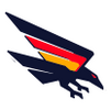
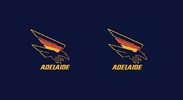
News New Crows Logo

Remove this Banner Ad

I would say people are complaining because this new design is a mediocre version of a better, existing, successful logo (90s crow).

The fact that it's an upgrade on the previous raven is getting lost in the wash.

I actually think this logo will be a grower for a lot of folks. That said, the font is already dated.

I've seen way better versions of it on here but it's slowly growing on me.
 
The concept is solid, there’s a lot I like about it. The overall shape and structure is strong, simple, and bold, which is exactly what you want in a timeless logo. I particularly like how the jumper hoops are incorporated within the wings. I also like that it avoids the trend of heavy shading or shadowing that many recent AFL logos have been leaning towards, which often gives them a cartoonish look.

However, where it falls short is in the execution, detail, and testing across different mediums.

There are some inconsistencies that stand out—like the varying stroke widths across the body and the jagged tips of the wings, which feel like an oversight. The top of the tail, for instance is missing an outline, which breaks the visual flow. The red and yellow bands merging into the body without any clear separation or thoughtful design makes them feel like an afterthought, rather than a deliberate part of the overall design. Additionally, when the logo is placed on different-coloured backgrounds, it tends to blend into the wing colours, obscuring the outline and reducing its visibility.

As a brand identity designer, I’m always hesitant to criticise fellow designers because I know how subjective design can be, and I understand the challenge of getting buy-in from all stakeholders. It’s bloody hard when you put your heart and soul into it.

But as professionals, we have a responsibility to anticipate issues that others may not see right away—especially when it comes to rolling out a design across various club merchandise and promotional materials.

Certainly miles better than their previous logo though 🙂
 
[emoji[emoji6]][emoji[emoji6]]" data-quote="SA_Great" data-source="post: 0" class="bbCodeBlock bbCodeBlock--expandable bbCodeBlock--quote js-expandWatch">
Honestly, what is going oh here with the outline - am I missing something?
Why are the end of the feathers such strange shapes?
Did they just give up?


Exactly what i thought! It goes from an outline to looking like a shadow. It’s really odd. Extremely grateful that’s not my clubs logo. Some of the concepts in this thread have been light years ahead of it in quality


Sent from my iPhone using BigFooty.com
 

Log in to remove this ad.

Honestly, what is going oh here with the outline - am I missing something?
Why are the end of the feathers such strange shapes?
Did they just give up?

View attachment 2159695
Agree. The circled part in particular does my head in.

It’s like a uni assignment where the student had a solid idea, but couldn’t make it work, ran out of time and handed it in anyway.

It’s like a MS paint job the more you look at it.
 
Always hard to guess how a new logo will appear in standard presentations (footy record, newspaper, AFL website etc.) when it's only ever shown off on a solid colour background.

This happens with most teams, but I remember it being particularly evident with the West Coast (royal background) and Richmond (black background) logo releases in their most recent iterations.

This Crows Shop logo gives us some idea as to how it might appear. No gold outline on the crow at all... it looks fairly plain?

465849843_930432939133259_7503050280736961262_n.png

I think it looks a lot better like this. Not fantastic, but fine. The outline is a huge part of the problem, thin and inconsistent, it doesn't scale well.

Without the outline it works well at small sizes, IMO.
1730915904471.png
1730915803493.png

If they wanted something they were going to display on blue first and foremost, they needed to design it like that from the ground up instead of giving it a dumb outline.
 
I think it looks a lot better like this. Not fantastic, but fine. The outline is a huge part of the problem, thin and inconsistent, it doesn't scale well.

Without the outline it works well at small sizes, IMO.
View attachment 2159907
View attachment 2159906

If they wanted something they were going to display on blue first and foremost, they needed to design it like that from the ground up instead of giving it a dumb outline.

I agree that it looks better without the outline but there’s still so many issues with it. The wing in particular is just a mess and the respective angles of the head and tail provides no connection between the two. It’s a good idea done very poorly.
 

Remove this Banner Ad

News New Crows Logo

Remove this Banner Ad

Back
Top