News New Saints' Logo

Remove this Banner Ad

Log in to remove this ad.

The text looks terrible. It's got the weird little speed lines but they're so small they almost look like image compression or one of those leftover bezier curves from when you vectorise an image in illustrator. The square under the T looks worse than the circle which was kind of iconic. Having just a suggestion of the old ribbon at the bottom looks worse than having the whole thing, and the way it cuts off the cross looks worse than the cross just ending in a point uninterrupted. Direct downgrade you'd have to say.
 
I'm really disappointed, actually.

The "bold new era" they've promised is an minimum effort, unnecessary update to a much loved classic logo nobody asked for or wanted. All they've done is remove the motto and put the full name on the top.

I'd actually have respected it more if they kept the traditional badge and added a completely different secondary logo to feature on merchandise and in other branding.

As opposed to the classic look of the shield, this logo will become dated very quickly, and I'll hold off buying any merch until it's shifted back.
 

(Log in to remove this ad.)

Dunno what's going on with the two different versions of the logo, either. The below is what the AFL has shared on Facebook. Are they using the two-coloured ribbon background or not?

467505751_1000942638742220_1682830769699271780_n.jpg
 
I like it, a nice balance of tradition and good design choices for modern use cases. I'll miss the FQF ribbon, but integrating the ribbon with the shield and the bolder design means it will be clearer and more prominent in a variety of placements - which is something our old logo lacked in a bit.

Considering the recent spate of club rebranding nightmares, safe to say I'm relieved with this announcement!
 
Dunno what's going on with the two different versions of the logo, either. The below is what the AFL has shared on Facebook. Are they using the two-coloured ribbon background or not?

467505751_1000942638742220_1682830769699271780_n.jpg
Again, no dog in the fight, but seems like a good logo but a worse club crest
 
And if we're comparing it to the 150 Year logo too, I think it's also a downgrade. Almost an identical shield shape, but I much prefer the wreath ribbon.


323055705_553647766371262_1705619209253086650_n.jpg
Rounded points was always a downside to the 150 logo. Plus the floating wreath + text created issues with application and scalability. IMO the new logo is a better version of this one - moving to the text just saying "St Kilda" is also a plus for the brand.
 
Anything more revolutionary would've been sacrilegious, and given we knew they wouldn't just so an SFGiant and modernise the exact current logo I think it's acceptable.

Ditching the floating motto/ribbon probably the only offensive thing but serves the purpose of a "badge" far better now just having the solid shape as it is. Maybe would have made it slightly bigger/wider just to balance the logo a bit more vertically. Also maybe the outer white stroke is a pixel or so too thin.

Sharpened points was the way to go, looks clean on the jumper and other applications (below), can't really complain too much and I think it'll age well.

1731997491711.png

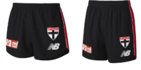
EDIT: Interestingly the shorts seem to drop the EST 1873 ribbon entirely - soo clean
1731997408056.png
 
And so the quindecinnial triple club rebrand of offseason 2024/5 ends not with a bang, but with a refresh.
Wonder if we'll see any next year, possibly Bombers but honestly think the board is way too scared about upsetting any members at the moment to go for it.
IMO the 2010-core mascot logos are ageing very poorly, we've just seen Adelaide drop theirs, but none of the others were ever quite as maligned, so it'll probably be another 5-10 years before any of them get dropped either.
 

Remove this Banner Ad

News New Saints' Logo

Remove this Banner Ad

Back
Top