Andonis1997
All-Round Good Guy
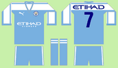
'Windy Wellington' away kit design, acknowledging Wellington's reputation as one of the most windy cities in the world

Instagram: @donisports.design for more
Instagram: @donisports.design for more

AFLW 2024 - Round 8 - Chat, game threads, injury lists, team lineups and more.