Andonis1997
Sporting masochist
'Windy Wellington' away kit design, acknowledging Wellington's reputation as one of the most windy cities in the world

Instagram: @donisports.design for more
Instagram: @donisports.design for more
Follow along with the video below to see how to install our site as a web app on your home screen.
Note: This feature may not be available in some browsers.

Had a quick browse on Google. Appears they've missed the mark for a while. They've probably got the best name in the league. KISS principal should be applied and then build on that tradition.View attachment 1883188
Sydney BlueSox to me have really let themselves down lately. The have a very bland look these days, a terrible font S on a Navy cap. Mine are the home in a Light Blue with an S from the Boston font and Road in Royal with Light Blue Hanging Sox. From a fan perspective I prefer this look to something that looks like it’s from What’s New gift shop
All other teams seem to have a grasp on design with Perth having the most iconic logo. Sydney’s isn’t just boring, it’s lazy.Had a quick browse on Google. Appears they've missed the mark for a while. They've probably got the best name in the league. KISS principal should be applied and then build on that tradition.


Please finish the portfolio these designs look SO GOOD! I'd love to see what you do for each teamMight make a portfolio of this.
I never finish them tho
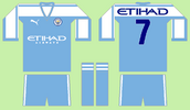
View attachment 1967910
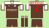
View attachment 1967911
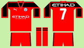
View attachment 1967912


First ever time using Illustrator. Took a while to understand but I've learned enough to make this design.
View attachment 2226252


So much love for the number fontSome Ducks concepts.
Going back to the retro colours while incorporating their modern orange.
View attachment 2226690
View attachment 2226689
View attachment 2226688
Some Ducks concepts.
Going back to the retro colours while incorporating their modern orange.
View attachment 2226690
View attachment 2226689
View attachment 2226688