Discussion Soccer/Association Football New Kits

Remove this Banner Ad

Status
Not open for further replies.

Log in to remove this ad.

images


25ae53431136b784010369ae55f196d2.jpg

Too hard to separate these two for me.
 
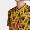
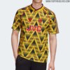
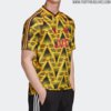
Thoughts? Fair bit of backlash on fbView attachment 793259
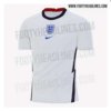
Very old school, similar to the newcastle kit. Feels better if the logos were placed on each breast rather than in the middle. The problem witht this sort of design and national kits are they are often one colour, mind you i dont think the newcastle kit was well recieved (maybe the 90s nostalgia isnt highon most peoples lists). I dont mind it, but it feels bland (but that is common with English kits across the board).
 

(Log in to remove this ad.)

Far too hard to just pick one for the best of the decade.
 

Attachments

  • 0_Leicester-City-away-kits.jpg
    0_Leicester-City-away-kits.jpg
    32.4 KB · Views: 194
  • 2a34408f00000578-3147756-image-a-37_1435938914413-1440138134-800.jpg
    2a34408f00000578-3147756-image-a-37_1435938914413-1440138134-800.jpg
    106.9 KB · Views: 45
  • faebd83dadfe21d210dca78c44585f4a.jpg
    faebd83dadfe21d210dca78c44585f4a.jpg
    14.2 KB · Views: 172
  • https___hypebeast.com_image_2019_06_adidas-arsenal-home-kit-premier-league-2019-2020-official-...jpg
    https___hypebeast.com_image_2019_06_adidas-arsenal-home-kit-premier-league-2019-2020-official-...jpg
    125.3 KB · Views: 37
  • inter-19-20-home-kit-5.jpg
    inter-19-20-home-kit-5.jpg
    76.6 KB · Views: 191
  • spal-110th-anniversary-shirt-3.jpg
    spal-110th-anniversary-shirt-3.jpg
    59.5 KB · Views: 192
  • Velez-Sarsfield-Umbro-Third-Jersey-2016.jpg
    Velez-Sarsfield-Umbro-Third-Jersey-2016.jpg
    71.7 KB · Views: 172
  • 2019-20-fc-internazionale-milano-away-kit-3_rectangle_1600.jpg
    2019-20-fc-internazionale-milano-away-kit-3_rectangle_1600.jpg
    326.1 KB · Views: 43
Very old school, similar to the newcastle kit. Feels better if the logos were placed on each breast rather than in the middle. The problem witht this sort of design and national kits are they are often one colour, mind you i dont think the newcastle kit was well recieved (maybe the 90s nostalgia isnt highon most peoples lists). I dont mind it, but it feels bland (but that is common with English kits across the board).
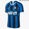
I think centred logos can look great when done right but they don't work well on national kits. I think a team like barca or Ajax could pull it off nicely. The Newcastle kit this year to me doenst work because the sponsor doesnt fit the style enough. A sponsor like Pirelli, Coca-Cola, Jeep or something like that would work perfectly in my opinion.
 
Status
Not open for further replies.

Remove this Banner Ad

Remove this Banner Ad

Back
Top