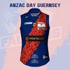
From across the border I couldn't quite fathom the whole Westar Rules thing. I didn't realise this design was part of that (I recall it now, with a demon head on it). I agree that an early design of theirs would make more sense, but I'm happy to see a different design to their usual sash one regardless.Bizarre choice to use a jumper inspired by the short lived and generally loathed Westar Rules era.
Navigation
Install the app
How to install the app on iOS
Follow along with the video below to see how to install our site as a web app on your home screen.
Note: This feature may not be available in some browsers.
More options
-
 BigFooty AFLW Notice Img
AFLW 2024 - Round 10 - Chat, game threads, injury lists, team lineups and more.
You are using an out of date browser. It may not display this or other websites correctly.
You should upgrade or use an alternative browser.
You should upgrade or use an alternative browser.
Discussion State League Guernseys
- Thread starter ULTIMATE_WARRIOR
- Start date
- Tagged users None
For reasons unknown Glenelg played in their Away jumper for a home game yesterday;
- May 8, 2001
- 5,696
- 873
- AFL Club
- Adelaide
- Other Teams
- CDFC (SANFL), Port Melb (VFL)
90th anniversary of their 1934 flag against Port? Only thing I can think of.For reasons unknown Glenelg played in their Away jumper for a home game yesterday;
- Nov 15, 2010
- 2,423
- 2,169
- AFL Club
- Fremantle
- Other Teams
- WACA, Western Force, Arsenal, Glory
Bizarre choice to use a jumper inspired by the short lived and generally loathed Westar Rules era.
Ah! I was hoping we'd bring back one of the old vee designs. Was never really a fan of our 2000 millennium design.
Orange Paradox
Debutant
- Oct 7, 2020
- 73
- 254
- AFL Club
- North Melbourne
- Other Teams
- Glenelg, Cardinals (NFL), Kings (NBA)
Glenelg chose to wear their away guernsey because it was a twilight match. The club was weary of the sun affecting the players' vision and didn't want them accidentally kicking the ball to the opposition if both clubs wore black guernseys.For reasons unknown Glenelg played in their Away jumper for a home game yesterday;
Honestly made for a much more aesthetically pleasing match, I reckon.
Sam Hall
Senior List
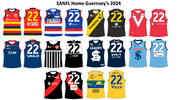
 2024 SANFL Home Jumpers. Changes are as follows:
Adelaide: New Balfours logo for the front sponsor and a new O'neils logo.
Central District: Unchanged.
Glenelg: New O'neils logo.
North Adelaide: Unchanged.
Norwood: The only major sponsor change. IWS is now the front sponsor instead of the back sponsor. New back sponsor is Valo.
Port Adelaide: Unchanged.
South Adelaide: Magin replaces Loftus as a small sponsor on the front. Fantastic Noodles replace Balfours as above number sponsor.
Sturt: The only club with a new jumper template for 2024. Thomas Farms is now the above number sponsor instead of the below number sponsor. New below number sponsor is Complete Windscreens.
West Adelaide: Copyworld is now a front sponsor. Ace It and Adelaide Image printing are now back sponsors.
Woodville-West Torrens: Sports Centre manufacturer logo has been updated Laurinex cleaning sponsor has been replaced by Jani King.
Last edited:
Andonis1997
All-Round Good Guy
*without the lightning effectSturt: The only club with a new jumper template for 2024. They've gone back to their previous template from 2022 with the lignting effect.
Fizzler
TAKE BACK PAFC
- Dec 26, 2013
- 13,457
- 18,053
- AFL Club
- Port Adelaide
- Other Teams
- OKC, Coburg, Werribee, Storm, QPR
Are the side panels on Sturt’s jumper new this year? Been working on back jumper icons for Australian Football Coach and I noticed I didn’t have any for last year’s but I don’t know if that’s just me missing that or they just brought them back.
Last edited:
Sam Hall
Senior List
You're right. I missed that detail for both years. I'll update soon.Are the side panels on Stuart’s jumper new this year? Been working on back jumper icons for Australian Football Coach and I noticed I didn’t have any for last year’s but I don’t know if that’s just me missing that or they just brought them back.
No side stripes in their game Thursday:Are the side panels on Stuart’s jumper new this year? Been working on back jumper icons for Australian Football Coach and I noticed I didn’t have any for last year’s but I don’t know if that’s just me missing that or they just brought them back.
- May 23, 2016
- 774
- 925
- AFL Club
- St Kilda
- Other Teams
- Port Melbourne; Kalkee; Horsham Demons
- May 23, 2016
- 774
- 925
- AFL Club
- St Kilda
- Other Teams
- Port Melbourne; Kalkee; Horsham Demons
View attachment 1946890
Frankston using a white version of their home jumper as a clash strip. IIRC it was grey last season.
This is a step down, with so much white, it looks kind of sparse to me. Could use another double stripe on the opposite side

- Dec 13, 2016
- 1,060
- 2,247
- AFL Club
- Brisbane Lions

- Other Teams
- Arsenal, Melb City, Storm, Stars
- Dec 13, 2016
- 1,060
- 2,247
- AFL Club
- Brisbane Lions

- Other Teams
- Arsenal, Melb City, Storm, Stars
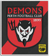
Perth Demons away/clash (?) - inverted design with sash broken up by logo


Andonis1997
All-Round Good Guy
Ever since the rebrand, I haven't liked any of Perth's branding. Seriously, how uninspiring are those logos?Perth Demons away/clash (?) - inverted design with sash broken up by logo

Bring back the old demon head, at least that had character.
Fizzler
TAKE BACK PAFC
- Dec 26, 2013
- 13,457
- 18,053
- AFL Club
- Port Adelaide
- Other Teams
- OKC, Coburg, Werribee, Storm, QPR
Never really noticed just how light of a shade Casey went for, I have a feeling it’s lighter than the Melbourne clash which could come down to different manufacturers (VFL standalones and aligned VFL clubs are all with ISC). Looks good though. I suppose there’s that bit of extra freedom they have to go lighter since Melbourne are trying to match an old jumper whereas Casey (Springvale) don’t share the same heritage. Props to them for keeping the back plain blue with no yoke like the old Springvale and Casey jumpers.bit of an interesting one with Casey rocking light(er) blue strip against Port Melbourne..
View attachment 1960141
View attachment 1960142
- Jun 23, 2021
- 2,230
- 2,146
- AFL Club
- Melbourne
- Other Teams
- LA dodgers LA Kings Melbourne Aces
think it was made diffent, maybe just for port and maybe williams town who wear royal blue which means no clash kit but stills clashes with home potenaltyNever really noticed just how light of a shade Casey went for, I have a feeling it’s lighter than the Melbourne clash which could come down to different manufacturers (VFL standalones and aligned VFL clubs are all with ISC). Looks good though. I suppose there’s that bit of extra freedom they have to go lighter since Melbourne are trying to match an old jumper whereas Casey (Springvale) don’t share the same heritage. Props to them for keeping the back plain blue with no yoke like the old Springvale and Casey jumpers.
- May 23, 2016
- 774
- 925
- AFL Club
- St Kilda
- Other Teams
- Port Melbourne; Kalkee; Horsham Demons
The light blue on the Melbourne clash strip would probably still clash with Port, so I think they had a choice between their old clash jumper of plain white with CASEY written across the front or this. I also think that's why the back is plain blue, the extra red might have caused confusion here.Never really noticed just how light of a shade Casey went for, I have a feeling it’s lighter than the Melbourne clash which could come down to different manufacturers (VFL standalones and aligned VFL clubs are all with ISC). Looks good though. I suppose there’s that bit of extra freedom they have to go lighter since Melbourne are trying to match an old jumper whereas Casey (Springvale) don’t share the same heritage. Props to them for keeping the back plain blue with no yoke like the old Springvale and Casey jumpers.
I actually quite like it, and it did it's job for sure.
- May 23, 2016
- 774
- 925
- AFL Club
- St Kilda
- Other Teams
- Port Melbourne; Kalkee; Horsham Demons
- Nov 15, 2010
- 2,423
- 2,169
- AFL Club
- Fremantle
- Other Teams
- WACA, Western Force, Arsenal, Glory
Last edited:
- Dec 13, 2016
- 1,060
- 2,247
- AFL Club
- Brisbane Lions

- Other Teams
- Arsenal, Melb City, Storm, Stars
- Dec 13, 2016
- 1,060
- 2,247
- AFL Club
- Brisbane Lions

- Other Teams
- Arsenal, Melb City, Storm, Stars
OWAAT69
Debutant
- Aug 4, 2020
- 58
- 71
- AFL Club
- Fremantle
Agreed, much more character, do you think the visual of a character portraying Satan or similar could be deemed offensive to potential new members, and or juniors and their families, I know the Perth junior district has a varied cultural pool to choose players from in the metro area which is much different than what it was 20 plus years ago. Melbourne Demons in the AFL have also gone down the same path losing their demon character on logo and marketing.I sent them this re-work ages ago, they did use the font (which is not mine) for a little while before the new PD stuff
View attachment 1961724 View attachment 1961726
- Jun 23, 2021
- 2,230
- 2,146
- AFL Club
- Melbourne
- Other Teams
- LA dodgers LA Kings Melbourne Aces
yeh and it sucks, it was internally done to appeal to the Chinese market (as far as i know) but now it doesn't matter would love to see us bring it back a bit more always wonder what or how a modernized flamming demon logo could look likeAgreed, much more character, do you think the visual of a character portraying Satan or similar could be deemed offensive to potential new members, and or juniors and their families, I know the Perth junior district has a varied cultural pool to choose players from in the metro area which is much different than what it was 20 plus years ago. Melbourne Demons in the AFL have also gone down the same path losing their demon character on logo and marketing.


