Navigation
Install the app
How to install the app on iOS
Follow along with the video below to see how to install our site as a web app on your home screen.
Note: This feature may not be available in some browsers.
More options
You are using an out of date browser. It may not display this or other websites correctly.
You should upgrade or use an alternative browser.
You should upgrade or use an alternative browser.
Workshop 2021 Jumper Ideas thread
- Thread starter Bacon Warrior
- Start date
- Tagged users None
- Status
- Not open for further replies.
We don't wear our clash against any 'red teams' tho.^ Would look too similar to gc and swans though with the predominantly red jumper with red shorts.
Personally I prefer the white shorts, but I think a lot of people who grew up in the 70s/80s have a real soft spot for the red shorts.
- Sep 22, 2011
- 42,228
- 92,353
- AFL Club
- Essendon
I reckon the white shorts makes us look like Sydney. With the white numbers it’s a lot of red and white.
I’d like to see red shorts with some proper black highlights. And maybe a slightly thicker black frame on the red sash.
Make it properly red and black.
Leave the white shorts for if we ever need an all-white kit.
I’d like to see red shorts with some proper black highlights. And maybe a slightly thicker black frame on the red sash.
Make it properly red and black.
Leave the white shorts for if we ever need an all-white kit.
Dylan8
Bar Up
Found a compromise that I think will keep Eddie happy!

- Aug 21, 2007
- 33,321
- 110,530
- AFL Club
- Port Adelaide
- Other Teams
- Aston Villa, San Antonio Spurs
Yeah, it's fun toying around with it though, because PBs with teal looks awesome. And without teal is it really possible to honor the near-quarter century as Port Power? Or is it part of the goal to erase that part of the club's history? I think you guys already kinda exist as a Frankenstein hybrid, PBs twice a year just adds to that IMO. Not meaning any shade by this - just my thoughts.
It's all gotten incredibly political at this stage. Purely because we've had so many issues wearing the guernsey, the current school of thought is that if we accept a compromise at this point then we'll be told that obviously the OG bars aren't that important to us, when we're actively trying to show how important they are.
If we had been allowed to wear the original bars at our leisure for the last 24 years, we'd probably have seen lots of cool variations without any opposition.
- Aug 21, 2007
- 33,321
- 110,530
- AFL Club
- Port Adelaide
- Other Teams
- Aston Villa, San Antonio Spurs
I reckon the white shorts makes us look like Sydney. With the white numbers it’s a lot of red and white.
I’d like to see red shorts with some proper black highlights. And maybe a slightly thicker black frame on the red sash.
Make it properly red and black.
Leave the white shorts for if we ever need an all-white kit.
Yeah agree with this, red with thick black side stripes or similar.
I hate the white shorts rule. There's no reason Essendon couldn't wear the red guernsey with black shorts against say, Geelong, Brisbane or North.
Yep, that's Eddie's fault. shouldn't even be a debate - clubs should be able to wear whatever they want.It's all gotten incredibly political at this stage. Purely because we've had so many issues wearing the guernsey, the current school of thought is that if we accept a compromise at this point then we'll be told that obviously the OG bars aren't that important to us, when we're actively trying to show how important they are.
If we had been allowed to wear the original bars at our leisure for the last 24 years, we'd probably have seen lots of cool variations without any opposition.
I guess you can take solace in the fact that Port's brand is pretty good looking at the moment regardless.
TheKITC
Cancelled
I don't know if it's been done before, but is there a modernised (logo, no laces) version of this floating around this forum?
I for one hate Carlton's 'insipid white' clash jersey; was thinking a modern, variation of this with potentially yellow or even white shorts could be (or might already have been) knocked up?? Be interesting to see how it looks next to our 'clashes' with other sides...

I for one hate Carlton's 'insipid white' clash jersey; was thinking a modern, variation of this with potentially yellow or even white shorts could be (or might already have been) knocked up?? Be interesting to see how it looks next to our 'clashes' with other sides...

I don't know if it's been done before, but is there a modernised (logo, no laces) version of this floating around this forum?
I for one hate Carlton's 'insipid white' clash jersey; was thinking a modern, variation of this with potentially yellow or even white shorts could be (or might already have been) knocked up?? Be interesting to see how it looks next to our 'clashes' with other sides...
View attachment 899027
Competition - Fauxback Heritage Carlton Jumper
I was asked to do these contests with the Brisbane Lions "Heritage" Jumper that they had never worn before. The jumper that the Lions wore against the Bulldogs in Round 13 was made up of parts of several former Fitzroy jumpers. There will be a "Fauxback" Competition for each of the AFL Teams...
I feel like I made a design based off it years and years ago, can’t find it though.
Andonis1997
Sporting masochist
Why? It's one of our club colours.I for one hate Carlton's 'insipid white' clash jersey
- Jan 3, 2017
- 5,144
- 7,103
- AFL Club
- Collingwood
- Other Teams
- Celtics, Packers
ThE cOlOuR oF sUrReNdErWhy? It's one of our club colours.
Barrybran
Premium Platinum
- Jun 18, 2016
- 54,694
- 104,039
- AFL Club
- West Coast
- Other Teams
- Perth Scorchers
Might want to ditch the white in your kits then. Congratulations Port!ThE cOlOuR oF sUrReNdEr
Was brainstorming ideas for jumper designs and realised next year Essendon Airport turns 100... hope the bombers do something cool.
there's the seed for something good here I reckon. Looks like a necktie wardrobe malfunction atm thoughIt's, uh, meant to be a tarmac
View attachment 900300
Lemon Boi
High quality
- Nov 20, 2019
- 1,281
- 2,531
- AFL Club
- Brisbane Lions

- Other Teams
- North QLD Cowboys, Las Vegas Bears
DoggieStyle07
Debutant
- Apr 11, 2007
- 134
- 146
- AFL Club
- Western Bulldogs
Bjo187
Premiership Player
- Apr 30, 2020
- 4,126
- 5,849
- AFL Club
- Essendon
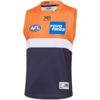
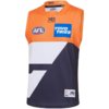
Quick mock up of a 'less is more' simplification of the Giants jersey to make it less cartoonish. Classic hooped look but would still be unique to the giants. Current version on right.
View attachment 900490View attachment 900488
I like it but just the white part a bit thicker i think would look good.
I don't know if it's been done before, but is there a modernised (logo, no laces) version of this floating around this forum?
I for one hate Carlton's 'insipid white' clash jersey; was thinking a modern, variation of this with potentially yellow or even white shorts could be (or might already have been) knocked up?? Be interesting to see how it looks next to our 'clashes' with other sides...
View attachment 899027

made this one a while ago
Cody_
♛
- Aug 25, 2014
- 7,734
- 11,833
- AFL Club
- Richmond
nice billboard
It is? I was arguing with someone once who was adamant that Carlton and Geelong didn't have the same colour scheme, since Carlton's only official colour is navy blue.Why? It's one of our club colours.
Andonis1997
Sporting masochist
Our emblem on the guernsey is white. Just like Essendon's colours are black and red because of their sash. If there was no CFC on the front, then I would argue we have no white. But we do, and it has stayed that way for 100 years. The reason why it hasn't changed is because our colours are navy blue and white, and white has been on the guernsey for 100 years.It is? I was arguing with someone once who was adamant that Carlton and Geelong didn't have the same colour scheme, since Carlton's only official colour is navy blue.
Lemon Boi
High quality
- Nov 20, 2019
- 1,281
- 2,531
- AFL Club
- Brisbane Lions

- Other Teams
- North QLD Cowboys, Las Vegas Bears
Umpire variations. (Add sleeves, of course)
Attachments
Last edited:
Michael Scarn
Club Legend
Having white on the guernsey doesn't make it an official club colourOur emblem on the guernsey is white. Just like Essendon's colours are black and red because of their sash. If there was no CFC on the front, then I would argue we have no white. But we do, and it has stayed that way for 100 years. The reason why it hasn't changed is because our colours are navy blue and white, and white has been on the guernsey for 100 years.
- Status
- Not open for further replies.
Similar threads
- Replies
- 726
- Views
- 85K


