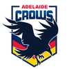
Opinion Adelaide Crows New Logo Discussion

The new Crows logo is...

  • Awesome

    Votes: 22 10.5%
  • Good

    Votes: 87 41.4%
  • Meh

    Votes: 55 26.2%
  • Not Good

    Votes: 17 8.1%
  • Terrible

    Votes: 29 13.8%

  • Total voters
    210

Remove this Banner Ad

Wonder if it's just an anniversary thing? Either way, pretty meh.

Bring back the 90's Bomber, that sucker taught me how to draw planes and got me a lot of cred as the go to plane drawing guy in primary school.
 

Log in to remove this ad.

Sooo bad.

"Oh I think we should do one like Melbourne's"
"Sure, but what will we do differently?"
"I don't understand the question"

It even looks navy
 

(Log in to remove this ad.)

Might be a new logo incoming actually.
For some reason our 2022 members gear still hasn't been revealed. Usually we reveal it on screen at last home game, and we didn't. Then even as 2022 membership properly launched theres still no sign of it. Have been wondering what they are hiding.
Then I also observed our current logo has been appearing less and less in the members emails, with the Crow logo usually displayed at the end of the email being replaced with "Adelaide Football Club".
And now the right time to tease a new logo because in two weeks players/staff will start wearing 2022 gear (featuring whoever is replacing Optus and any potential new logo).

hopefully not a false alarm!
 
Last edited:
I remember when the hideous monstrosity got leaked.
Wasn’t it from the QLD transport commission because they were issuing club based number plates?
It was something random like that..
 
The piece of absolute shit raptor logo is synonymous with the Rob Chapman reign of failure and it needs to be replaced quickly. I swear that banking loser promptly signed off on the design and it was immediately hated by everyone
 
Last edited:

Remove this Banner Ad

Opinion Adelaide Crows New Logo Discussion

Back
Top