They are flipping terrible hats/caps this year. I'm the same boat. Might have to bring out the old blk newbie for this year (just as bad but not as bad).Trying to find something to spend my voucher on. Kudos for expanding the number of hats, but geez there's some strage colours there.
Headwear | Crows Shop
Amplify your style with our exclusive Headwear collection. Discover a diverse range of head-turning hats and caps that combine fashion and function seamlesslyshop.afc.com.au
Navigation
Install the app
How to install the app on iOS
Follow along with the video below to see how to install our site as a web app on your home screen.
Note: This feature may not be available in some browsers.
More options
-
Mobile App Discontinued
Due to a number of factors, support for the current BigFooty mobile app has been discontinued. Your BigFooty login will no longer work on the Tapatalk or the BigFooty App - which is based on Tapatalk.
Apologies for any inconvenience. We will try to find a replacement. -
Mobile App Discontinued
Due to a number of factors, support for the current BigFooty mobile app has been discontinued. Your BigFooty login will no longer work on the Tapatalk or the BigFooty App - which is based on Tapatalk.
Apologies for any inconvenience. We will try to find a replacement.
News Crows guernseys/apparel discussion and news
- Thread starter SC26
- Start date
- Tagged users None
🥰 Love BigFooty? Join now for free.
Andonis1997
Sporting masochist
The best hat the Crows released were the 25th anniversary ones with the AFC monogram. Has nothing to do with the club logo, which by default makes it the best.
Absolutely 100% correct. Best by a mile.The best hat the Crows released were the 25th anniversary ones with the AFC monogram. Has nothing to do with the club logo, which by default makes it the best.
FR0GGY
Busy
That’s your Carlton supporter coming out in you.The best hat the Crows released were the 25th anniversary ones with the AFC monogram. Has nothing to do with the club logo, which by default makes it the best.
Log in to remove this Banner Ad
Andonis1997
Sporting masochist
Haha while that is the case, if it helps, I have the yellow one from being a member that season, so it could be considered pretty far removed from Carlton if I still like itThat’s your Carlton supporter coming out in you.

Smoooothy
May have been wrong about em!
- Jan 12, 2005
- 24,694
- 23,077
- AFL Club
- Adelaide
- Other Teams
- North Adelaide; ConeyIslandWarriors
lost mine at disneylandThe best hat the Crows released were the 25th anniversary ones with the AFC monogram. Has nothing to do with the club logo, which by default makes it the best.
- Mar 20, 2013
- 5,594
- 5,911
- AFL Club
- Adelaide
Fair few options with the old logoFront and centre and prominent in the majority of those hats, I thought the club realised it was unpopular and were working on changing it? Seems weird to then promote so much
Imagine having a hat with the current logo plastered in the front once it changes. Not only will it look shit, it won’t even be our logo
- Oct 2, 2022
- 8,023
- 10,906
- AFL Club
- Adelaide
Yeah, you'll suddenly never see that logo being worn again.Fair few options with the old logo
Imagine having a hat with the current logo plastered in the front once it changes. Not only will it look s**t, it won’t even be our logo
Daresay when we change logo we will break the AFL club merchandise sales record, for this reason.Fair few options with the old logo
Imagine having a hat with the current logo plastered in the front once it changes. Not only will it look s**t, it won’t even be our logo
On SM-A325F using BigFooty.com mobile app
Most of the hats are made by New Era, so the clubs get no say in what is produced. Its a standardized colour/design that they'll use across every club.They are *ing terrible hats/caps this year. I'm the same boat. Might have to bring out the old blk newbie for this year (just as bad but not as bad).
Some clubs will have varying ranges of their own merchandise in regards to headwear, but it looks like for the most part we run all of ours through New Era to produce.
Who exactly would we even wear that against?
late to this party, but I can't see it clashing any less than our normal guernsey.
Am I really alone in not liking the jumper? Just think a whole team wearing that is an eyesore.
looks a mess to me, but I'm probably old fashioned when it comes to footy guernseys. Don't mind these kind of pictorial efforts for the odd themed ro7nd like indigenous or gather, but not as part of regular rotation.
Trigg is a stain on our clubs history. What a terrible leader.
Chapman and Ford worse.
"Canary yellow? That's Australian gold my friend and don't you f*ckin' forget it!"
best character in that series by a mile.
Taking a closer look at photos of Jordan Dawson
in this year's home guernsey, and again the tricolours aren't quite right. The red is fine (the easiest colour to get right), but the blue doesn't quite have the depth or saturation, and the gold is a little too light. I've seen worse, and I've seen better. ISC was the only one since Adidas to get it right - the jumper I wear to games is an ISC.
PLAYERCARDSTART
12
Jordan Dawson
- Age
- 28
- Ht
- 190cm
- Wt
- 91kg
- Pos.
- Mid
Career
Season
Last 5
- D
- 17.0
- 4star
- K
- 11.4
- 4star
- HB
- 5.7
- 4star
- M
- 4.8
- 5star
- T
- 2.8
- 4star
- CL
- 0.6
- 3star
- D
- 15.7
- 4star
- K
- 10.9
- 4star
- HB
- 4.9
- 3star
- M
- 2.9
- 3star
- T
- 2.0
- 3star
- CL
- 0.4
- 3star
- D
- 11.8
- 3star
- K
- 7.8
- 3star
- HB
- 4.0
- 3star
- M
- 5.0
- 5star
- T
- 3.0
- 5star
- CL
- 0.6
- 3star
PLAYERCARDEND
- Aug 21, 2008
- 7,587
- 16,229
- AFL Club
- Adelaide
we REALLY need footy back.
Scorpus
Moderator
- Apr 16, 2014
- 65,710
- 178,063
- AFL Club
- Adelaide
- Moderator
- #2,517


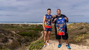
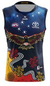
Crows unveil 2024 Indigenous Guernsey
The design will be worn by all three of Adelaide’s teams
- Moderator
- #2,518
It looks amazingView attachment 1928391

Crows unveil 2024 Indigenous Guernsey
The design will be worn by all three of Adelaide’s teamswww.afc.com.au
 we deliver every time!!
🥰 Love BigFooty? Join now for free.
FR0GGY
Busy
The sanfl side get to wear it this year
FR0GGY
Busy
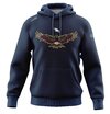
Logo looks weirdQuite like the hoodie version they've come up with
View attachment 1928403
SugarShane
C12 H22 O11
Ahhhhhh **** yeah. That's amazing, probably my favourite since 2015's swooping Crow.
Crow logo almost looks like it's holding a baseball
Similar threads
- Replies
- 1K
- Views
- 15K
- Replies
- 13
- Views
- 693
- Replies
- 987
- Views
- 65K
- Replies
- 52
- Views
- 2K


