- Mar 30, 2014
- 2,940
- 5,036
- AFL Club
- Brisbane Lions

- Other Teams
- Dolphins, Seattle Kraken
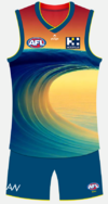
The difference is most* don't have a big GC gradient surfboard on themAll these "re brands" are basically just the same as what they have now
Follow along with the video below to see how to install our site as a web app on your home screen.
Note: This feature may not be available in some browsers.
Due to a number of factors, support for the current BigFooty mobile app has been discontinued. Your BigFooty login will no longer work on the Tapatalk or the BigFooty App - which is based on Tapatalk.
Apologies for any inconvenience. We will try to find a replacement.
Due to a number of factors, support for the current BigFooty mobile app has been discontinued. Your BigFooty login will no longer work on the Tapatalk or the BigFooty App - which is based on Tapatalk.
Apologies for any inconvenience. We will try to find a replacement.
The difference is most* don't have a big GC gradient surfboard on themAll these "re brands" are basically just the same as what they have now
You joke, but I think this is the reason why Gold Coast probably won't move to a more, aesthetically pleasing deeper shade of red, as it's too close to the other team in the state. Their realistic best move imo would be to move to a yellow/gold base and own it, they'd be the only team other than Hawthorn.Deeper red, you stealin' our maroon you bastards! /s
You joke, but I think this is the reason why Gold Coast probably won't move to a more, aesthetically pleasing deeper shade of red, as it's too close to the other team in the state. Their realistic best move imo would be to move to a yellow/gold base and own it, they'd be the only team other than Hawthorn.
Log in to remove this Banner Ad
But that would mean we don't get to wear our bears coloursThis is essentially what Woodville-West Torrens ended up doing in the SANFL and it was a good move IMO considering that most teams were already blue or black. Their yellow jumper/blue shorts look really stands out.
GC could do something similar with a yellow jumper/red shorts combo and they’d really only need a blue kit for games against Hawthorn and GWS.
They should just get an AI to generate it, like i didblue wave on a mostly yellow (sand) base with a gradient red into ochre sunset above the sand/behind the wave

A mostly-yellow clash jumper is fine, but as a main it sucks. Woodville-West Torrens is awful, and I wish they would return to a mostly blue or green main jumper with the yellow as a clash only.
I had a look at those teams & I'll hold to my view for now, but if GC manage to come up with a pleasing gold jumper I'll happily concede the point.I disagree. Yellow/gold can work really well as a main identity, just look at Dortmund or Norwich City. Just need the right shades and proportions (of both gold and red) to make it work.
Not soon enough.Shutup ! Need to maintain rage and status of worst logo for the club to do something..
Our CEO has basically confirmed there will be a new logo timed with the move to new HQ likely in 2025/2026.
A few more concepts, this is assuming they don't go for the complete rebrand...
View attachment 1796139
View attachment 1796141
View attachment 1796143
Agreed, I don’t mind the logo but it’s not good enough to be the sole focus of the jumperAs I've always said the crap logo doesn't look as crap if it has something else going on around above or behind it.
New GC logo shadow drop?
New GC logo shadow drop?


Needs to be even lighter shade of blue, looks too much like Fitzroy or South Australia state jumper.mucking around with Gold Coast... surfboardView attachment 1820795 point meets standard chevron...
Yuck. It's like an AI destroyed SA SOO guernsey.yeh it is drifting there, maybe filling the 'board' helps... they have good base colours, its just about the combo..View attachment 1821525
