Resource Gold Coast Suns Rebrand

Best rebrand option


  • Total voters
    189

Remove this Banner Ad

Status
Not open for further replies.
What would you do differently if you designed one now? no ochre allowed though


Well it's funny you mention that, because my belief now is that the Suns should wear the below as their home and away. They're an untraditional footy side, so lean into it with something that really works well for their colour scheme and creates a fairly unique identity.

Logo change would be handy too.
1715297054715.png
 
I mean if that’s on the worst guernsey design lists you’ve just proven my point that most times the fans don’t know s**t.
Not at all, fans were the reason Brisbane got rid of that terrible paddle pop lion guernsey. Also, West Coast fans picked the superior royal blue and gold wing design back in the mid 2010's for West Coast's home uniform, rather than that tri-panel thing. May as well do it with Gold Coast's guernsey, fans seem to get it right more than any internal corporate second guessing and "market research".
 

Log in to remove this ad.

I don't mind the idea of a gradient base and trying to get some sun beam strike going through, i also think you are going to give people crazy headaches...

1715301344354.png
 
Well it's funny you mention that, because my belief now is that the Suns should wear the below as their home and away. They're an untraditional footy side, so lean into it with something that really works well for their colour scheme and creates a fairly unique identity.

Logo change would be handy too.

View attachment 1984387

This is one of those ones that looks great in store, but looked crap on field when they wore it.

Your 2018 one is still the best I've seen, you could do so much to tweak it every year too as clubs like to do. Thicken the hoop, add some orange shade to the hoop, add yellow cuffs, all stuff clubs love doing to sell more merchandise and they wouldn't need to change the logo, which I don't think is essential if the current one isn't slapped on the front of the jumper.
 
Well it's funny you mention that, because my belief now is that the Suns should wear the below as their home and away. They're an untraditional footy side, so lean into it with something that really works well for their colour scheme and creates a fairly unique identity.

Logo change would be handy too.

View attachment 1984387
yep - these should probably go in the poll
 
yes, i get why they have it but its time to bring back the anchor at the very least, and maybe bring back green and red maybe a little sprinke of green and red
That was changed because corporate did "market research" rather than a poll. I agree, they should bring back the anchor guernsey but in all haze, red or green.
 
Well it's funny you mention that, because my belief now is that the Suns should wear the below as their home and away. They're an untraditional footy side, so lean into it with something that really works well for their colour scheme and creates a fairly unique identity.

Logo change would be handy too.

View attachment 1984387
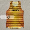
Agree, it would be a great point of difference from the rest of the competition. On top of that if the Suns ever reach out to tap into the Darwin/NT market then this jumper suits that purpose really nicely. If they aren't going to lean into the lifesaver identity then this would be the next best thing.
 

(Log in to remove this ad.)

846697c3056e4f1aa4c72cf5f995d209.jpg
90113fd57677fd6d38b086bd4fa808b0.jpg
b7dd1ff6f2f3646045ca8cb3611fde12.jpg
e52d12bc29f180009c60e1b6fec8bbcf.jpg


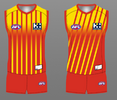
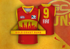
These have been the ones that have appealed to me (sorry can’t remember who designed what, just have these images saved). I just love the half and half red/yellow split with horizontal lines (“rays”, sun on the horizon vibes) starting thick and becoming thinner (whichever way) to create the split gradient look.

I just think it strikes a balance as a design for a relatively modern club that can try something different and unique as there’s no strong heritage/tradition ties holding them back, but also not straying too far from guernsey design conventions in some respects. Need to look at it and automatically recognise like “yeah, that’s a footy jumper”. As for the GC initials/wordmark, could take it or leave it.

But also don’t mind the logo I’ve attached too and would be sick to see that incorporated in the jumper somehow. Add the horizontal rays and could look really effective.

I don't mind the second one actually, a clever way to make the gc letters look better. The logo at the end looks too old though I think.

On another note, I prefer when the bottom of the jumper is a different colour to the shorts than vice versa, it adds a better contrast, instead of looking like a girls jumpsuit 😅.
 
Agree, it would be a great point of difference from the rest of the competition. On top of that if the Suns ever reach out to tap into the Darwin/NT market then this jumper suits that purpose really nicely. If they aren't going to lean into the lifesaver identity then this would be the next best thing.
not sure if you've heard but we're playing 2 games in darwin starting this weekend. :p
whilst we have the deal going we have been marketing it as the NT team.


1715406061306.png

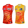
i've been saying for years gold should be our clash (smiths chips guernsey is ass), some version similar to the ones FT posted would be nice, especially if it takes the emphasis off the logo. the logo itself i don't have a massive problem with, just the fact its the only focal point of our strip.
 
846697c3056e4f1aa4c72cf5f995d209.jpg
90113fd57677fd6d38b086bd4fa808b0.jpg
b7dd1ff6f2f3646045ca8cb3611fde12.jpg
e52d12bc29f180009c60e1b6fec8bbcf.jpg


These have been the ones that have appealed to me (sorry can’t remember who designed what, just have these images saved). I just love the half and half red/yellow split with horizontal lines (“rays”, sun on the horizon vibes) starting thick and becoming thinner (whichever way) to create the split gradient look.

I just think it strikes a balance as a design for a relatively modern club that can try something different and unique as there’s no strong heritage/tradition ties holding them back, but also not straying too far from guernsey design conventions in some respects. Need to look at it and automatically recognise like “yeah, that’s a footy jumper”. As for the GC initials/wordmark, could take it or leave it.

But also don’t mind the logo I’ve attached too and would be sick to see that incorporated in the jumper somehow. Add the horizontal rays and could look really effective.
those 3 guernseys were my designs, i thought if the club was hellbent on keeping the lettering on the front incorporating it into a design like that could work.

did them a few years ago, not sure how i feel about them now re: the stripes.
 
Status
Not open for further replies.

Remove this Banner Ad

Back
Top