some insights from the brand refresh below. more comments in the linked thread too.
I’ll try and put my thoughts into words, sorry if it seems clunky.
So I walked out of the brand refresh feeling really flat.
They showed us 3 designs. Mostly focusing on the logo and putting it in a lineup with all other club logos for comparison.
Logo Design 1.
This was awful, really awful.
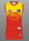
But, the guernsey they slapped it on was GREAT.
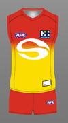
Red to Yellow gradient. Starting with red at the bottom changing into yellow around the chest and up, with red hems and collars!
The away was yellow and yellow gradient.
(Looked okay nothing great like the yellow training jumper)
The clash was blue and red gradient, looked really good - think phoenix suns but more blue than purple.
Logo Design 2.
This was the best logo that was offered up.
They had placed this on a 2 toned red jumper. Think soccer shirt where it’s red with darker red lines quite busy, I hated it.
And a yellow version - the same.
Logo Design 3.
This logo was also terrible.
On the guernseys they had changed the red and blue shades to almost lions colors. And the logo on this one was really big and quite low on the jumper in a darker shade of the same color of the jumpers.
I have written a lot about the different jumper designs they showed us and honestly if the put logo 2 onto guernsey 1 it would be pretty decent design.
But they didn’t seem to care about the actual guernsey design. Every time I asked about it or gave feed back they tried to put me back into talking about the logo. It seemed like it would be an after thought.
They did concede that they would be going with some type of gradient and all signs pointed to yellow being the away/clash.
Anyone who wants a “traditional” strip will be disappointed.
I should also say he did stress that these designs weren’t anywhere near completion before he showed us, to the point where he almost sounded defensive, almost like he had negative feedback all day.
It is happening. 2025 we will be in a new kit.
Members will be shown in November.
I didn’t end up signing any type of NDA and we didn’t have to give them our phones, just turn them off.
Sent from my iPhone using BigFooty.com

