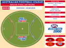
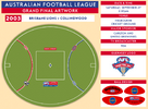
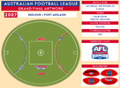
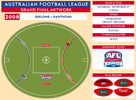
Resource History of AFL Grand Final Artwork

Remove this Banner Ad

Jul 17, 2006
5,275
9,856
Victoria
AFL Club
Adelaide
Other Teams
Liverpool FC, Melbourne Victory
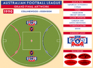
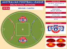
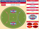
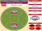
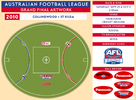
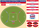
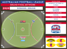
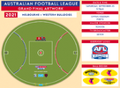
So this is a project I've been meaning and wanting to do for some time now. I've always had an interest in the various logos and on-field artwork used in the AFL, and wanted to document how that has developed over the years. The most interesting designs are associated with the Grand Final, where for a period of time, unique logos and layouts were used.

Here, I present the artwork associated with Grand Finals in since 1990 - the AFL era. This is the result plenty of research and countless hours of designing and re-creating the various logos used throughout the years. I endeavour to eventually go back into the 1980s as well, but for now, given that we are in Grand Final week, I thought it would be an appropriate time for the first release.

Special thanks to Mero for providing his versions of the Grand Final patches. I couldn't have done these designs without his help.

Anyway, hope you enjoy!


UPDATE:
VFL Grand Final Artwork from 1976-1989 begins from this post.
AFLW Grand Final Artwork begins from this post.


***WARNING: Heavy graphics load ahead! Sorry.***
 
Last edited:

Log in to remove this ad.

Yaaaa! This is so good. I always wanted to chronicle on-field logos, particularly because there's been so many in the Toyota era (often changing mid season).

This is a great start and the timing of the thread release is perfect. Well done!
 
Great work How long did that take?

Thanks! Been working on it for a bit over a month, which probably doesn't sound like very long but I was spending a lot of my free time on it. It actually took a lot longer than I expected. I thought it would be a simple case of sourcing the logos and whacking them on a template, but it didn't quite turn out like that.

What I didn't count on was the need to create so many logos myself. I knew I would have to create all of the Toyota outer wing logos myself, but some weren't as straight forward as I was expecting (finding the right font for example). For the actual Grand Final logos, I had to alter them to make the "sponsored" version that appears on the field, which for a few was quite different to the jumper version. I also could not find a good quality version of the old Carlton Draught logo anywhere, so I remade that myself too. That was very time consuming, but I'm really happy with how it turned out.

I'm also really pedantic with things, so there was a few things that looked very close but to me weren't quite accurate enough, so I spent ages trying to get it right. There are still a couple of minor inaccuracies but they were things that were beyond my skillset.
 
Brilliant!
I love it!

Any reason why 2004 had the club logos on different sides?

I have no idea. It was also the year they switched which ends the red and blue arcs were, so it is definitely a unique year.
 
Yaaaa! This is so good. I always wanted to chronicle on-field logos, particularly because there's been so many in the Toyota era (often changing mid season).

This is a great start and the timing of the thread release is perfect. Well done!

I would love to continue it to all time as well, but that is a hell of a task. Outer wing logos is where the complexities lie. As you say, the Toyota logos often changed mid season. Also, the early 2000s saw different CUB brands in different states. Plus you have special round logos (Opening Round, Indigenous Round, etc), and then you could also include random special one-off things like coloured centre circles for different causes.

Its a much bigger project than this, but one I'd like to get around to eventually.
 

(Log in to remove this ad.)

great work....

i like the 91 style of having the club logos on the wings
i wouldn't mind them if they were in the inside 50m arcs either, instead of actually on the 50m arcs at an angle as they are now

would be nice if the GF logo got updated a bit slightly from year to year... maybe having something on it that links it to melbourne...

- MCG silouette
- Melbourne skyline
- tram with its destination being 'MCG - GRAND FINAL'

that sort of thing
 
Last edited:
Doesn't 2004 have the double centre circles?

Fantastic work, great to see all the different artworks
 
Are you doing the rest of them?
1987
hqdefault.jpg


1986
1986.png
 
Are you doing the rest of them?
1987
hqdefault.jpg


1986
1986.png

Yeah I plan to continue back as far as there were any actual logos painted on the ground (1976 I think), but wanted to get some stuff out this week so just focussed on AFL era for now.
 
Is the colour co-ordination of the logos to the 50m lines an accident or on purpose this year?

Its pretty much always on purpose, at least since 2005. They colour code wherever possible each season. So Geelong have always had the blue arc, Sydney have always had the red arc. Hawthorn - who don't have either blue or red as one of their colours - have played GF's against both of these teams, so they've featured on both arcs as they get the opposite arc by default.

The only GF so far where neither side had red or blue in their colour scheme was 2013. Fremantle got the blue arc, I assume, because their purple was the closest match either side had to one of the arc colours.

The first couple of logo years didn't seem to have any rhyme or reason to them. My theory is that the 2005 Sydney-West Coast GF gave them the perfect opportunity to colour code both logos with arcs, and that was reinforced the next year with the same match up so they've continued that as a policy. Thats just a theory though, I have no evidence to back that up.

I'd love to talk to the person at the MCG or AFL who decides these things. I'd find it fascinating!
 

Remove this Banner Ad

Resource History of AFL Grand Final Artwork

Remove this Banner Ad

Back
Top