Navigation
Install the app
How to install the app on iOS
Follow along with the video below to see how to install our site as a web app on your home screen.
Note: This feature may not be available in some browsers.
More options
You are using an out of date browser. It may not display this or other websites correctly.
You should upgrade or use an alternative browser.
You should upgrade or use an alternative browser.
Resource History of AFL Grand Final Artwork
- Thread starter Red Crow
- Start date
- Tagged users None
Red Crow
Modrarator
- Thread starter
- #277
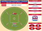
Gotta say, I'm pretty chuffed with myself. Did the artwork on Sunday pre-emptively, based on what I expected it to be, and hoping not to have to change too much. The only thing I got wrong was the order of the club logos. Even got the ball designs right, thankfully they didn't change the layout they've been using in recent years.
Gambled on them going back to the 'Footy. OWAF" slogan, figuring that 'Finals...' would look odd for a GF, and changing it to 'Grand Final...' would necessitate a re-centering of the whole slogan and thus require it to be fully removed and repainted.
Heardy_101
TRUMP 2024 🇺🇸🇺🇸🇺🇸🇺🇸🇺🇸
They had one job... To match the logos with the Arcs!As a Swans coach once famously said... here it is!View attachment 1516052
Red Crow
Modrarator
- Thread starter
- #280
They had one job... To match the logos with the Arcs!
Now that they're not actually on the arcs, I'm not really concerned about colour matching. I think it just needs be home team on the left.
I started to wonder if they've been doing the logos dependent on which end the cheer squad was. Thought I'll go back over the last few years and see if that was the case, but this year the Geelong cheer squad is at the Punt Rd end, or left of screen. So that theory is busted right away.
Two years straight the away team is on the left, surely the AFL isn’t turning into an NBA style concept, for example (Sydney @ Geelong)
On iPhone using BigFooty.com mobile app
Heardy_101
TRUMP 2024 🇺🇸🇺🇸🇺🇸🇺🇸🇺🇸
It still looks wrong because Sydney are on the Blue arc side and Geelong on the red side.Now that they're not actually on the arcs, I'm not really concerned about colour matching. I think it just needs be home team on the left.
I started to wonder if they've been doing the logos dependent on which end the cheer squad was. Thought I'll go back over the last few years and see if that was the case, but this year the Geelong cheer squad is at the Punt Rd end, or left of screen. So that theory is busted right away.
Do we know which team gets which changerooms yet?
- Jun 9, 2015
- 12,777
- 9,810
- AFL Club
- St Kilda
Is the interchange really not in the centre?As a Swans coach once famously said... here it is!View attachment 1516052
Football needs updating to gold logo
 www.bigfooty.com
Discussion - Finals Series 2022 - Photos and Discussion
QUALIFYING AND ELIMINATION FINALS Thursday, September 1 EF2 - Brisbane Lions v Richmond (G) (N) Friday, September 2 QF2 - Melbourne v Sydney (MCG) (N) Saturday, Setember 3 QF1 - Geelong v Collingwood (MCG) (T) EF1 - Fremantle v Western Bulldogs (OS) (N) SEMI FINALS Friday, September 9 SF2...
Correct, it's slightly off at the MCG.Is the interchange really not in the centre?
Hi, I have tried to message you, but can't find the prompt to do so. Do you mind messaging me? I have a question I would like to ask you.So this is a project I've been meaning and wanting to do for some time now. I've always had an interest in the various logos and on-field artwork used in the AFL, and wanted to document how that has developed over the years. The most interesting designs are associated with the Grand Final, where for a period of time, unique logos and layouts were used.
Here, I present the artwork associated with Grand Finals in since 1990 - the AFL era. This is the result plenty of research and countless hours of designing and re-creating the various logos used throughout the years. I endeavour to eventually go back into the 1980s as well, but for now, given that we are in Grand Final week, I thought it would be an appropriate time for the first release.
Special thanks to Mero for providing his versions of the Grand Final patches. I couldn't have done these designs without his help.
Anyway, hope you enjoy!
UPDATE:
VFL Grand Final Artwork from 1976-1989 begins from this post.
AFLW Grand Final Artwork begins from this post.
WARNING: Heavy graphics load ahead! Sorry.
Why did the AFL step away from unique Grand Final logos? There is something nostalgic about the huge GF logos of the late 90’s.
pretty sure it lines up with Toyota being the major sponsor...Why did the AFL step away from unique Grand Final logos? There is something nostalgic about the huge GF logos of the late 90’s.
Slightly biased, but I reckon the 1994 one was the best of those 90s ones. The most balanced. They were all good though, from 91-95.
i have a soft spot for 97 just for how insanely large the logo was on the ground...Slightly biased, but I reckon the 1994 one was the best of those 90s ones. The most balanced. They were all good though, from 91-95.
Yeah I was thinking more of the logo on the guernseys. I do like how big they were on the ground back then as well. I think the later 90s ones, when guernseys went to polyester, were a bit ruined cause they hadn’t quite got the heat pressing right, and they looked like big beer coasters glued over the AFL logo 

Design wise i think 93 is the best balanced, tho my essendon bias probably shows, however i think 2000 was the worst logo. At least the most uninspired. 99 is pretty bad as well but at least it has some personality.
- Sep 21, 2004
- 39,797
- 30,003
- AFL Club
- West Coast
- Other Teams
- Norwood & Liverpool.
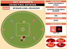
why do they put "home" team on the right rather than the left? Is is just cause its closer to the rooms they walk out of and where they stand for the anthems?Grand Final artwork will be the same as last year, with Collingwood being painted on the right side of the field and Brisbane on the left. The logos look much larger, or that's just a image being wierd
Similar threads
- Replies
- 143
- Views
- 8K
- Replies
- 49
- Views
- 5K
- Replies
- 65
- Views
- 4K
- Replies
- 88
- Views
- 5K


