Workshop Jumper Ideas For 2023

Remove this Banner Ad

Status
Not open for further replies.
No jumper idea here but I saw a Fremantle training with the players wearing the purple guernsey with black shorts or tights, looked awesome that combination of purple and black together, better than the all purple.
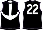
The anchor guernsey with just black and white would look amazing (unfortunately Collingwood would never allow that). idea.jpg
 
Last edited:

Log in to remove this ad.

St Kilda has it's 150th anniversary next year, expect the original red and black hoops with the white saddle to get a run at some point.
 
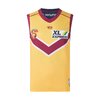
My all time favourite strip is the old bears chevron jumper but this one looks like ass IMO. Perhaps with a different yellow and a bigger V it could be saved though?
Yes, the V should be larger, its too small. And I think the collars and cuff should be white.
 
Seeing it on, it actually looks pretty shmick.
If they integrated parts from our Majestic yellow kit it would be a quality strip

BJQHvLgy.jpg
 

(Log in to remove this ad.)

View attachment 1494393
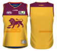
The Lions are currently using this as their training jumper. This should be promoted to clash guernsey, asap.
the V could be a bit bigger to match the actual jumper but yeah completely agree. Having said that, I'd much rather see them come out with this as a clash jumper next year. Would instantly be one of their best jumpers yet.
1661843450703.png
 
the V could be a bit bigger to match the actual jumper but yeah completely agree. Having said that, I'd much rather see them come out with this as a clash jumper next year. Would instantly be one of their best jumpers yet.
View attachment 1494557
Not really a fan of the home guernsey having its colours revised for a clash, it looks best with blue and maroon. Even that red guernsey doesn't look good with the lion on it, they should have used the monogram like the Fitzroy uniform. Maroon as a accent colour would be best with yellow.
 
Not really a fan of the home guernsey having its colours revised for a clash, it looks best with blue and maroon. Even that red guernsey doesn't look good with the lion on it, they should have used the monogram like the Fitzroy uniform. Maroon as a accent colour would be best with yellow.
It's not a home kit revision necessarily, but an homage to one of the Bears classic away kits. I disagree about the Fitzroy red kit with the Lion, it's incredibly clean and a great update of the old Fitzroy kit. I wouldn't mind the FFC being on the away kit in some respect though
 
It's not a home kit revision necessarily, but an homage to one of the Bears classic away kits. I disagree about the Fitzroy red kit with the Lion, it's incredibly clean and a great update of the old Fitzroy kit. I wouldn't mind the FFC being on the away kit in some respect though
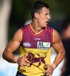
Actually, seeing it used for real does make it look better. Perhaps because the colours are slightly different. Although, I do stand by the monogram looking better on the red guernsey. yellow.JPG
 
Actually, seeing it used for real does make it look better. Perhaps because the colours are slightly different. Although, I do stand by the monogram looking better on the red guernsey. View attachment 1495138
Future captain's photo aside, the red stitching was the big disappointment on that season's training kit
 
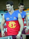
Even that red guernsey doesn't look good with the lion on it

Disagree. The red and blue jumper with the gold lion is the best of the Brisbane jumpers. Would look even better if they wore blue shorts with it.
 
Status
Not open for further replies.

Remove this Banner Ad

Remove this Banner Ad

Back
Top