Navigation
Install the app
How to install the app on iOS
Follow along with the video below to see how to install our site as a web app on your home screen.
Note: This feature may not be available in some browsers.
More options
You are using an out of date browser. It may not display this or other websites correctly.
You should upgrade or use an alternative browser.
You should upgrade or use an alternative browser.
Workshop Jumper Ideas For 2024
- Thread starter Swooping_Magpie
- Start date
- Tagged users None
- Status
- Not open for further replies.
- Mar 30, 2014
- 2,831
- 4,816
- AFL Club
- Brisbane Lions

- Other Teams
- Dolphins, Seattle Kraken
I've always loved this design, but please use one of the alternative pieces of software recommended previously, those pixels and random paint fills are hurting my eyes!omg i posted this thread back2back years! please no one f*** up the three peat next year.
anyways here's a brisbane heritage jumper i made. very simple and quick but i like it.
View attachment 1647234
Swooping_Magpie
it's swooping season
- Thread starter
- #3
yeah i will. as i said it was a very quick jobI've always loved this design, but please use one of the alternative pieces of software recommended previously, those pixels and random paint fills are hurting my eyes!
- Mar 30, 2014
- 2,831
- 4,816
- AFL Club
- Brisbane Lions

- Other Teams
- Dolphins, Seattle Kraken
Even the subtle change of the red tick looks miles better than the black one on the current V!
- Sep 30, 2015
- 3,741
- 5,639
- AFL Club
- West Coast
- Mar 30, 2014
- 2,831
- 4,816
- AFL Club
- Brisbane Lions

- Other Teams
- Dolphins, Seattle Kraken
I love the anchor and it so so iconic, but not sure if the red is required when an inverse without adding colours will do.Return the anchors, but with a full haze home uniform and a red clash uniform.
View attachment 1648799View attachment 1648798
Also fun fact; this particular anchor was only worn for 10 years, the current kit has now been worn for 12.
- Sep 30, 2015
- 3,741
- 5,639
- AFL Club
- West Coast
White uniforms look weaker, clubs are even moving away from them. Brisbane being an example, and they, too, look so much better with just the maroon, red and gold uniforms. No more white. For Freo, a red uniform looks more stronger, and a good colour contrasting alternative.I love the anchor and it so so iconic, but not sure if the red is required when an inverse without adding colours will do.
Also fun fact; this particular anchor was only worn for 10 years, the current kit has now been worn for 12.
Last edited:
RWB_Threads
Debutant
- Oct 27, 2016
- 6,095
- 11,181
- AFL Club
- Collingwood
- Other Teams
- Packers, Raptors, Renegades
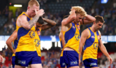
The players don't look too pleased about itpretty s**t shop coming from me but anyway would be cool to see the Weagles get back on the Yellow home jumper next year
View attachment 1649935
Mr Eagle
Bird-brain
I would not at all mind seeing some coloured shorts with that jumper. Even #goldshorts would do.pretty s**t shop coming from me but anyway would be cool to see the Weagles get back on the Yellow home jumper next year
View attachment 1649935
- Mar 30, 2014
- 2,831
- 4,816
- AFL Club
- Brisbane Lions

- Other Teams
- Dolphins, Seattle Kraken
Clubs only look weaker if the design is weak in my opinion. The Freo anchor is a strong emblem and would work well (and has, historically).White uniforms look weaker, clubs are even moving away from them. Brisbane being an example, and they, too, look so much better with just the maroon, red and gold uniforms. No more white. For Freo, a red uniform looks more stronger, and a good colour contrasting alternative.
The Lions example completely doesn't really work as it was sort of forced onto us by Classic. Prior to that design we had already used multiple different clash kits (including the piss-stain), but the Majestic gold kit with the maroon v-yoke worked really well and had some Bears heritage baked in. The current clash one is essentially our original Bears minus the pyramid.
neogh
Senior List
- Apr 17, 2015
- 239
- 242
- AFL Club
- Essendon
- Other Teams
- Dolphins, MVFC

Will probs upload my ideal jumper portfolio later on, but wanted to discuss about future jumpers too.
Am I the technically the only person that likes my fat sash AND Carlton's baby blue?
Unless Collingwood wears white at home against the Big 4, how would these work as away jumpers? Not just used against Collingwood and each other, but also as a conventional away jumper against teams they don't clash against.
I considered both contrast and tradition here - when Carlton wore a white sash over their jumper against Fitzroy to create contrast (except white won't work against Collingwood thus went with baby blue. Considered chamois but that will clash against Richmond), and Richmond having a solid black back but reversed.
- Sep 30, 2015
- 3,741
- 5,639
- AFL Club
- West Coast
The empty white space looks weak. Should be only umpires who wear white uniforms.Clubs only look weaker if the design is weak in my opinion. The Freo anchor is a strong emblem and would work well (and has, historically).
The Lions example completely doesn't really work as it was sort of forced onto us by Classic. Prior to that design we had already used multiple different clash kits (including the piss-stain), but the Majestic gold kit with the maroon v-yoke worked really well and had some Bears heritage baked in. The current clash one is essentially our original Bears minus the pyramid.
- Sep 30, 2015
- 3,741
- 5,639
- AFL Club
- West Coast
That Eagle should be blue, too, on those gold uniforms.pretty s**t shop coming from me but anyway would be cool to see the Weagles get back on the Yellow home jumper next year
View attachment 1649935
- Oct 27, 2016
- 6,095
- 11,181
- AFL Club
- Collingwood
- Other Teams
- Packers, Raptors, Renegades
they're just in absolute disbelief of how hot the blue wings/shorts combo isThe players don't look too pleased about it
- Jun 23, 2021
- 2,355
- 2,478
- AFL Club
- Melbourne
- Other Teams
- LA dodgers LA Kings Melbourne Aces
Swooping_Magpie
it's swooping season
- Thread starter
- #19
that Richmond design isn't too bad but I can't see them moving away from the black sash on yellow any time soon. Much cleaner and simpler, they won their drought-breaking flag in it, and it's generally a fan favouriteView attachment 1650189
Will probs upload my ideal jumper portfolio later on, but wanted to discuss about future jumpers too.
Am I the technically the only person that likes my fat sash AND Carlton's baby blue?
Unless Collingwood wears white at home against the Big 4, how would these work as away jumpers? Not just used against Collingwood and each other, but also as a conventional away jumper against teams they don't clash against.
I considered both contrast and tradition here - when Carlton wore a white sash over their jumper against Fitzroy to create contrast (except white won't work against Collingwood thus went with baby blue. Considered chamois but that will clash against Richmond), and Richmond having a solid black back but reversed.
- Sep 30, 2015
- 3,741
- 5,639
- AFL Club
- West Coast
- Mar 30, 2014
- 2,831
- 4,816
- AFL Club
- Brisbane Lions

- Other Teams
- Dolphins, Seattle Kraken
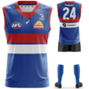
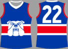
I dont mind a coloured collar and cuffs for them, but do all the same colour. Don't do red cuffs and a toilet seat neckBulldogs really should just go back to their 2016 premiership guernsey, which best uniform they had having the all blue collars and cuffs. View attachment 1654728
- Sep 30, 2015
- 3,741
- 5,639
- AFL Club
- West Coast
Contrasting colours like red, white and blue for the collar and uniform don't look good together. It looks so much better all one colour. I think Brisbane recently did that with their Fitzroy guernsey, different colour for the collar, and it just looks worse for it.I dont mind a coloured collar and cuffs for them, but do all the same colour. Don't do red cuffs and a toilet seat neck
- Mar 30, 2014
- 2,831
- 4,816
- AFL Club
- Brisbane Lions

- Other Teams
- Dolphins, Seattle Kraken
I can't recall where the Lions have done a Fitzroy kit with different collars/cuffs. This season they've gone gold for the Fitzroy kit, which people are still trying to figure out if they like.Contrasting colours like red, white and blue for the collar and uniform don't look good together. It looks so much better all one colour. I think Brisbane recently did that with their Fitzroy guernsey, different colour for the collar, and it just looks worse for it.
Supercheapgiants
As long as Giants win
- Status
- Not open for further replies.
Similar threads
- Replies
- 3
- Views
- 25


