*non negotiableI personally think that matching up with the jumper hoops is very preferable.
Navigation
Install the app
How to install the app on iOS
Follow along with the video below to see how to install our site as a web app on your home screen.
Note: This feature may not be available in some browsers.
More options
You are using an out of date browser. It may not display this or other websites correctly.
You should upgrade or use an alternative browser.
You should upgrade or use an alternative browser.
News New Crows Logo
- Thread starter _Damo_
- Start date
- Tagged users None
Andonis1997
Sporting masochist
To be fair, we don't know what these 'minor changes' to the guernsey will be. We think it will match up with the guernsey hoops but who knows (and for what it's worth, I certainly don't  )
)
 )
)- May 5, 2019
- 5,034
- 5,495
- AFL Club
- Adelaide
errant bounce
All Australian
- May 2, 2024
- 846
- 1,324
- AFL Club
- Fremantle
- Other Teams
- South Fremantle
Little tip: the amount of influence glorified social media managers have on presentation on entire AFL clubs is a joke. absolute no idea on the sport or graphic design as a process (I know nothing about this, I don't know what kerning is and feel impressive at work when I say what a serif is) but the amount of pull they have is an offense.
Some of the garish shit they get away with is insane. there needs to be a thread dedicated to social media presentations.
The AFL is really bad. lots of them look like bad AI. like an inch away from a Mr Beast screenshot.
****ing heinous when you see some of the tight, respectful, club appropriate stuff even a fourth division English club has.
errant bounce
All Australian
- May 2, 2024
- 846
- 1,324
- AFL Club
- Fremantle
- Other Teams
- South Fremantle
Feel like the graphic designers at AFL clubs are like guitarists. the really technically great ones generally make absolutely shit end products.
- Aug 21, 2007
- 33,327
- 110,569
- AFL Club
- Port Adelaide
- Other Teams
- Aston Villa, San Antonio Spurs
This one is spectactular, well done! Needs a more interesting wordmark but the Crow is top notch
Freight Train
Maccas footy aficionado
Little tip: the amount of influence glorified social media managers have on presentation on entire AFL clubs is a joke. absolute no idea on the sport or graphic design as a process (I know nothing about this, I don't know what kerning is and feel impressive at work when I say what a serif is) but the amount of pull they have is an offense.
Some of the garish shit they get away with is insane. there needs to be a thread dedicated to social media presentations.
The AFL is really bad. lots of them look like bad AI. like an inch away from a Mr Beast screenshot.
****ing heinous when you see some of the tight, respectful, club appropriate stuff even a fourth division English club has.
Feel like the graphic designers at AFL clubs are like guitarists. the really technically great ones generally make absolutely shit end products.
Incredibly ignorant take, with zero understanding of how these things work internally, the lack of resourcing that exists and the expectations both internally and externally to deliver content that is fresh, engaging and different year on year, as well as staying aligned with modern industry trends.
I wanted to let this through to the keeper but damn.
I don't have a robust understanding of the industry - but my father in law is a commercial graphic designer and I've sat with him while he was in his study designing packages for horse feed, cleaning products and some other stuff while running me through his directives/what the clients didn't like etc.
And it seems the designers themselves are in a constant push and pull with their managers, who are in turn in a push and pull with the clientele... when it comes to a commercial product what usually eventuates is the safest possible option which the designers don't really have any of their heart in.
A company chooses a firm, the designers at the firm get a brief, they go off and design and pitch their work, either those are brought to the clients who select the direction they want to go in or the firm internally chooses which one to go with.
Anyone who's ever had to deal with corporate anything can guess how it goes getting bossed around by people who have no idea how your job works.
But... I don't know how this would go down in something like sports branding where it's kind of the point to stand out and be profound. It would be different even from the work of 'world leading' design firms like Pentagram, where again, you want something cutting edge but it still has to be easily digestible, something that can be at the bottom of an ad for anything etc.
But in sports logos, a field which you would expect demands the creative of individuality you can't help but wonder what creative juices are lost within the design firm process.
You look at sports logo history at the dawn of commercial sports brands and the best ever were often designed by the artist at the city's local newspaper - when it's someone's personal art it defines an epoch rather than being derivative of it, whereas the work of a firm often must be rebranded decade after decade and is the work of research and market trends. That is not to say there aren't good sports logos that come from the process of design firms because there obviously is, but yeah - I'd be much quicker to blame corporate meddling and the culture of design by committee for vanilla flop designs than the designers themselves.
Last edited:
errant bounce
All Australian
- May 2, 2024
- 846
- 1,324
- AFL Club
- Fremantle
- Other Teams
- South Fremantle
I've seen the shite the Freo guy does and he was clearly hired to continue doing the same. which is shite that looks like a promo poster for a Marvel movie. it's all dashes, rings of fire, smoke. it just looks a bit... lame.
I'll also never tying in a 2003 jumper's rereleases with... a skateboarding theme? for a footy club? it was just a real hackneyed idea of the era. it had no relationship to that jumper design or the club at the time.
The guy has talent but he doesn't have taste. I know that's harsh but it really does look like a live action version of Yu-gi-oh or something.
It's not resourcing or whatever, it's just a matter of taste, and AFL clubs have nfi.
Freight Train
Maccas footy aficionado
I've seen the shite the Freo guy does and he was clearly hired to continue doing the same. which is shite that looks like a promo poster for a Marvel movie. it's all dashes, rings of fire, smoke. it just looks a bit... lame.
I'll also never tying in a 2003 jumper's rereleases with... a skateboarding theme? for a footy club? it was just a real hackneyed idea of the era. it had no relationship to that jumper design or the club at the time.
The guy has talent but he doesn't have taste. I know that's harsh but it really does look like a live action version of Yu-gi-oh or something.
It's not resourcing or whatever, it's just a matter of taste, and AFL clubs have nfi.

also, I reckon the skateboarding tie in for that guernsey made total sense. 2001-2003 was the peak of skateboarding in mainstream culture, think back to the Tony Hawk Pro Skater games etc.
I can probably see this is going to go around in circles though, so my advice would be to give it a crack yourself. So many resources out there, and a pretty diverse design community here on this board. I made my start right here on FJGD and now I’m in the sports industry as a graphic designer so nothing stopping you.

errant bounce
All Australian
- May 2, 2024
- 846
- 1,324
- AFL Club
- Fremantle
- Other Teams
- South Fremantle
Come on, this is a stupid argument. this is a forum dedicated to discussing design in Aussie Rules. you're offended that I think your colleague/mate's artwork isn't very good. it's a form of art and art has plenty of critics. if you can't criticise things on here, where can you? I like to think I explain my positions and don't just say 'it's shit.' dismissing my comments as just whinging isn't really true.View attachment 2139582
also, I reckon the skateboarding tie in for that guernsey made total sense. 2001-2003 was the peak of skateboarding in mainstream culture, think back to the Tony Hawk Pro Skater games etc.
I can probably see this is going to go around in circles though, so my advice would be to give it a crack yourself. So many resources out there, and a pretty diverse design community here on this board. I made my start right here on FJGD and now I’m in the sports industry as a graphic designer so nothing stopping you.
Tying in a football jumper with skateboarding is just so weird. the club never had any connotation with skateboarding. it's completely nonsensical.
The most hilarious and clueless thing is they shot it at a skate park in Freo that nobody ever actually skates at. meanwhile the Woolstores are a skating mecca. have been forever. and they were only a block away.
Freight Train
Maccas footy aficionado
Come on, this is a stupid argument. this is a forum dedicated to discussing design in Aussie Rules. you're offended that I think your colleague/mate's artwork isn't very good. it's a form of art and art has plenty of critics. if you can't criticise things on here, where can you? I like to think I explain my positions and don't just say 'it's shit.' dismissing my comments as just whinging isn't really true.
Tying in a football jumper with skateboarding is just so weird. the club never had any connotation with skateboarding. it's completely nonsensical.
The most hilarious and clueless thing is they shot it at a skate park in Freo that nobody ever actually skates at. meanwhile the Woolstores are a skating mecca. have been forever. and they were only a block away.
Don’t get me wrong, you’re welcome to criticise whatever you would like - that doesn’t mean that no one’s allowed to call you out on it. If that’s not what you’re after though and you’re looking for a community that’ll jump on bagging designers for designing, FJGD might not be the place.
Also, it was what, two years ago now? Why are you so hung up on the skateboards? It made sense, it just didn’t make sense to you.
Andonis1997
Sporting masochist
I'd think an empty skate park is the perfect place for promo photos, regardless of how much it's used.
- May 5, 2019
- 5,034
- 5,495
- AFL Club
- Adelaide
Try working for government where you get directors drawing logo designs on napkins for you to replicateLittle tip: the amount of influence glorified social media managers have on presentation on entire AFL clubs is a joke. absolute no idea on the sport or graphic design as a process (I know nothing about this, I don't know what kerning is and feel impressive at work when I say what a serif is) but the amount of pull they have is an offense.


It's one of those industries where people sometimes want to influence the result a bit too much rather than just trusting the creativity of the person who does it for a living.
errant bounce
All Australian
- May 2, 2024
- 846
- 1,324
- AFL Club
- Fremantle
- Other Teams
- South Fremantle
This happens in most 'creative' avenues. it's not taken seriously so everyone thinks they're an expert, but then they subconsciously understand it is quite impactful so want to get involved.Try working for government where you get directors drawing logo designs on napkins for you to replicate
It's one of those industries where people sometimes want to influence the result a bit too much rather than just trusting the creativity of the person who does it for a living.
Public or private it's all the same shit. half the issue is every board, panel, or special interest group needing consulting and everyone having a massive ego and thinking that joining a one hour meeting once a month is a blessing for everyone else.
I've copped this shit in branding, style guides. an hour before a deadline and the deadshit 'project manager' comes in and realises every page or sheet looks completely different because it's had 13 people involved. 'can you make everything look the same? and why isn't there a comma thing, that word ends with an s!'
errant bounce
All Australian
- May 2, 2024
- 846
- 1,324
- AFL Club
- Fremantle
- Other Teams
- South Fremantle
Basically my issue isn't that. I couldn't imagine how difficult it would be to placate an AFL club. it's why Melbourne ended up with the Car Built for Homer years ago.
The issue is Fremantle hired someone based off his portfolio and let him carry on doing that stuff for a professional football club. they just hired the wrong person. smoke and rain effects and dramatic shadowing and lighting and making players look like cartoon superheroes is just a really really lame look. he uses the exact same look for Game of Thrones artwork as he does for a retirement. the Vale Cam McCarthy post looked celebratory, like he'd announced retirement after 250 games.
The issue is Fremantle hired someone based off his portfolio and let him carry on doing that stuff for a professional football club. they just hired the wrong person. smoke and rain effects and dramatic shadowing and lighting and making players look like cartoon superheroes is just a really really lame look. he uses the exact same look for Game of Thrones artwork as he does for a retirement. the Vale Cam McCarthy post looked celebratory, like he'd announced retirement after 250 games.
- May 5, 2019
- 5,034
- 5,495
- AFL Club
- Adelaide
Feels a bit like the left wing (from the viewers perspective) is too short. I think the red-yellow-blue stripes would improve it.
I like this one a lot, different to the usual stuff you get with bird teams.
fethers17
Debutant
that was the inspiration yesThat looks like the Spoderman meme from a decade back, I feel old knowing that part of Internet history
Chezzel
Debutant
- Oct 15, 2023
- 59
- 97
- AFL Club
- Adelaide
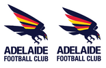
Just a bit of an update on my design (old version on the left).
I felt like the the wings and tail looked a bit too 'angular'...
View attachment 2154907
It just keeps getting better, and the clubs not contacted you about it at all?
Sent from my iPhone using BigFooty.com
- Sep 25, 2014
- 5,306
- 3,905
- AFL Club
- Adelaide
- Other Teams
- Sturt, Adelaide United & Leeds United
i really hope the fans etc have sent the club emails and messages about what they want. this idea is fantastic.It just keeps getting better, and the clubs not contacted you about it at all?
Sent from my iPhone using BigFooty.com
Similar threads
- Replies
- 6
- Views
- 332
- Replies
- 11
- Views
- 484
- Replies
- 41
- Views
- 2K


