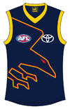
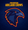
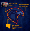
I think part of the agreement with the SANFL was that we weren't allowed to be called the Crows (not that anyone outside of branding follows that rule). And the new logo doesn't say Crows on it. So maybe (ignore the giant crow on the logo though).I wonder if they’ll be using the new logo in the SANFL as well. At the very least they’ve changed the club colours so they might need to make that minor change to the shield logo. I figure changing the senior logo is the good opportunity to unify the branding like what we did in 2020.
Navigation
Install the app
How to install the app on iOS
Follow along with the video below to see how to install our site as a web app on your home screen.
Note: This feature may not be available in some browsers.
More options
You are using an out of date browser. It may not display this or other websites correctly.
You should upgrade or use an alternative browser.
You should upgrade or use an alternative browser.
News New Crows Logo
- Thread starter _Damo_
- Start date
- Tagged users None
- Aug 21, 2007
- 33,298
- 110,417
- AFL Club
- Port Adelaide
- Other Teams
- Aston Villa, San Antonio Spurs
View attachment 2160423
Hawthorn did it better imo
Uh, it's an iteration on the old Crows logo, which comfortably predates this Hawthorn logo.
Swooping birds are a fairly well worn logo trope.
- Aug 21, 2007
- 33,298
- 110,417
- AFL Club
- Port Adelaide
- Other Teams
- Aston Villa, San Antonio Spurs
I think it looks fine on a white background. Not great but good enough.
On a blue background with the yellow outline though it looks bad.
On a blue background with the yellow outline though it looks bad.
- May 5, 2019
- 5,016
- 5,472
- AFL Club
- Adelaide
Ah, the real EaglesI don’t really get this comparison. It’s a completely different graphic style and the pose isn’t exactly unique. I mean there’s only so many ways you can draw a flying bird and Hawthorn didn’t invent the wheel here anyway. West Torrens for example were using swooping eagle graphics in the 1950s.
View attachment 2160728
View attachment 2160729

- Mar 30, 2014
- 2,818
- 4,800
- AFL Club
- Brisbane Lions

- Other Teams
- Dolphins, Seattle Kraken
Both are minimalist "bird of prey attacking" themes despite the crow (or raven) not being a bird of prey, both are angular and streamlined and oversimplified minimalist features, both are dynamic poses in motion, in the same angle (previous angles were quite different).Uh, it's an iteration on the old Crows logo, which comfortably predates this Hawthorn logo.
Swooping birds are a fairly well worn logo trope.
I am aware that this could be considered an adaptation of the old one, but it didn't really need adapting, people loved it being on the kit!
I dunno, feel like they just went "this works".
#bringback90scrom
Yeah there's a reason for that.i know this is for the suns but the crows logo looks like a logo for a cyber security company (mods move this to crows chat if you want)

memes_about_carlton
Flaggers 2025
- May 20, 2011
- 12,315
- 11,029
- AFL Club
- North Melbourne
So much better than the old logo or new logo.Probs not the right place to post but here is the redesign for Adelaide I did a while back. (Based off Luc Scamanski)
View attachment 2164338View attachment 2164339
Fizzler
TAKE BACK PAFC
- Dec 26, 2013
- 13,499
- 18,134
- AFL Club
- Port Adelaide
- Other Teams
- OKC, Coburg, Werribee, Storm, QPR
Bit of a bump but the first tangible proof that this might be the Crows’ SANFL logo. SANFL website hasn’t been updated but still, this is something.
Cory
Brownlow Medallist
Bit of a bump but the first tangible proof that this might be the Crows’ SANFL logo. SANFL website hasn’t been updated but still, this is something.
Well why would they have a seperate logo in the first place?
Similar threads
- Replies
- 11
- Views
- 451
- Replies
- 41
- Views
- 2K


