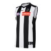
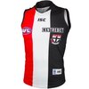
Discussion State of our jumper

Remove this Banner Ad

Hold your horses. You forgot about my propensity for all things negative. I kind of like it but there is something about it that looks a bit amateurish. As he said, good concept but a bit clunky in final execution. It's got year 12 graphic arts student vibes.

Well you’re a given

Anyway, it’s designed by Nicky for a round that celebrates his peoples’ history and culture so that’s good enough for me
 
Well you’re a given

Anyway, it’s designed by Nicky for a round that celebrates his peoples’ history and culture so that’s good enough for me


Yeah, I love the concept, it almost looks like they had too many good ideas and should have used one out of the three. The birds, his silhouette, the rock art spatter etc all look like they'd have been good on their own but together gets a bit busy. The spatter looks a bit too computer generated, it looks like a filter effect rather than manually applying it and then transferring it to digital then the rest looks like they had to put bits somewhere but weren't sure where.
 

Log in to remove this ad.

Yeah, I love the concept, it almost looks like they had too many good ideas and should have used one out of the three. The birds, his silhouette, the rock art spatter etc all look like they'd have been good on their own but together gets a bit busy. The spatter looks a bit too computer generated, it looks like a filter effect rather than manually applying it and then transferring it to digital then the rest looks like they had to put bits somewhere but weren't sure where.
This is spot on for me and frankly the image of Nicky gets lost a bit down the bottom end of the jumper, that piece of the imagery should have been front and centre to me.

As said, it’s a great concept but the jumper is messy.
 
In the circumstances, I’d much prefer a jumper that most of us loved but a few thought was ‘messy’, ‘amateurish’ or ‘childlike’.

Than a jumper that all of us liked but which Nicky Winmar didn’t think fully captured his vision.

When we get our own round we can design our own version.
 
In the circumstances, I’d much prefer a jumper that most of us loved but a few thought was ‘messy’, ‘amateurish’ or ‘childlike’.

Than a jumper that all of us liked but which Nicky Winmar didn’t think fully captured his vision.

When we get our own round we can design our own version.
Fair point.
 
I noticed this on the saints Facebook page - I did not know this was the reason, I just thought it was a commercial reason to maximise sponsorship revenue. Maybe it's both I guess.

1624450874884.png
 
I noticed this on the saints Facebook page - I did not know this was the reason, I just thought it was a commercial reason to maximise sponsorship revenue. Maybe it's both I guess.

View attachment 1162113
How do you reckon it'd look above the sponsor logo anyway, or is that too high?
 

(Log in to remove this ad.)

How do you reckon it'd look above the sponsor logo anyway, or is that too high?


It's tricky, you could centre it but it wouldn't be over the heart which I assume is the point.
 
I noticed this on the saints Facebook page - I did not know this was the reason, I just thought it was a commercial reason to maximise sponsorship revenue. Maybe it's both I guess.

View attachment 1162113

Boy I hope that post means we could we wearing the candy stripe next year.

Day 1 purchase if we make the change
 
Thick white panels we reckon


c6950cf2f6cc92870da0da85a1d121e0


I hated this jumper FWIW.
 

Remove this Banner Ad

Discussion State of our jumper

Remove this Banner Ad

Back
Top