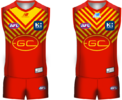
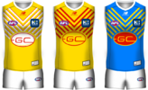
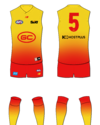
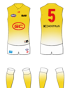
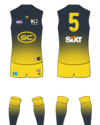
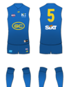
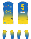
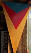
How does it look if the chevrons keep repeating right to the collar? Could be a unique lookView attachment 1838319
Theres gotta be a way to crack this thing....must they insist on that logo??
Navigation
Install the app
How to install the app on iOS
Follow along with the video below to see how to install our site as a web app on your home screen.
Note: This feature may not be available in some browsers.
More options
You are using an out of date browser. It may not display this or other websites correctly.
You should upgrade or use an alternative browser.
You should upgrade or use an alternative browser.
Resource Gold Coast Suns Rebrand
- Thread starter 1990crow
- Start date
- Tagged users None
- Status
- Not open for further replies.
Bjo187
Premiership Player
- Apr 30, 2020
- 4,139
- 5,873
- AFL Club
- Essendon
View attachment 1838319
Theres gotta be a way to crack this thing....must they insist on that logo??
I quite like this and again when the logo has something in the background it's not nearly as shit.
- Jun 23, 2021
- 2,353
- 2,477
- AFL Club
- Melbourne
- Other Teams
- LA dodgers LA Kings Melbourne Aces
yes very niceView attachment 1838319
Theres gotta be a way to crack this thing....must they insist on that logo??
Tandy
Norm Smith Medallist
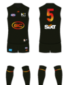
I can see the marketing on that black guernsey. Looks like an 'eclipse' guernsey
black is not one of our official coloursI can see the marketing on that black guernsey. Looks like an 'eclipse' guernsey
Tandy
Norm Smith Medallist
Yes but a one off 'eclipse' guernsey wouldn't be the worst little money spinner. Would look good, probably top 2 or 3 designs they've had, leans into the Sun thing so it's not off brand.black is not one of our official colours
Cor that black jumper is elite
Australian T20 cricket team has worn black for some time & grey before that. Not Australian colours either!black is not one of our official colours
- Nov 7, 2012
- 10,809
- 35,366
- AFL Club
- St Kilda
- Other Teams
- Bristol City FC, Urawa Red Diamonds FC
Fizzler
TAKE BACK PAFC
- Dec 26, 2013
- 13,502
- 18,141
- AFL Club
- Port Adelaide
- Other Teams
- OKC, Coburg, Werribee, Storm, QPR
Black kit making a late run at design of the year, holy ****kkkk


- Jun 23, 2021
- 2,353
- 2,477
- AFL Club
- Melbourne
- Other Teams
- LA dodgers LA Kings Melbourne Aces
send it to the suns now i rate itBlack kit making a late run at design of the year, holy *kkkk
- May 3, 2004
- 698
- 1,312
- AFL Club
- Geelong
Gradients are good, but we don't need another Brisbane piss-stain 
- May 3, 2004
- 698
- 1,312
- AFL Club
- Geelong
Oh dear. This once all-blue uniform has been ruined by Gold Coast becoming scared of the prospect of success, and pissing themselves in the process, no thanks to the Berocca ingested shortly before...
It even spilled into the socks, and crept up the jumper
- Oct 5, 2017
- 1,316
- 1,085
- AFL Club
- Sydney
- Other Teams
- Port Melbourne, Norwood, St George
If Parramatta merged with the Suns.....
Oh dear. This once all-blue uniform has been ruined by Gold Coast becoming scared of the prospect of success, and pissing themselves in the process, no thanks to the Berocca ingested shortly before...
It even spilled into the socks, and crept up the jumper
they should bring it out once every few years when it coincides with an actual solar eclipse hahahYes but a one off 'eclipse' guernsey wouldn't be the worst little money spinner. Would look good, probably top 2 or 3 designs they've had, leans into the Sun thing so it's not off brand.
Why does it have to be red? Feel yellow is a better colour from a branding perspective also.
Should be gold
And not Hawthorn gold
Scotty_222
Norm Smith Medallist
Glad to see the Southport sharks have a new shark logo. What do we need to do to get a refresh?
Andonis1997
Sporting masochist
Are you talking the one from 2017, or do they have a new new one?Glad to see the Southport sharks have a new shark logo. What do we need to do to get a refresh?
Bjo187
Premiership Player
- Apr 30, 2020
- 4,139
- 5,873
- AFL Club
- Essendon
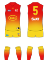
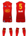
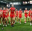
For what it's worth, I actually think the jumper has gotten even worse over the years. If you look at these two photos, the old one was ordinary too, but the side panels having some shape and some gradient behind the GC didn't look as bad as the even more plain and boring abomination of the current jumper. The straight side panels make it look like a plain red jumper with a crappy weak logo from the front.



Scotty_222
Norm Smith Medallist
I dunno, first time I’ve noticed itAre you talking the one from 2017, or do they have a new new one?
- Oct 30, 2014
- 4,902
- 9,924
- AFL Club
- Western Bulldogs
- Status
- Not open for further replies.
Similar threads
- Poll
- Replies
- 5
- Views
- 991
- Replies
- 14
- Views
- 1K
- Replies
- 6
- Views
- 847


