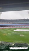
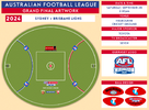
Seriously couldnt tell you mate, i have no idea why the AFL does thatwhy do they put "home" team on the right rather than the left? Is is just cause its closer to the rooms they walk out of and where they stand for the anthems?
Navigation
Install the app
How to install the app on iOS
Follow along with the video below to see how to install our site as a web app on your home screen.
Note: This feature may not be available in some browsers.
More options
-
 BigFooty AFLW Notice Img
AFLW 2024 - Round 10 - Chat, game threads, injury lists, team lineups and more.
You are using an out of date browser. It may not display this or other websites correctly.
You should upgrade or use an alternative browser.
You should upgrade or use an alternative browser.
Resource History of AFL Grand Final Artwork
- Thread starter Red Crow
- Start date
- Tagged users None
Red Crow
Modrarator
- Thread starter
- #302
Another year upon us and as promised, I've gone back to update previous images to reflect the new template and include the ball designs and adjust the 50m arc logo sizes. So far I've only done the AFL era. I won't be doing ball designs prior to 1990 as they were just regular footballs with nothing particularly interesting about them, but I will update the VFL-era template at some stage. Some of the 90's balls were a little hard to get clear and definitive images of, so I've used best guess on what I could see. If anybody spots any issues, feel free to hit me up with the evidence so I can update.
One interesting thing I noticed that I missed when I first did these, is that the 50m arcs at Waverley in 1991 actually had three '50's on them! The camera was in a horrible position there being to the right of centre wing, so the angles played tricks on me.
Also with the West Coast logos in 2005/06, I thought they had been squashed both years to fit in the gap, but they actually only did that for 2005. In 2006 they had it at its proper ratio. I've also double checked which years had the arcs stop before the logo, and which has them going behind the logo. 2010 was weird as the arc goes behind the ribbons of the St Kilda logo but not behind the main body of it, while the Collingwood logo has the standard stops with the white end. Very peculiar.
- Sep 7, 2009
- 6,679
- 7,219
- AFL Club
- Collingwood
- Other Teams
- Real Madrid, Man City, GS Warriors
Our logo should be on the left as we are the designated "home" team"
- Mar 30, 2014
- 2,743
- 4,663
- AFL Club
- Brisbane Lions

- Other Teams
- Dolphins, Seattle Kraken
Guess notOur logo should be on the left as we are the designated "home" team"
lionbear
Geelong Member from 2016
- Feb 25, 2007
- 12,488
- 8,985
- AFL Club
- Geelong
- Other Teams
- 49ers, Indians, Storm
Based on room positions like 2022 you come out of the rooms closer to the right of screen end so your logo is on the right.Our logo should be on the left as we are the designated "home" team"
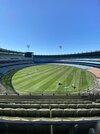
Not the best photo, but it shows the placement, and double Telstra 50’s.
On iPhone using BigFooty.com mobile app

On iPhone using BigFooty.com mobile app
seaforthswan
glebegreyhound
- Apr 18, 2013
- 413
- 520
- AFL Club
- Sydney
- Other Teams
- UTS Bats, Manly Marlins
Red Crow
Modrarator
- Thread starter
- #310
why do they put "home" team on the right rather than the left? Is is just cause its closer to the rooms they walk out of and where they stand for the anthems?
Seriously couldnt tell you mate, i have no idea why the AFL does that
Our logo should be on the left as we are the designated "home" team"
Based on room positions like 2022 you come out of the rooms closer to the right of screen end so your logo is on the right.
So I think I finally cracked the code of why the logos are the "wrong" way around, and if I'm right its actually pretty simple and can't believe I didn't figure it out earlier.
They match up with the bench position!
The teams line up for the anthem in front of their respective benches, so they paint the on-field logos to match, so that the teams line up alongside the correct logos as well. If they put the logos how we would consider to be correct, the teams would either line up next to the wrong logo, or have to cross over each other when going to/from the benches. Its basically purely a logistical thing as I suspected, it just took me a while to figure out exactly what that logistical thing is.
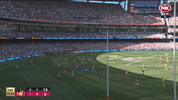
In the image below, the stats on the LED screens above the benches match the position of the benches. I believe (though don't go to enough games to be 100% sure) that the home team always has the left bench, which is actually to the right of screen.
If it was me organising it, even if just for the GF only I'd switch the benches so that the logos end up looking correct, as far more people see them than see the benches. But its probably not something the AFL really think or care much about.
Heardy_101
LET'S GO BRANDON
Sydney better get the red & white end this year....
Because hopefully someone got fired in 2022
Because hopefully someone got fired in 2022
i would like to wish for the telstra logos and team logos to switch so that we get the 50m arcs looking like they should on gf day
but then again i wish to win the lotto and that is not happening
but then again i wish to win the lotto and that is not happening
Gydafud
Premium Platinum
It used to be that the team on the red arc couldn’t win, but now since the logos have moved to the wing, the team closest to the blue arc hasn’t won. What will the order be this year?
Red Crow
Modrarator
- Thread starter
- #315
Unless the AFL change their processes, Brisbane’s logo will be to the left and Sydney’s to the right. This has been the case in both the mens and womens GFs since they moved the logos to the wing in 2021. It lines up with the benches, and the home team gets the bench to the right. There is no colour coding any more, which I don’t think really matters now that the logos aren’t on the actual arcs anyway.
Graphic may not be up until after the GF as my computer now takes 3-5 business days just to boot up. I’ll also post last years AFLW graphic. I did it at the time, but evidently never posted it.
Graphic may not be up until after the GF as my computer now takes 3-5 business days just to boot up. I’ll also post last years AFLW graphic. I did it at the time, but evidently never posted it.
lionbear
Geelong Member from 2016
- Feb 25, 2007
- 12,488
- 8,985
- AFL Club
- Geelong
- Other Teams
- 49ers, Indians, Storm
I thought the logos was based on which dressing rooms, as the forward pocket ones seem to be more popular (Collingwood automatically get them, see Qualifying final 2022) I think you are correct Sydney to the right and Brisbane to the left meaning Sydney will get the red and white 50 meter arc in 2024.
- Jun 3, 2015
- 923
- 964
- AFL Club
- Port Adelaide
Painted logo on the right is 3-0
seaforthswan
glebegreyhound
- Apr 18, 2013
- 413
- 520
- AFL Club
- Sydney
- Other Teams
- UTS Bats, Manly Marlins
All minor premiers tooPainted logo on the right is 3-0
- Sep 7, 2009
- 6,679
- 7,219
- AFL Club
- Collingwood
- Other Teams
- Real Madrid, Man City, GS Warriors
2021: Melbourne on the right - wonAll minor premiers too
2022: Geelong on the right - won
2023: Collingwood on the right - won
- Sep 7, 2009
- 6,679
- 7,219
- AFL Club
- Collingwood
- Other Teams
- Real Madrid, Man City, GS Warriors
First time team painted toward the right of the screen won. Presentation was done at the Punt Road end. Last year it was done at the City End where the Pies cheersquad sit
- Apr 6, 2010
- 3,553
- 4,417
- AFL Club
- Geelong
- Other Teams
- Man Utd, AC Milan, Wolfsburg,
Always thought the presentation was done with the winning cheer squad behindFirst time team painted toward the right of the screen won. Presentation was done at the Punt Road end. Last year it was done at the City End where the Pies cheersquad sit
Remember in 08 it was in front of the cats end and looked absolutely dreadful
- Sep 7, 2009
- 6,679
- 7,219
- AFL Club
- Collingwood
- Other Teams
- Real Madrid, Man City, GS Warriors
2018 it was done at the Punt Road end which was closer to Perth with us sitting at the City End.Always thought the presentation was done with the winning cheer squad behind
Remember in 08 it was in front of the cats end and looked absolutely dreadful
And 2008 was awkward seeing Clarko speak in front of the Cats cheersquad
Similar threads
- Replies
- 143
- Views
- 7K
- Replies
- 49
- Views
- 5K
- Replies
- 65
- Views
- 4K
- Replies
- 88
- Views
- 5K


